
Recommended
More Related Content
What's hot
What's hot (20)
Similar to All Time Low CD cover textual analysis
Similar to All Time Low CD cover textual analysis (20)
More from RachaelMedia
Recently uploaded
Recently uploaded (20)
All Time Low CD cover textual analysis
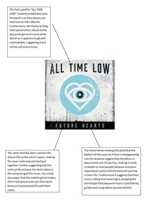
- 1. The font usedfor“ALL TIME LOW” instantlyestablisheswho the band isas theyalwaysuse that fonton theiralbums. Furthermore,the blockywriting and capital lettersalludetothe poppunk genre of musicof the albumas it appearstoughand unbreakable,suggestingitwill not be softpianomusic. The same fonthas beenusedforthe albumtitle asthe artist’sname,making the cover lookneatandwell put together,furthersuggestingthatthe same pride andcare has beentakenin the composingof the music.You could alsoargue thatthe matchingfontmakes themlookpossessive overtheirwork because itcompletelyfitswiththeir name. The streetlampsstrategicallyplacedatthe bottomof the coveras if they’re disappearing intothe distance suggestthatthe albumis aboutsome sort of journey,makingiteasily relatable tomostpeople because everyone experiencessome kindof emotional journey intheirlife.Furthermoreitsuggeststhattheir musicisdeepand meaningful,escapingthe stereotype thatpoppunkmusicisjustblaring guitarsand songsaboutsex and alcohol.