
Recommended
More Related Content
What's hot
What's hot (20)
Similar to Digipak analysis
Similar to Digipak analysis (20)
Recently uploaded
Recently uploaded (20)
Digipak analysis
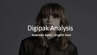
- 1. Digipak Analysis Gabrielle Aplin – English Rain
- 2. The multi-coloured umbrella juxtaposes with the black and white background which may suggest that she is able to find happiness in a sad world and she is trying to do that for everyone else with her music. The serif font in which her name is written is simplistic yet classic which goes with the singer- songwriter genre. However, despite it’s simplicity it the most bold writing on the cover which makes it stand out. By doing this the consumer is able to see exactly whose album it is. The name of the album is written in a sans serif font which acts as synthetic personalisation because it looks as if it was hand written and gives it a more personalised feel, therefore her audience are more likely to connect to the album as they would feel like it was made just for them. The artist is in the centre of the album which makes her the main focus. I could use this idea for my own Digipak because I believe that this would be a great way to promote and up-and-coming artist. Furthermore, having little in the background makes the artist stand out and further makes her the focal point.
- 3. The back cover follows the same theme of simplicity and the rule of third by placing the song titles in the middle. This, again, makes the titles the focal point of the cover which makes them stand out and the consumer clearly know where to look. Furthermore, the rule of thirds within the landscape allows the track list to be clearly visible. This is something that I could like to use within my own cover because the clear and set structure allows the track list to stand out which makes it easy for the consumer to find and read. Arguably the serif font would be easier to read which would allow the consumer to make a quicker decision about whether or not they would want to buy the album. However, the handwritten font makes the titles seem more personal and as if each song has been written with meaning and purpose which better goes with the singer-songwriter genre.