2. I searched into some traditional magazine front covers, I found BLUES & SOUL
which was attractive to the eye. This magazines really suited my genre as I’m
focusing on soul, the magazine cover interested me and I decided to use it for
inspiration on my front cover. BLUES & SOUL is the most popular soul
magazine I’ve found which is why I’ve decided to use it, BLUES & SOUL is
published bi-monthly and was first published in 1966 they’re based in London
with representatives in New York and LA - and a readership that spans all over
the world. The magazine has many archives such as live reviews, features, charts
etc. The magazine also has a website offering similar genres to also be able to
view and read their magazine. The magazine really highlights options of being
able to see soul artists live at venues, also features a lot of current soul artists and
giving an option to readers to be able to blog about soul music events etc, really
involving their readers.
THABILE KWEPILE
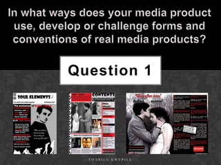
3. Masthead: I chose Showcard gothic
Selling line: It’s short Barcode: I used a standard font with the size of 60pt because I think
sweet and true for barcode to make the the font made it easily recognised and
magazine traditional. unique. I’ve made it like this for
those who love soul.
advertising purposes and as general
logo. I then got a picture of a quaver
note from Google imported it on my
Main image: My main image is cover. I used the line tool to make
my model, representing Robin a black line to underline my masthead.
Thicke whose a neo-soul music
artist famous for his song ‘Lost
Without You’. The image is making Dateline: I’ve added a dateline
full eye contact to connect with the in the same way a traditional
audience. magazine has mine has specific
dares, most magazines used just
a month and year of
publication, often with the price
but mine has no price written on
Cover lines: My cover it.
lines are organised on the
left side of the magazine
Main cover line: My main cover like
isn’t as big as most main cover lines
but not distracting too
would be but stands out at the top
much from the main image.
highlighting what the main article.
Left third: This part of the magazine
Colour Scheme: I used the is crucial as most magazines are sold
colour scheme of red, white showing just that part but I’ve
and black as they work well decided not to have a left third just
together and I got this idea including that part with
from a Kerrang double page COMPETITION to capture the reader
spread for MCR. quickly as people love competitions.
4. I used Kerrang magazine as a basis to start from for ideas for
my contents page, I realise Kerrang is a metal/rock magazine
and my genre is the total opposite but I really think the way
Kerrang designed their contents page and front cover really
works well as it uses normal magazine skills to look realistic
and to engage the correct audience, they way they’ve done
that is to add a lot of colour which contrasts well together
and also stick to a colour scheme that works for their
magazine as it links it when you see the contents page this
helps the reader connect the two and not feel as if they’ve
entered a new world. They’ve used a lot of images to also
reel in their audience which makes the audience not have
too much text to read so suiting their audience well and
putting in an editors view on the top of every contents that
helps the magazine reach out more to the public as it feels
more personal. I really like this idea for my magazine, The
magazine masthead is really large and can’t be ignored and
the same with the contents page, I like the way they’ve used
that to capture people.
THABILE KWEPILE
5. I have adapted some ideas from
Kerrang magazine for my magazine
like having an editors view in the
In order for my corner adds a sense of class as it’s a
magazine to appeal to soul magazine, this really gives it a
my niche audience I sense of being professional. Kerrang
researched into some uses this too and it’s a rock
neo-soul artists that magazine it still seems not too crazy
are current and also which means it’s not conforming to
some more older soul the sort of stereotypes that would
artists so my audience be expected of a rock magazine. I
can have a variation in really like this idea and have
artists to do this, I incorporated that into my
looked in the blues & magazine.
soul as it has categories
for different genres I have also used a big title to
such as hip stand out and having a quote
hop, r’n’b, soul, blues from an infamous blues & soul
etc which really helped
singer, Etta James on the top
with making my
magazine as I imported also taking the magazine a
some ideas from other scale up.
genres to give my
audience a sense of I’ve made the image of the two
difference and not too main models who’ll be featured in
much focus on just soul the double page spread the largest
music but still focussing to make it obvious who the
on soul. magazine is based on but also
My magazine does challenge other forms of soul magazines on the marker adding pictures of other models
included within the magazine, is
but that's too appeal to my niche audience and to be different. similar to Kerrangs layout using the
THABILE KWEPILE same convention.
6. I researched into some double page spreads from some popular music magazines and founds some that I like, such as
Kerrang I like the layout and I also like it because of the colour scheme as it matches mine exactly with the red, white
and black! The layout is professional precise and clear as there is not too much writing taking over the page and the
fact the picture on the left side of the double page spread is so large, makes the reader feel a little involved with what’s
going on. Adding the images on the bottom makes it seem like the magazine is telling a story of something important
they way the images are captioned. For my music magazine contents page I also used Kerrang as my inspiration
which really is the opposite to soul music and shows I’m not conforming to what a normal soul magazine would look
like, as Kerrang is a rock magazine. I also found more double page spreads that I find interesting Vibe magazine
being one of them, Solange Knowles(model) being in colour on the front but having little figures of her in the
background being black and white, it’s really effective makes her seem like her lifestyle is colourful and the
background images are like other little crazy pieces of her. I like the layout of LIVE magazine and how bright it is, it’s
really appealing to the eye with the colours and pictures on the side the magazine seems more editorial as if it the
double page spread would’ve been found within a news paper instead of a magazine. It doesn’t look too professional
but the magazine looks good, the text however seems a little too much read. But making the title so bold really makes
certain parts of the double page stand out.
THABILE KWEPILE
7. I’ve kept the body text
simple starting straight I wanted my double page spread to be clear
into an interview with and neat therefore have not overcrowded it
Robin thicke about his
wife and life. Still kept in with too much. I’ve made the first letter
of the article big to stand
line with my colour
out as this is a traditional
scheme. I’ve made the
thing to do with
font size quite at 14
magazines and
make it large enough for
newspapers.
readers to see.
I added the magazine
Headline – shows website and names of
the reader what the the people featured
feature is about. I together so if readers
used all three would like to find out
more they would know
colours red, white where to go. This also
and black and added makes the magazine
a grey outline and a look more professional.
shadow to make the
words stand out I’ve used a quotation to
more. show the reader what the
people in the feature are
saying. Also including the
I used a large image quotation might interest
taking up the first Added the world exclusive box to make the reader to read the
it seem more exciting and professional! story.
page of my double
Similar to Kerrang double page spread.
page spread. This
makes the feature I’ve included a page number to make it seem more
THABILE KWEPILE
visually stimulating. professional.