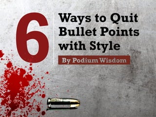
6 Ways to Quit Bullet Points with Style
•
1,614 likes•161,437 views

6 simple yet stylish design alternatives to the hated bullet point - to help you step up your presentation game.

Recommended
Recommended
More Related Content
What's hot
What's hot (20)
Viewers also liked
Viewers also liked (19)
Similar to 6 Ways to Quit Bullet Points with Style
Similar to 6 Ways to Quit Bullet Points with Style (20)
Recently uploaded
Recently uploaded (20)
6 Ways to Quit Bullet Points with Style
- 1. 6 Ways to Quit Bullet Points with Style
- 2. Open any book on how to design presentation slides, and you’re guaranteed to see an entire section on why bullet points suck.
- 3. This isn’t unjustified. After all, we’ve all suffered from this experience…
- 4. Yucks (See Fergus McAuliffe’s full TED talk on how to tell a captivating story of science)
- 5. So ok, we don’t want to do that… but what are some alternatives? How can we not only quit the bullet point, but quit it with style?
- 6. Let’s look at 6 designs that are simple yet effective.
- 7. Let’s look at 6 designs that are simple yet effective. BTW: The 6th option is the most difficult yet offers the biggest potential payoff. Stick with me ‘til the end to see what it is!
- 8. Before we dive in, let’s cover some ground work. Here’s an example of your typical, brain death- inducing bullet point slide:
- 9. A Good TED Talk: 1. Should offer new value, new insight to the audience, something they’d never heard before. If people already know it, why do they need to listen to you? 2. Should be passionate and authentic. The speakers must live and breathe their messages, and be ready to show their true, even vulnerable selves 3. Should use stories and examples. Stories are the killer app of presentations. People simple love stories. They trigger the senses and help the audience see, smell, and touch – not just hear – your talk.
- 10. Disastrous. The first thing to do is to identify the key words. Luckily they’re already there for the plucking.
- 11. A Good TED Talk: 1. Should offer new value, new insight to the audience, something they’d never heard before. If people already know it, why do they need to listen to you? 2. Should be passionate and authentic. The speakers must live and breathe their messages, and be ready to show their true, even vulnerable selves 3. Should use stories and examples. Stories are the killer app of presentations. People simple love stories. They trigger the senses and help the audience see, smell, and touch – not just hear – your talk.
- 12. Unless you have a great reason for the audience to see & remember every single word, it’d be best to keep the key words and cut everything else.
- 13. A Good TED Talk: 1. Should offer new value 2. Should be passionate and authentic 3. Should use stories and examples
- 14. Brain death averted! But not all is well… because such slides are simply not pleasing to the eyes, and yes, aesthetics matter! Let’s look at the options.
- 16. This is the most widely-used option. Let’s take the earlier slide on TED talks, and give each point its own slide, with awesome pictures, like this:
- 17. New & Valuable1
- 20. Different, isn’t it? This puts more emphasis on the individual points, and gives them powerful visual support.
- 21. “Then I’ll have too many slides! It’ll take too long!” Actually, it won’t.
- 22. If you’re going to cover each point anyway, it really doesn’t matter that the points are on separate slides rather than one. 1 2 3 4
- 23. “Wait! But I prefer to give my audience an overview, so I need them on one slide!” Fair point. Let’s look at the next options.
- 24. 2 Keywords plus photos on one page
- 25. Let’s keep all the points & photos, but combine them into a single slide:
- 26. Stories & Examples New & Valuable Passion & Authenticity
- 27. Have the points appear one by one so as to avoid having the audience “read ahead” while you’re talking. As each new point appears, de-emphasize the earlier points, like this:
- 28. New & Valuable
- 30. Stories & Examples Passion & Authenticity New & Valuable
- 31. This helps the audience focus on the current point, while still having access to the previous points.
- 32. Got more items to talk about? No problem.
- 33. *From People,Not Candidates by Dave Hazlehurst on Slideshare
- 34. Or you could try a horizontal orientation:
- 35. Safe Nuclear? Energy Efficiency Renewable Energy Recycling
- 36. Notice that the photos are color-tinted green so they seem like parts of a whole. This simple trick helps maintain cohesion while using photos from different sources.
- 37. 3 Keywords plus icons on one page
- 38. Another trendy option is to combine key words not with photos, but with icons. Even the United Nations does this, like with the Sustainable Development Goals:
- 40. To this.
- 41. More pleasing and inviting, isn’t it? Here’s another example.
- 42. I recently designed a client’s presentation on 8 key factors of Silicon Valley’s Innovation Ecosystem. A traditional slide might have looked like this:
- 43. SiliconValley Innovation Ecosystem: 8 keys 1. Many Silicon Valley companies have built-in exit strategy: e.g. to be acquired by other companies.The founders can then move on to build the next advance. 2. Successful entrepreneurs often become angel investors that help nurture the next generation of startup founders. 3. Elite schools such as Stanford and Berkeley feature top research programs that collaborate successfully with industry, and also train elite talent that constantly bring new blood to the startup scene. 4. A strong garage culture means anyone can be building the next great business or technology anywhere. 5. Silicon Valley’s unique environment also attracts the best and brightest from around the world. 6. One of the big factors in attracting talent is its incredibly hospitable climate, Spring-like for 8-10 months of the year. 7. Another factor is the infrastructure, which greatly facilitates both a high living standard and the ease of doing business. 8. Finally, Silicon Valley’s community and culture is incredibly accepting – even encouraging – towards failure.Where other places look down upon failed businesses, Silicon Valley folks would pat you on the back and say:“Keep trying!”
- 44. I re-designed it into the next slide for a Chinese- speaking audience. But you don’t need to speak Chinese to see the difference.
- 46. Again, have the icons appear in the order you’re narrating the points, so as to focus the audience’s attention.
- 47. Ok. So those were three rather common designs. Now let’s look at three less common ones.
- 49. Putting lots of point + photos on screen requires tiny, almost invisible pictures… What if you wanted every point on screen, but to use BIGphotos?
- 50. Here’s one way. Keep the points on one side, and just alternate the background picture, like these next slides on disasters:
- 56. This allows you to use larger photos for impact, yet still reminds your audience of the previous points.
- 57. Bill Gates used this technique beautifully in his TED talk Innovating to Zero. He explained different parts of a key formula by switching background pictures:
- 58. *Screenshot of Bill Gates TED Talk: Innovating to Zero,TED Global 2010
- 59. *Screenshot of Bill Gates TED Talk: Innovating to Zero,TED Global 2010
- 60. *Screenshot of Bill Gates TED Talk: Innovating to Zero,TED Global 2010
- 61. 5 Highlight different parts of a text wall
- 62. Let’s say you have a huge list of things to talk about. The usual “expert” advice is to cut it down. Drastically.
- 63. But let’s try something else. Instead of cutting the list down, just put all of them up – as a “text wall”. And selectively highlight different parts:
- 64. il wells ran dry natural gas depletion peak coa odiversity loss mass coral reef die-out fisherie ollapse extinction mass forest die-off ocean ac tion desertification all bees disappeared drou e avalanches earthquakes tsunamis typhoons ooding extreme weather hurricanes blizzards nowstorm sea-level rise cities under water coa eas retreat $trillions in damages insurance lo splacement food production drops sharply assive crises mass hunger social crises politic pheaval depression violent conflicts political
- 65. il wells ran dry natural gas depletion peak coa odiversity loss mass coral reef die-out fisherie ollapse extinction mass forest die-off ocean ac tion desertification all bees disappeared drou e avalanches earthquakes tsunamis typhoons ooding extreme weather hurricanes blizzards nowstorm sea-level rise cities under water coa eas retreat $trillions in damages insurance lo splacement food production drops sharply assive crises mass hunger social crises politic pheaval depression violent conflicts political
- 66. il wells ran dry natural gas depletion peak coa odiversity loss mass coral reef die-out fisherie ollapse extinction mass forest die-off ocean ac tion desertification all bees disappeared drou e avalanches earthquakes tsunamis typhoons ooding extreme weather hurricanes blizzards nowstorm sea-level rise cities under water coa eas retreat $trillions in damages insurance lo splacement food production drops sharply assive crises mass hunger social crises politic pheaval depression violent conflicts political
- 67. The wall of text conveys overwhelming abundance: “Wow there’re A LOT of disasters!” (You could also use it to convey good overwhelm.) And yet it allows you to drill in on each specific item.
- 68. This idea has been used in various designs, such as the cover for Nate Silver’s superb The Signal and the Noise.
- 69. And now… The 6th option – the most difficult yet with the greatest potential payoff…
- 71. Actually, this should probably be your first question:“Is the list just a loose ‘list’? “Or is there structure to their relationship that can be visually represented?”
- 72. If you can find a visual structure, this can be a huge help to the audience to better understand and remember your points.
- 73. Take this loose list, for instance: • Friendship • Family • Confidence • Sex • Loyalty • Creativity • Good food • Art • Leisure • Respect • Intimacy • Achievement • Meaning • Security • Expression • Music • Autonomy • Sleep
- 74. By organizing these into a hierarchy, Maslow made them more memorable & influential *Source:Wiki Commons
- 75. Here’s another cool example. At the recent TEDxTaipei event, BMW’s Alexander Kotouc spoke about the future modes of transportation.
- 76. Thankfully, he didn’t give us a boring list of transportation technologies. Instead, he re-organized these in terms of his own journey from Germany to Taipei.
- 77. Germany Taipei He took us through each “leg” of his journey… *This is a mock-up of his slides, as the video of his talk has not be released yet.
- 78. Germany Taipei ... and outlined the futuristic tech that will likely appear for each.
- 79. Germany Taipei *This is a mock-up of his slides, as the video of his talk has not be released yet. This was way, way more memorable than a simple list.
- 80. Here’re some other common ways to organize a list: By time By location By step in a process By function
- 81. You could also find metaphors to organize your points. Take, for instance, how speaker Roger Dooley organized his ideas about persuasion:
- 83. Certainly more arresting and memorable than a list! Let’s look at one more example: a hypothetical defense system:
- 84. Defense System 1. Be able to detect threats well ahead of time, in order to give the system time to react 2. Be able to verify the nature of the threat so as to distinguish between real danger and false alarm, and to determine appropriate response 3. Be able to move quickly to intercept the threats before they cause significant damage 4. Be able to quickly and effectively destroy the threats once it has been intercepted
- 85. Boooooooooring as hell. So let’s get a little playful with this.Why not use, say…
- 86. Boooooooooring as hell. So let’s get a little playful with this.Why not use, say… A guard dog?
- 88. Detect threat Inu Defense, Inc.
- 89. Detect threat Verify threat Inu Defense, Inc.
- 90. Detect threat Move to intercept Verify threat Inu Defense, Inc.
- 91. Detect threat Move to intercept Verify threat Destroy threat Inu Defense, Inc.
- 92. Inu Defense, Inc. Disclaimer: Only functional with abundant naps & snacks
- 93. Fact is, bullet points are always the easiest option, but rarely the best. With just a bit of effort and creativity, your slides can be way easier to understand, love, and remember!
- 94. 6 Ways to Quit Bullet Points with Style
- 95. Thanks for Reading! Find more goodies at www.podiumwisdom.com Connect with me on Twitter: @podiumwisdom