
Recommended
More Related Content
What's hot
What's hot (20)
Similar to Planning - Costume, Photos etc.
Similar to Planning - Costume, Photos etc. (20)
Recently uploaded
Recently uploaded (20)
Planning - Costume, Photos etc.
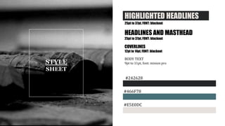
- 1. STYLE SHEET HIGHLIGHTED HEADLINES. 25pt to 37pt, FONT: blackout HEADLINES AND MASTHEAD 25pt to 37pt, FONT: blackout COVERLINES 12pt to 14pt, FONT: blackout BODY TEXT 9pt to 11pt, font: minion pro #466F78 #242628 #E5E0DC
- 2. STYLE SHEET COLOUR SCHEME AND FONTS The colours for the magazine is based on the colour scheme of different indie pop things. I researched Indie Pop music videos, fashion, posters etc, and the pattern was neutral earth tones when it came to colour schemes. I’ve decided to go with that look, i’ll use soft colours – not even the black will be the dark black but rather a soft brownish black. I’ve also decided to have one more pop out colour (the blue tone) to bring more attention to the magazine. This will be used on the masthead and special words I want the reader to pay extra attention to. For the fonts i’ve gone with a sans serif font for headlines and general front cover text as it’s softer to the eye. The font however is bold and uppercase letters only. This is as the magazine doesn’t just focus on music – but about making a statement so I wanted the font to be one that you’d see on posters in protests and the font Blackout does that perfectly. As for general body text (content in double page spread article) I decided to go with Minion Pro as it’s easy to read and works well with the Blackout font when you have a page with mainly general text and the Blackout font for titles.
- 3. COVER PAGE The front cover will consist of a teenage boy smiling. It’ll be similar to the photo to the left, but more of a close medium shot instead of just a medium shot. The purpose of this will be to create a bigger feeling of wonder: who is this and why is he so happy? It’ll make the model very eye catching to the possible readers passing by the magazine in stores. It’ll be taken in a studio as that’s what most magazines do, and it’s the best way to get a clean and clear background for my model making it easier to edit and add headlines in later without it being too messy. It’ll also make the magazine look a lot more professional. As for clothing, I did some research on Indie bands and fashion, and discovered a pattern. They often wear earth tones clothing, and often use flannel shirts or pattern tops with skinny jeans. My model will wear black jeans with a brown-grey flannel shirt. The overall look of my model will be very relaxed as to make the readers like him from first glance. POSE AND COSTUME
- 4. CONTENTS PAGE The contents page will consist of several images. The main image will be of a band consistent of three girls. One of them sitting while the others stand, this is done to create variety in the image, making it even more interesting to the readers. It’ll be in the studio as to show that we’re interviewing them, and met up with them ourselves to plan a shoot and interview. I’ll also include another band photo of a band with four members. I’ve done some research into Indie Pop photoshoots and noticed a pattern of using outside areas like in the woods, so I’ve decided to follow that rule. The image will have all models except two standing. One will sit down on the ground as to add more depth to the image and one will be sitting on the back of a man. The one on the back will gain the most attention as she’s taller and stands out more – so the viewers will understand she’s the main artist of the band. The image will be mostly green as to suit the colour scheme of the contents page. This image will also be a nice relaxed photo adding more harmony to the page as the other photo will be very obviously staged compared to this one. This will draw more viewers, as they often see a front cover then the contents page to decide if they want to buy it or not – and seeing variety in images will give them the feeling that there is variety in the magazine itself, making them more excited to buy it. The models in the main image will be dressed casual and neutral which will show the typical Indie Pop vibe, but the band outside in the woods – will be wearing mostly black and statement fashion pieces. This will once again help to show that the magazine has lots to offer for any taste in music. POSES AND COSTUME
- 5. DOUBLE PAGE SPREAD The two images I plan to use for the double page spread will be very special. I’ve written the article which inspired my photos for the double page spread. I’ll have my model looking lost in a lake. This will make the reader curious about why she’s in the lake, why she looks sad and/or confused. It’ll make them question everything, and really grab their attention. In one of the photos the model will look away from the camera as to create a sense of mystery, making the reader want to know even more. The photos will be grey-blue toned. She’ll be standing in a spotlight, hopefully I can manage to create a theatrical feeling to the images as to make it seem more realistic than in a studio, a bit more down to earth. Her clothing will be very minimalistic. Only her top will be visible and it’ll be a shoulderless top as to add more elegance to the model. I want people to look at the images and immediatly be intrigued about the article and the girl my article will be about. POSE AND COSTUME