Making communications land - Are they received and understood as intended? we...
Front cover analysis
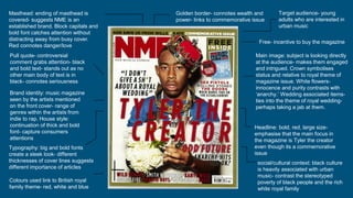
1. Masthead: ending of masthead is
covered- suggests NME is an
established brand. Block capitals and
bold font catches attention without
distracting away from busy cover.
Red connotes danger/love
Golden border- connotes wealth and
power- links to commemorative issue
Free- incentive to buy the magazine
Main image: subject is looking directly
at the audience- makes them engaged
and intrigued. Crown symbolises
status and relative to royal theme of
magazine issue. White flowers-
innocence and purity contrasts with
‘anarchy.’ Wedding associated items-
ties into the theme of royal wedding-
perhaps taking a jab at them.
Pull quote- controversial
comment grabs attention- black
and bold text- stands out as no
other main body of text is in
black- connotes seriousness
Target audience- young
adults who are interested in
urban music
Brand identity: music magazine
seen by the artists mentioned
on the front cover- range of
genres within the artists from
indie to rap. House style:
continuation of thick and bold
font- capture consumers
attentions
Headline: bold, red, large size-
emphasise that the main focus in
the magazine is Tyler the creator
even though its a commemorative
issue
Typography: big and bold fonts
create a sleek look- different
thicknesses of cover lines suggests
different importance of articles
social/cultural context: black culture
is heavily associated with urban
music- contrast the stereotyped
poverty of black people and the rich
white royal family
Colours used link to British royal
family theme- red, white and blue