
Recommended
More Related Content
What's hot
What's hot (19)
Similar to In what ways does your media product use, develop or challenge forms and conventions of real media products
Similar to In what ways does your media product use, develop or challenge forms and conventions of real media products (20)
More from sophiabenyahia
Recently uploaded
Recently uploaded (20)
In what ways does your media product use, develop or challenge forms and conventions of real media products
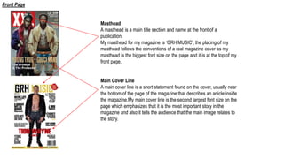
- 1. Masthead A masthead is a main title section and name at the front of a publication. My masthead for my magazine is ‘GRH MUSIC’, the placing of my masthead follows the conventions of a real magazine cover as my masthead is the biggest font size on the page and it is at the top of my front page. Main Cover Line A main cover line is a short statement found on the cover, usually near the bottom of the page of the magazine that describes an article inside the magazine.My main cover line is the second largest font size on the page which emphasizes that it is the most important story in the magazine and also it tells the audience that the main image relates to the story. Front Page
- 2. Flash I have placed the flash at the top right hand corner of my front cover because in the XXL magazine they have also placed it in the top right have corner because it is a convention of real magazines. The flash sells a feature in the article which could be a CD or awards. Date The date of the issue is just below the masthead which is small feature but is important as it is a connotation of magazines Barcode I have placed the barcode at the bottom right hand corner of my front cover which is a connotation of real magazines. Front Page
- 3. Cover Lines Cover lines are short statements found on the cover of the magazine that describe the articles inside. I have use many different fonts and sizes for my cover lines which makes the cover lines stand out and is a connotation of real magazines. Colour Scheme A colour scheme is a connotation of magazines and is used throughout the magazine. The colours in the magazine can effect a readers mood while reading the magazine. The colour scheme of my magazine is white, black and yellow. I used yellow because it is a colour of energy and happiness, I have also used red for the main cover line and puff to add colour to my page and make those features stand out. Synergy The website and social media platforms for my magazine are at the bottom of the page, this creates synergy which links on product to another, as my magazine is old media and websites and social media are new media they all interlink with each other. Front Page
- 4. Heading My contents page challenges the forms and conventions of a real contents page as magazine headings are usually put in the top left hand corner of a contents page. However, I have chose to put mine in the bottom right hand corner. Colour Scheme The colour scheme is very clear on my contents page as I have only used the colours white, black and yellow. I decided to have wob (white text on a black background), as it stands out. Contents List I have used many fonts and sizes for my contents lists as it is a connotation of magazines. However, my contents page challenges the forms and conventions as the contents list are usually aliened to one side whereas I have mine aliened around my image. Contents Page
- 5. Headline A headline is the main title of the article. My headline for my double page spread is a pull-quote from the article and reads “the grind never stops” Colour Scheme My colour scheme white, black and yellow continues throughout all my pages. Following my front cover I have continued to use a hint of red to which is recognisable from my front cover, therefore my audience will know this article is from the front cover. Main image The main image on my double page spread covers one side of my double page spread which is a convention of real magazines. Double Page Spread
- 6. Drop Cap A drop cap is a large initial letter at the start of the text that drops into the line or lines of text below. Running Head A running head is a title or heading that runs along the top of a printed publication, usually a magazine. The running head at the top of the pages Pull-Out Quote A pull-out quote is a selected quote from a story highlighted next to the main text. Often used in interviews. Double Page Spread
- 7. Columns It is a convention in a double page spread to have three columns for an article body. Therefore, I have used three columns to follow the forms and conventions of a magazine. Tombstone A tombstone is used to indicate the end of an article. I have used designed my tombstone as my website to indicated the end of the article. Also, because the website is the last thing they read they are more likely to go to the website. Page numbers Page numbers are a small feature of double page spread however, they are important as it is a connotation of double page spreads. Double Page Spread