
Recommended
More Related Content
What's hot
What's hot (20)
Viewers also liked
Similar to Media genre
Similar to Media genre (20)
Recently uploaded
Recently uploaded (20)
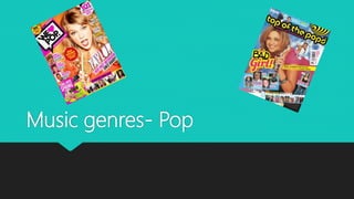
Media genre
- 2. Colours We are able to tell a lot by the colours of the magazine, as if tis quite a dark and dull it wont be pop. Usually pop magazines are very bright and lively colours that jump out at you on the page. As usually pop music is quite happy and lively so they use these type of colours and how bright/dark they are to show not only the type of magazine but also the mood of it. For example
- 3. Font From the font you are able to tell that it is a pop magazine, you can tell this as the fonts are very bold and stand out, you wont miss them. Also they aren't boring and your typical newspaper fonts they are all abstract and different. You can tell it’s a pop magazine as pop music is always very happy and lively just like this font so they have took the feeling from the type of music and made it into a text form so you can relate the same feeling as when listening. Here are 3 different pop magazine fonts.
- 4. Image The images magazines use are a key aspect of how successful a magazine can be. As based on what image they use can determine the whole mood that the magazine has and the genre. For example on a classical magazine the main image is quite dull and serious where as on a pop magazine they are always lively and smiling. Here we have an example of a classical magazine and the type of expressions they have. Here we prove the point, these are two different pop magazines and both are using a smiley, glamour's front cover
- 5. Costume & props Costume plays a min part in showing what type of genre it is represented as. Usually with pop magazines they wear clothes that are in with the trends, and up to date. They tend to be normal designer clothing nothing to abstract and over the top but something they will be noticed and something people reading the magazine can copy and aspire to be like them. They will also be wearing very glamour's clothing that makes them look good, also jewelry and general accessories Props don’t play much part in this magazines, maybe they will have the stereotypical microphone or something in their hands but usually not many props are used in these magazines. Here are some examples of what costumes they wear.
- 6. Lighting In pop magazines the lighting is always going to be bright and lively, much like the music itself they are trying to put that seem happy feeling that comes with pop music onto the paper and get the same emotions out of looking and reading the magazine. Also the reason they do this is because if the lighting was dark and dull it wouldn't’t generate the same atmosphere and feeling of a pop song and it wouldn't’t fit with the genre. Here we can compare the 2 front covers the dark one doesn't’t generate the same feeling as the pop one on the right, that magazine on the left is done with very dark lighting so it creates a different type of mood.
- 7. Summary In my own work I will include a few of the key aspects of the pop genre that need to be done to have a successful product. Firstly I would make sure I had very high key lighting and colours as this will help generate the same feeling and mood as a pop song would. Secondly I would make sure I use the correct font, based on my research I have found out that a high amount of pop front covers have a bold and standout font, this is important so that the reader can notice it and it doesn't’t blend in worth the rest of ,magazines of the shelf also so that it generates the same vibe as a pop song. Furthermore I will make sure my model is wearing trendy clothes so it looks appropriate for the magazine as if they were wearing indie clothes it wouldn't’t fit in with the whole feel and mood of the magazine.