Web & Social Media Analytics Previous Year Question Paper.pdf
Learning magazine design conventions improved my music magazine
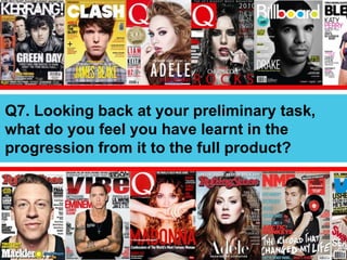
1. Q7. Looking back at your preliminary task,
what do you feel you have learnt in the
progression from it to the full product?
2. Music Magazine VS School Ma
Q7. Looking
back at
your
preliminary
task, what
do you feel
you have
learnt in
the
progression
from it to
the full
product?
With my school magazine, I did
not really know many of the
conventions that are associated
with the magazine. As you can
see, there isn't much of a layout
on my school magazine. The
colours also don’t compliment
each other well and looks very
random. The masthead is also
straight across the top and does
not follow conventions well. The
picture that stick out from the
text looks messy and doesn’t
meet the conventions of a normal
music magazine cover. The picture
also has a unusual background
and makes the magazine look
boring. The music magazine was
definitely a bigger change and
looks much better.
3. Music Magazine VS School Ma
Q7. Looking
back at
your
preliminary
task, what
do you feel
you have
learnt in
the
progression
from it to
the full
product?
With my contents, my school
magazine again didn’t really
follow any conventions. There are
no columns and there are very
limited information on the page.
Also, the pictures are very
randomly placed and does not
add to the look of the magazine
in a positive way. Although the
colours match the cover, it still
isn't a great colour scheme. I do
like the large image faded in the
background although I doubt this
would've looked good on my
magazine. I didn’t really follow
anything from the school
magazine on my own music
magazine as it didn’t follow
conventions and also, in truth, did
not look very good.
4. Magazine Cover
The Masthead here is large and very
visible at the top left of the page.
The font is also different to the rest
of the magazine and also relates to
the name (different fonts for each
letter showing mixed genres). This
is different from my preliminary
magazine as that magazine ha the
masthead across the top which
didn’t make the magazine look very
professional and neat.
The image used on this cover fills
the whole page. The difference
however is that I edited out the
background behind the two artists.
I also took pictures of both of them
separately meaning I had to edit
them into the magazine separately
and turn them and angle them in a
way that made it look like they
were in the same photo. Unlike the
school magazine, the subject was
edited from the background.
On my music magazine, the
headline was shown near the
bottom however it was a large
and attractive font which would
attract customers in to buy it. My
school magazine did not even
have a headline and only had sub-
headings. On this magazine, the
font and size of the lettering is
very large and follows the
conventions of a magazine well.
The sub-headings here are very
well laid out and have an obvious
colour scheme that they all
follow. Unlike my preliminary
magazine, this magazine has 3
rather then only two and does not
have pictures coming from them
which I think makes the magazine
look neater and follow the
conventions better.
The separators on this cover also
help the magazine flow and allow
the reader to be able to see and
separate the different parts of the
page. Also, there is more activity
going on on this page that would
draw readers in more then the
boring colours on my previous
preliminary magazine. Also there is a
clear colour scheme on the
magazine here rather then a
unattractive one on the preliminary.
Conclusion
On the whole I feel like my
magazine here was a success
because I followed the
conventions. Doing the preliminary
did help me see the rights and
wrongs of a magazine and was bale
to make me change those bad
parts on my own magazine.
5. Magazine Contents
On this magazine, there are
obvious changes from the
preliminary task. One of these is
that there are columns. These are
important parts to a magazine
contents and are conventional to
any magazine. On my previous,
the text was just lined down the
page in a single and messy column
and wasn’t very neat however
here, the columns separated
everything nicely.
The colours here were also more
dominant and made the magazine
bolder and made everything stand
out better then my preliminary
where the colours were boring
and didn’t reflect a positive vibe
from the magazine. Here, I tried
to make the colours reflect the
mood of the magazine and I think I
did this well.
The images on this page were also
clearer and related to the articles
and also fit in with the rest of the
age. On the preliminary magazine,
the images were not very well laid
out and looked random and made
the magazine look un neat. The
images were also included with
their own article and page number
which also made it match the rest
if the magazine.
On this magazine I decided not to
include a large image as the
background as I felt this took the
spotlight from the other photos
and articles n the page and drew
the readers attention away from
the important parts. I also believe
that this decision was good as the
background image would not have
matched the style of magazine
that I was going for.
The text was another important
part if the magazine. I felt like the
text on this page really matched
the style of magazine and also
made the different parts link up as
it was the same font that was
used throughout the magazine.
Also, the lack of colour just using
red white and black and blue as
the colours really helped me
create a simple yet effective style
to the magazine and throughout.
Conclusion
I believe this page was successful
as again I followed all the
conventions and made the
magazine look realistic. Also, the
images mixed with the text made
the magazine fit together and
made it seem realistic in most
ways.