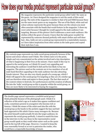
1. My magazine represents the particular social group called 'indie' the same as
the genre. As I have designed the magazine to suit the needs of this social
group. The style of the magazine is similar to that of Q and NME because these
are the same music genre as my magazine. The use of the black, white and red
colour scheme represents the genre because these are the colours you most
often associate with the bands that would feature in the magazine. I chose my
cover artist because I thought he would appeal to the male audience I am
targeting. Because of this picture I feel it addresses a more male audience. His
clothes reflect the genre of music; I knew that the indie genre wouldn't be
represented by someone dressed perfectly with smart clothes and well done
hair. Also, Indie are not a social group represented in a materialistic manner,
so I have taken inspiration from other artists in the indie genre and copied
their style how I can.
My contents page represents my indie social group primarily because of the
layout and colour scheme used I think. The written style is to the point,
simple and very concentrated on the artists involved and a tiny description
of what is happening in their lives at the minute. I have made it this way to
appeal to the social group, as I think if it wasn't very appealing and
interesting the audience would find it dull and be less likely to buy my
magazine. The picture used on the contents are is two members of an all
male band therefore appealing to the male audience but also attracting
female interest. They are also very clearly people of a young age, which I
think will appeal to the social group I'm targeting as they are of a similar age
and can therefore relate and aspire to these people. The fact that much of
the content relates to festivals, live performances and the creation of albums
fits into the 'indie' social group as this is popular within the social group, so
they are more likely to be interested in buying the magazine.
The double page spread represents a youthful social group I
think primarily because of the photograph used. I think it is
reflective of the artist's age as it makes him appear confident and
cocky; sometimes present in youngsters who become rich or
famous. I think the stance of the artist used also fits with the
social group as the hands in the pockets suggest the lazy and laid
back approach to life which I know many teenagers do. Because
the artist himself would actually fit into the target audience, he
represents the social group perfectly. I aimed to match his tone
in the interview to the way those in the representative social
group would speak so they could relate easier such as the quote
used in the top left of the page. However, I wanted to keep the
tone reasonably formal so as not to patronize the reader, who
would have a respectable knowledge of music.