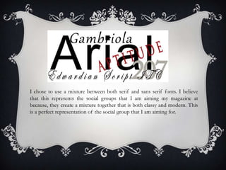
The magazine represents middle to upper class women aged 17-30 interested in pop music and high fashion. The female editor leads a successful career, representing the audience. Images of women use stereotypes of sex objects but to assert dominance, wearing short black dresses with red lipstick. Colors of black and red connote empowerment and dominance, representing the audience of career women who care about appearance and fashion. Font choices include serif and sans serif to appear both classic and modern, representing the audience who seek a balance of class and modern style.
Mumbai Call Girls Malad West WhatsApp 9892124323 Full Night Enjoy -
Q2
1. HOW DOES YOUR MEDIA
PRODUCT REPRESENT
PARTICULAR SOCIAL
GROUPS?
My magazine is for middle class/upper class strong women aged between 17 and 30 with an interest in
both pop music and higher end fashion. They would be the Femme Fatales of business and careers.
2. The editor for my magazine is a female
which is leading a successful career as
she is the editor of my magazine. She is
a well kept lady so again represents the
kind of women that will read my media
magazine. She represents a large
proportion of the audience. This means
that the magazine itself appears to be
run by people that would be the
audience. So by having a woman as the
editor represent the desire for women
to have a strong job and look after
themselves.
3. My images of females all represent a woman that is using the stereotype of
being a sex object but using this idea to assert her dominance. The outfits
consist of short black dresses one strapless and one coated in lace; both of
these have sexual connotations. The use of the red lipstick adds more sex
appeal and breaks the dress code of black dresses and black heels. This
makes the colours consist of black and red which are seen as empowering
colours and connote dominance. The styling of the woman represents my
audience because, they are women that have careers and are dominant but
care about their appearance and fashion and will use this to assert themselves.
4. As visible in the collage of my work on the left
• The colour scheme for my magazine was
red black and white. This connotes power
and independence but are also colours
associated with sex appeal. They make the
magazine appear stylish and modern, which
represents my audience because they are
independent, modern, stylish and well kept.
• I chose to use a mixture of serif and sans
serif fonts. This gives the idea of classic
beauty and classiness yet keeps the magazine
looking modern and up to date. It creates
the right mix of classiness and modern style.
This represents my audience because they
will be looking to find the mix between class
and modern style particularly towards the
older end of the audience.
5. I chose to use a mixture between both serif and sans serif fonts. I believe
that this represents the social groups that I am aiming my magazine at
because, they create a mixture together that is both classy and modern. This
is a perfect representation of the social group that I am aiming for.