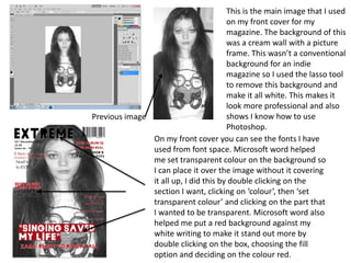
1. This is the main image that I used
on my front cover for my
magazine. The background of this
was a cream wall with a picture
frame. This wasn’t a conventional
background for an indie
magazine so I used the lasso tool
to remove this background and
make it all white. This makes it
look more professional and also
shows I know how to use
Previous image
Photoshop.
On my front cover you can see the fonts I have
used from font space. Microsoft word helped
me set transparent colour on the background so
I can place it over the image without it covering
it all up, I did this by double clicking on the
section I want, clicking on ‘colour’, then ‘set
transparent colour’ and clicking on the part that
I wanted to be transparent. Microsoft word also
helped me put a red background against my
white writing to make it stand out more by
double clicking on the box, choosing the fill
option and deciding on the colour red.
2. From my double page spread you can see
that word helped me create columns for
my article, I did this by using three
separate textboxes and then making them
the same length and width, this is
something that allowed me to make my
double page spread look professional. I
also learnt how to break up the columns
to put my pull quote in between. All I had
to do was create a space in the textbox by
pressing enter numerous times and then
adding the pull quote text in the middle of
the space. This is something that is
conventional for an indie magazine.
On my contents page I added in lines to separate the page
up. I did this by clicking on ‘insert’, then ‘picture’ and lastly
‘auto shapes’ I then selected the shape I wanted and added
it in. I already knew how to do this but it did show me lots of
different shapes I could of used that I didn’t know about. I
also coloured in the bottom box red by double clicking on
the box, choosing the fill option and deciding on the colour
red.