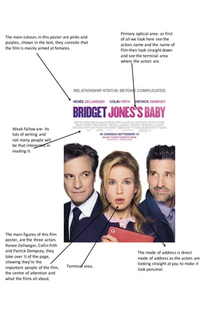
The film poster uses pink and purple colors and prominently features the three main actors, indicating it is aimed at female audiences and focuses on the actors. It places the actors' names and the film title in the center to draw attention. However, there is a lot of small text that may not interest many viewers. The actors look directly at the viewer to create a personal connection.
Measures of Central Tendency: Mean, Median and Mode
Document2 (2)
1. The main colours in this poster are pinks and
purples, shown in the text, they connote that
the film is mainly aimed at females.
The main figures of this film
poster, are the three actors
Renee Zellweger, Collin firth
and Patrick Dempsey, they
take over ½ of the page,
showing they’re the
important people of the film,
the centre of attention and
what the films all about.
Terminal area.
Primary optical area- as first
of all we look here see the
actors name and the name of
film then look straight down
and see the terminal area
where the actors are.
Weak fallow are- its
lots of writing and
not many people will
be that interested in
reading it.
The mode of address is direct
mode of address as the actors are
looking straight at you to make it
look personal.
2. The main colours in this film poster are
black and red, connoting death/ anger/
blood/ dark/ cold, just portraying a not
very happy feel to the film
The whole film poster
is basically lots of
tress and branches
filling the whole page
which could mean
somebody’s bones
and the red behind it
could be the blood as
we know it’s a horror
film from hearing
about it.
Primary optical area is the
background of the filmposter
wroth the tree branches then the
terminal area is the name of the
film and the date its coming out
as there’s not much on the film
poster to say much about the
film, they’re making you wait to
go and watch it.
The mode of address is indirect
in the film poster as it doesn’t
tell you much on it.