2. Fonts:
For my magazine I chose a range of fonts to interest the reader but
also followed my market research that my audience preferred a
spacious layout and the use of too many fonts would have distracted
the reader from the content. The boldest font I used was for my
masthead which was Sugar Punch which stood out effectively which is
what I wanted to achieve a vibrant front cover.
For my other font on my cover I used a font Babas Neue and added
boldness effect in order to make them look different and have a variety
of font shapes. I also added an outline around some of the words to
make them stand out better.
I also made my fonts different sizes in order for them to stand out and
look appealing to the audience best they could. I didn’t use many
different styles of font but I thought that added continuity to my
magazine effectively. The use on my contents of having they key line of
information in a bigger font was to attract the audience then having the
smaller font beneath it was extra information for the audience to read
before going to the page. I thought this was a great way to attract my
audience into certain ages.
From my audience research I found that my audience preferred a big
and bold lay out. The use of bigger chunky text to make it stand out. As
you can see from my images my chosen fonts were big and bold.
3. Photos:
For my photos I wanted continuity within my feature character
so on the front page I deliberately didn’t have her looking at the
camera to add mystery in a medium shot. On the contents page
I didn’t have her looking straight at the camera either and then
on the double page spread I didn’t either to continue to have to
mystery I aimed for throughout the magazine to leave the
audience wanting to know more and more about her leading to
the interview.
In also had images of other people on my contents so it wasn’t
all the same thing over and over again. I also had an image of
a panorama of a concert image which is what my target
audience said they wanted in my survey.
From my audience research I found that people preferred photo
studio images, there for I used a professional camera and used
lighting to alter my pictures and make them look the best they
could.
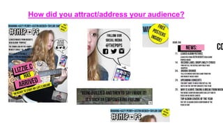
4. Addressing my audience using language:
One way I addressed my audience was through language that drew
them in. I used direct audience address in my language on the front
cover to pull my audience in straight away to my magazine. Words
such at ‘You’ and ‘your’ directs the audience straight away that the
magazine is all about them and wat they want, this is a key way to
grab the audiences attention.
I also added key words such as plugs that stand out and grab my
audiences attention, such as- ‘exclusive’ these words catch the
audiences attention and drags them in instantly to the topic it is
based around.
The use of quotes on my front page draws the audience in to that
area, it shows the audience that it is the feature to the magazine and
the main aspect to the issue. I thought the quote was a great way to
give a glimpse to the article before the reader even turned to the
page
My colour scheme idea was to use bright colours only light florescent pinks
and yellows, blues and greens to make the magazine stand out at much as
I could. Seen as my target audience was younger teens I thought the use
of bright colours would have more of effect on that age range then adults.