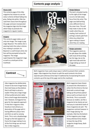
1. House style
The contents page of this Vibe
magazine has chosen to use the
colour scheme of black fading into
grey, fading into white. Vibe has
used their classic font throughout
this page and even incorporated
the magazine logo into the image
which helps to promote the
magazine to regular readers.
Design Balance
The text is situated mainly
to the right of the image
so as to not take away
focus from the artist. The
page uses bold writing
and a different font on
the cover lines. This will
help make it clear to the
reader what they are
reading. Each section of
writing is clearly split from
others by a black line
again making it clearer
what they are reading.
Imagery
This contents page makes use of
only one image. The image is pop
singer Beyoncé. The clothes she is
wearing match the colour scheme
thus making it constant. As
Beyoncé is a well-known artist, her
fans will be prompted to buy the
magazine. The image
superimposes the magazine’s logo
as well as a small part of the
masthead.
Design symmetry
The magazine seems to
be split down the middle
with most of the writing,
bar the logo, be on the
right hand side with the
image taking up most of
the page.
Both magazines have used unique ways in which to present their contents
pages. Vibe magazine has chosen to split the word contents into three
separate parts whereas Q has kept it traditional by incorporating the word
contents up at the top of the page next to the masthead.
Both magazines have chosen
to present the information in
either the first third or the last
third with a central image
taking up the primary optical
area as well as at least one of
the thirds. This is successful
because as readers, we like a
magazine to be clearly set out
and easy to read which both of
these magazines do well. The
magazines contrast however in
their image placing. For
example, Vibe has the bottom
of the magazine very image
heavy whereas Q has chosen
to have the top of the
magazine image heavy. Both
work well.
Vibe magazine has deliberately
chosen to be more image heavy
than text heavy as they believe
that it will help to attract a
reader if they see a large image
of their preferred artist rather
that a small image dominated by
text. However, Q magazine has
gone for the opposite approach
in that their magazine relies
heavily on text almost as a
decoration of the page with it
having different colours here
and there as well as varying
fonts. This is not a disadvantage
though as the text appears to
frame the image making It one
of the first things we see much
like in Vibe magazine.
Contents page analysis
Contrast