1. Liam Keenan
In the strong fallow area the date and
price is normally placed in formal tabloid
newspapers. The audience are more
In the terminal optical area is a picture
likely to look here than the weak fallow
of Ronaldo to attract the male and
area so the editor places the price here
younger audience to the newspaper.
to give more chance of purchases. The
The columns are set out in a very
blue 1st edition attracts a male audience.
organised style.
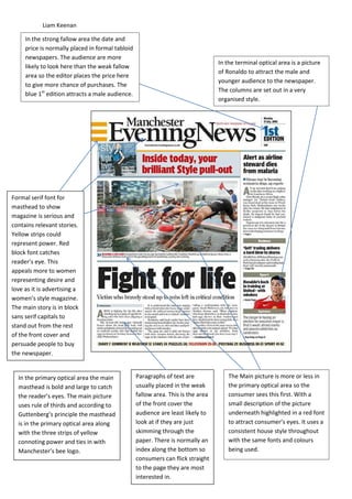
Formal serif font for
masthead to show
magazine is serious and
contains relevant stories.
Yellow strips could
represent power. Red
block font catches
reader’s eye. This
appeals more to women
representing desire and
love as it is advertising a
women’s style magazine.
The main story is in block
sans serif capitals to
stand out from the rest
of the front cover and
persuade people to buy
the newspaper.
In the primary optical area the main Paragraphs of text are The Main picture is more or less in
masthead is bold and large to catch usually placed in the weak the primary optical area so the
the reader’s eyes. The main picture fallow area. This is the area consumer sees this first. With a
uses rule of thirds and according to of the front cover the small description of the picture
Guttenberg’s principle the masthead audience are least likely to underneath highlighted in a red font
is in the primary optical area along look at if they are just to attract consumer’s eyes. It uses a
with the three strips of yellow skimming through the consistent house style throughout
connoting power and ties in with paper. There is normally an with the same fonts and colours
Manchester’s bee logo. index along the bottom so being used.
consumers can flick straight
to the page they are most
interested in.
2. Liam Keenan
The Blue house style of the paper appeals to The red circle in the top right hand
their male primary target audience and gives corner attracts the reader with the bold
it a formal, office like feel. The serif typeface typeface saying ‘free’ in bold to stand
also gives the paper a formal, high class vibe. out. There is an image of Victoria
The white font on the blue background Beckham next to this in a yellow outfit.
stands out predominantly. The price and This represents power and would make
barcode are in the primary optical area the consumer want to be ‘This year’s
according to Guttenberg’s principle. Also the best dressed’ like victoria Beckham so
most exciting story is located in this area so
they would flip to page 13.
the consumer sees this before everything
else.
The advert for Facebook
in the terminal optical
area would attract a
The paragraphs are set out in a very younger audience that
organised way. The image of Colin aren’t actually reading
Firth is more or less in the middle of the paper just flicking
the page and features a mid-shot of through. They would be
him smiling in a bright white shirt. more interested in this
The shirt could connote purity, story.
power or fame.
3. Liam Keenan
Red connotes danger because stoke fans
might be worried if Pulis was sent off or The paper follows a red house style which
not and the colour ties in with the kit that attracts footballers and stokes fans. The
stoke players wear. The main masthead is colour of the box matches the image of the
in a formal serif font to attract an older referee next to it. The text is in a large bold
audience to the paper. The Font of the sans serif font to attract a younger audience
masthead also gives a ‘classic’ look to the and football fans. The price is located in the
paper, giving the impression that the top left hand corner so the consumer sees
paper is trustworthy and honest. this first according to Guttenberg’s principle.
The main story’s masthead is in a The advert for Auto cab follows
bold black typeface standing out the red house style of the
against the light background. It says cover and stands out to
‘another fine mess’ which states consumers that are skimming
the story will contain chaos which through the paper as it appears
people are interested nowadays in the terminal optical area.
especially consumers in a small The small green circle stands
town where hardly anything out against the red background
happens. and is dominantly contrasting.
4. Liam Keenan
Facial expressions show the dire
The Masthead is in a formal
state of the family and how
serif font with a red
unhappy they are with the
background to attract the
circumstances they are in. the
consumer’s eyes and connote
pink Adidas logo and love heart
danger and love. The reader
jumper represent the love they
will be drawn to stories like
had for their son. And the pink
these as they are interesting.
could appeal to a female audience
This small blue box
appeals to a
working class
audience, primarily
male as it appears
in the primary
optical area so
would be seen first
and foremost.
There is less writing
for working class
people as
compared to the
large stories on the
more formal front
cover.
The advert on the right hand side will
appeal to mothers and parents with the Main storyline is in a bold sans
young girl holding up the sign. Yellow serif typeface to catch the
symbolises power which will appeal to reader’s attention and the
mothers who are matriarchal in a family main picture fills most of the
and the red will appeal to women page appearing in the primary
because it ties in with love. The bottom optical area more or less. The
advert is yellow over black to stand out story that says ‘clampdown on
and appeal to rebellious teenagers that gangs after shooting spree’ is
also love power, tying in with the colour in a red font indicating that
yellow. It appears in the weak fallow the story includes death and
and terminal areas for youths who are danger.
just flicking through.