
Recommended
More Related Content
What's hot
Viewers also liked
Similar to FONTS
Similar to FONTS (20)
More from azizamrobinsonmedia
More from azizamrobinsonmedia (20)
Recently uploaded
Recently uploaded (20)
FONTS
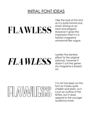
- 1. I like the look of this font as it is quite formal and smart aiming at an neat and elegant. However it gives the impression that it is a fashion magazine somewhat like vogue. I prefer the slanted effect to the original (above), however it doesn’t suit the genre my magazine is based on. I’m not too keen on this font as it looks quite childish and plain, as it is just an outline of the letters, but it does appeal to the younger audience more. INITIAL FONT IDEAS
- 2. I particularly like this font as it is clear, nicely spaced out and not too classy and not too formal, and appeals to my audience perfectly. I really like the rounded effect on the letters because it is a quite popular effect and would look good on my magazine conforming to my genre This is my favourite font as it is clear and slanted lines inside the letters stand out and make the letters look bold. I have chosen to use this font as it will compliment my magazine well and suits the type of magazine it is. FINAL OPTIONS