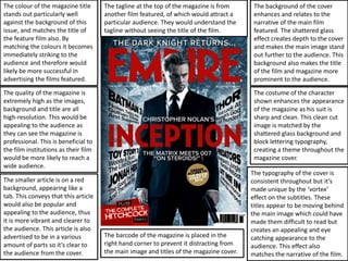
The document discusses the design elements of a magazine cover that effectively advertise featured films. It notes that the title color stands out against the background and matches the featured film's title, immediately drawing attention. The high resolution images, background, and title create a professional impression. Smaller articles use distinctive colors and formats to seem appealing. The background, shattered glass effect, and main image work together to make the film title and magazine title prominent. The main character's sharp suit matches this theme. Typography is consistent while subtitle textures create an eye-catching yet coherent design that reflects the featured film's narrative.