

Recommended
More Related Content
What's hot
What's hot (20)
Similar to Horror Poster analysis
Similar to Horror Poster analysis (20)
More from Emma Collins
More from Emma Collins (20)
Recently uploaded
Recently uploaded (20)
Horror Poster analysis
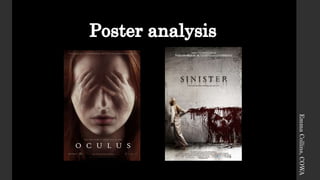
- 2. Conventions- The use of a bold main image is a convention as it is usually used to shock and confuse the audience as they will wonder what the film is about. The colours are unusually bright for a horror poster, however the weird nature of the photo means there is no need for menacing shadows. The dramatic nature of the image is conventional for the supernatural horror. This image is unexpected and suggests something ominous will happen to the character. This poster is typical to the genre as it is used to shock and draw in the audience. Typography- The fonts used in this poster are serif. This makes the fonts simple but stand out to the audience. The largest text on the poster is the film’s title, this is so it stands out to the audience, conventional for all film posters. The smaller fonts are used for the tag line and other information such as the ‘From the producers of…’ and ‘In theatres soon’. Colour- The main colours used in the poster are natural, for example the natural skin colour. The use of the natural colours make the unnatural image of the hands on the face stand out. The use of the light colours connotes good and pure. This is a contradiction to the nature of the film. Layout- The layout of the poster is very conventional for the genre. The main image dominates the poster, and the text is restricted to the top and bottom of the poster. This is set out this way to follow the natural root of eye, we usually look from top left to right, the way the poster is laid out we naturally will look at the image first as it is in the centre. Image- The shot type is a close up shot. This places the audience close to the creepy image. It also allows them to see the unnerving image of the hands on the face, this is conventional for the genre as horror usually includes some sort of body horror, such as being possessed or something taking over. This is suggested in the image. Form convention- The poster follows the layout for a regular horror poster. As it is only a teaser they haven’t given away hardly any information, this makes it a successful teaser as it leaves the audience wanting more. They have used interesting typography, which draws in the audience, this works with the conventional root of eye layout. Emma Collins, COWA
- 3. Conventions- The main image used is a convention, this is because it is bold and shocking to the audience. The colours used are very dull and also very conational for the genre, they work well with the fonts used on the poster. This poster is a example of an effective, and conventional horror poster. Colour- The colour used in this poster is very conventional. The red is used to represent blood, it shocks the audience and suggests to them that something horrible will happen in the film. The grey washed out background can suggest the dark nature of the film, it also makes the girl on the left almost blend into the background. The colours work well together, the dull background helps draw the audiences attention to the red blood. Image- The image used is put on the poster to shock and make the audience wonder what the film is about as it doesn’t give too much away. The blood is the main focal point for the audience as it a image made out of blood. This shocks and suggests to the audience that there will be blood and death in he film. The girl on the poster is turned away from the audience suggesting that she is to be taken over by the antagonist of the film, her white costume connotes purity, which could be a contradiction to what will happen to her. Typography- The bold Serif font stands out to the audience. The use of the blur and smudges at edges of the letters helps create the effect that the letters are burned into a wall. This fits into the horror theme. The same font is used throughout the poster to create continuity. The choice of the dark colours connotation of death. Layout- The layout for the poster is very conventional. The image is the centre of focus. The text is located at the top and bottom, however the title is in the centre. Meaning the audience would view the image and the title first. Form conventions- The poster follows the conventional root of eye layout. It also uses colours which show contrast, helping the poster stand out. It also uses bold and interesting typography, and tag lines leaving the audience wanting more , making them wanting to see the film. Emma Collins, COWA