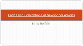
2. Codes and Conventions
The title or slogan of the documentary is the biggest font on the page.
Channel logo is often fairly big on the advert, as you want people to see what channel it
will be shown on.
When the programme is on (date and time) is the smallest font.
A bold font is used to ensure that it is eye catching.
Anchor- where aspects of the advert have meaning to the image.
They also have a colour scheme, which often links to the topic of the documentary.
The main image must be striking to make it stand out and often uses the rule of thirds.
A slogan or tag line is essential.
The style, size and colour scheme still don’t distract you from the main image.
3. Dispatches The advert also follows channel 4’s
house style, therefore people will
recognise just from a glance that it is
channel 4. The tagline‘Disarming Britain’ clearly shows the
audience that the programme is about youths who
have guns.This anchors to the main image, which
is a striking picture of a child pretending to hold a
gun to another child’s head.This is a rather
controversial image, as it is showing children and
associating them with violence.Therefore it will
grab peoples attention. One child is obviously a
victim as he is wearing dull colours and has his
head tilted to one side, whereas the other is the
aggressor, we can tell this from his facial
expression and that he is wearing red which is a
colour associated with danger and violence.This
main image also uses the rule of thirds, which is
conventional of these adverts.
The documentary name, time and
website are all smaller and out of the
way so that it doesn’t distract from the
main image.This is so that peoples
attention will be taken by the main
image, and then once there looking at it
read on to see the time it’s on.
The logo is big so that you know what
channel the documentary is on.
4. 9/11: The Falling Man
The slogan is the biggest font on the page,
this follows the conventions of these
adverts. It anchors to the main image as it is
relevant, as it’s the image which they are
talking about.
The documentary name, time and website are all smaller and out of the
way so that it doesn’t distract from the main image.This is so that
peoples attention will be taken by the main image, and then once there
looking at it, they will read on to see the time it’s on.
The logo is big so you can’t miss it, and
you know what channel the
documentary is on.
The advert also follows channel 4’s house
style, therefore people will recognise just
from a glance that it is channel 4.
A striking image has been used, to get peoples attention and make them look at the
poster. It is a questionable main image to use, as it is one of a man jumping off a building.
However, it will make people look at the poster which is what they want.
There is a clear colour scheme on the
poster, this a convention of these
advertisements.The red colour has been
used, possibly to represent the blood
that was shed on a rather tragic day.
5. Iraq: The Woman's Story
The other information on the advert, like the slogan, documentary name, day and
time it is on is all smaller.As the idea is that you will look at the other things first
then go on to the additional information.
There is a clear colour scheme of red, black
and white.These colours have been
appropriately used for this advert, as the
black and white sets the sombre tone of the
documentary as it is on a dull topic.The red
has been used to represent the danger and
possible blood shed of women in Iraq
during their struggles.
A powerful main image has been used for the
advert, it is of a distressed woman stood in front
of some barbed wire.This is a striking image due
to the fact that, Iraq was supposed to have been
liberated and women given equal rights, however,
this image will suggest to people that this is not
the case as women are still being mistreated.The
tagline links (anchors) to this image as it is
focusing on women's liberation which links to the
main image.
On this advert the channel logo which the
documentary is being shown on is rather
large so that people will see it and know
what channel it is on.
The tagline has been written in bold writing so
that it is eye catching and will stand out, it is the
biggest font on the page as you want people to
read the slogan and been drawn in by it and then
go on to read the other information about the
documentary. Even though it is bold and stands
out, it still doesn’t detract from the main image
which is a good thing.
The advert also follows channel 4’s house
style, therefore people will recognise just
from a glance that it is channel 4.
6. Britain's Forgotten Children
On this advert the channel logo
which the documentary is being
shown on is rather large so that
people will see it and know what
channel it is on.
An eye catching main image has been used
for the advert. It is a striking image due to
the fact that it is of a child, who is clearly in
need of help and people look as if they are
just walking by paying no attention.This
anchors to the documentary, as it’s about
forgotten children, which is demonstrated
in the image.
There is a dull colour scheme on
the advert, this has been done to
link to the mood of the topic.As it
is quite bleak, therefore the colours
are appropriate using black white
and grey. It also has a darker filter
over the image.
All the information about the documentary
is in the bottom corner, although it is out of
the way it is still bold and easy to read.