
Recommended
More Related Content
What's hot
What's hot (20)
Viewers also liked
Viewers also liked (15)
Similar to Mumford & Sons Debut Album Digipak Focus on Music Over Image
Similar to Mumford & Sons Debut Album Digipak Focus on Music Over Image (20)
More from hsmedia16
Recently uploaded
Recently uploaded (20)
Mumford & Sons Debut Album Digipak Focus on Music Over Image
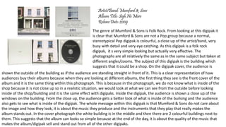
- 1. Artist/Band: Mumford & Sons Album Title: Sigh No More Release Date: 2009 The genre of Mumford & Sons is Folk Rock. From looking at this digipak it is clear that Mumford & Sons are not a Pop group because a normal, stereotypical Pop digipak is colourful, a close up of the artist/band, very busy with detail and very eye catching. As this digipak is a folk rock digipak, it s very simple looking but actually very effective. The photographs are all relatively the same as in the same subject but taken at different angles/zooms. The subject of this digipak is the building which suggests that it could be a shop. On the digipak cover, the audience is shown the outside of the building as if the audience are standing straight in front of it. This is a clear representation of how audiences buy their albums because when they are looking at different albums, the first thing they see is the front cover of the album and it is the same thing within this photograph. This is because in the photograph, we do not know what is inside of the shop because it is not close up so in a realistic situation, we would look at what we can see from the outside before looking inside of the shop/building and it is the same effect with digipaks. Inside the digipak, the audience is shown a close up of the windows on the building. From the close up, the audience gets a better look of what is inside of the builsing and the audience also gets to see what is inside of the digipak. The whole message within this digipak is that Mumford & Sons do not care about the image and how they look, it is about the music they produce and the instruments that they play that really makes the album stands out. In the cover photograph the white building is in the middle and then there are 2 colourful buildings next to them. This suggests that the album can looks so simple because at the end of the day, it is about the quality of the music that makes the album/digipak sell and stand out from all of the other digipaks.
- 2. The middle photograph of the windows with each member on one window. Some of them have their instruments with them which shows that they care about the music and the music only. The title of the Band and the album title is a lot bigger than what Rihannas album is because Mumford & Sons is not as big as Rihanna this suggests that Mumford 7 Sons are trying to get more recognition as they are not as big but from the simplicity of the digipak colours and design, it is clear that fame is not their life goals but just being able to produce music is their life goal. The record company that Mumford & Sons are on is Island Records. There logo of the record company are on the back of the digipak. By having the record label displayed on the back may influence people to look at other artists/bands that are with the same record label such as Catfish & The Bottlemen, Bombay Bicycle Club and Jessie Ware. From looking at the different artists and bands that are with Island Records shows that they have a lot of Indie/Folk (Alternative) artists and bands. As Island Record has a lot of Indie/Folk/Alternative artists means that the main audience they attract is people that listen to Alternative genres.
- 3. Artist/Band: Rihanna Album Name: Loud Release Date: 2010 Rihanna’s Digipak for Loud is very vibrant and appealing with it’s colour. From using colours such as Red and Pink it signifies that the genre of this album is Pop (Pop is also listed as the genre of this album on iTunes) because the album is bursting with colour (mainly reds) that draws an audience that are particularly interested in Pop Music. The red that dominates the digipak relates to Rihannas hair as her hair is vibrant red and she is famously known for her vibrant hair. The red can also signify that in this album, there is going to be songs relating to love because of the red Roses that are shown within the digipak as they stereotypically represent love. The red could also symbolise passion to represent how passionate Rihanna feels about her music and the songs in this album are very passionate to herself and to the audience that listens to it. The red also goes with Rihannas lipstick that is also a deep vibrant red that could signify that the album is quite a powerful album because when I see someone wearing red lipstick, I find they look more powerful and in control which suggests that Rihanna had a lot of say and control with her album. There is a running theme within all the photograph on this digipak which is that Rihanna has her eyes shut. This suggests that the photographs are not about how she looks in them, it is about the music. Rihanna is not making eye contact with the camera which suggests that she is very embraced with the music that also suggests that she so deeply passionate about her music that it puts her in a dream. The roses also link with this because the roses symbolise love and passion and that is how she feels about her music. The close up photograph of Rihanna that Rihanna is a icon as people instantly know who she is just by looking at her face because she is so well known in the music industry and even if people do not listen to her music they know who she is. This is why the font/text does not stand out.
- 4. The artists name and album title is not blog and stands out from the photograph because Rihanna is a very popular recording artist that people do not need to know what the album is called or who it is by because people instantly know. The record label Rihanna is with is Def Jam which has mainly Hip Hop/R&B artists such as Iggy Azalea and Kanye West. This means that audiences that listen to artists such as Kanye West and Iggy Azalea would listen to Rihanna because the record label would attract that audience that listen to Hip Hop/R&B (Hybrid Genre). However, the record label could’ve made it clear that Def Jam was the record label that Rihanna is with because that could get people wanting to see what other artists/bands are with Def Jam as they like Rihannas music.