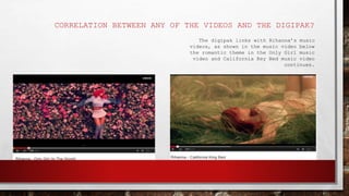
Download to read offline


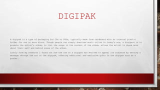

The document discusses digipaks, which are cardboard packaging for CDs and DVDs that promote artists and their albums. It then analyzes the digipaks of three albums - Rihanna's "Loud", Drake's "Take Care", and Beyoncé's "I Am... Sasha Fierce". The analyses examine how the designs portray the artists and reinforce stereotypes through images and colors. Common themes across the digipaks include romantic themes, emphasis on the artists, and sexually suggestive photos of the artists.


