1. DigipakAnalysis(similarproductresearch)
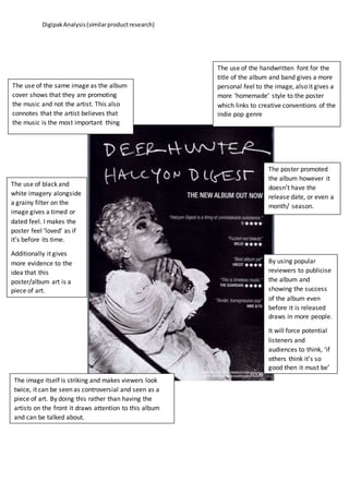
The use of the same image as the album
cover shows that they are promoting
the music and not the artist. This also
connotes that the artist believes that
the music is the most important thing
The use of the handwritten font for the
title of the album and band gives a more
personal feel to the image, also it gives a
more ‘homemade’ style to the poster
which links to creative conventions of the
indie pop genre
The use of black and
white imagery alongside
a grainy filter on the
image gives a timed or
dated feel. I makes the
poster feel ‘loved’ as if
it’s before its time.
Additionally it gives
more evidence to the
idea that this
poster/album art is a
piece of art.
The poster promoted
the album however it
doesn’t have the
release date, or even a
month/ season.
By using popular
reviewers to publicise
the album and
showing the success
of the album even
before it is released
draws in more people.
It will force potential
listeners and
audiences to think, ‘if
others think it’s so
good then it must be’
The image itself is striking and makes viewers look
twice, it can be seen as controversial and seen as a
piece of art. By doing this rather than having the
artists on the front it draws attention to this album
and can be talked about.