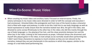
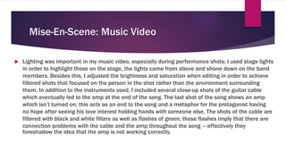
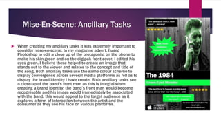
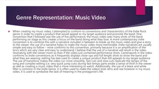
1. Evaluation Question 2: How
effective is the combination of
your main product and ancillary
task?
BY JOE LEVER
2. Mise-En-Scene: Music Video
When creating my music video and ancillary tasks I focused on mise-en-scene. Firstly, the
actors/actresses in my music video were directed in order to fulfil the concept and execution I
had envisioned. I directed Aiden (the protagonist and front man of the band) to play a character
that is filled with anger and jealousy; in order to do this I told him to use body language as well as
facial expressions to really ensure that the narrative looked real. Bria, the girl in the video, was
directed to come across flirtatiously to the other boy in the video; she did this mainly through the
use of body language i.e. the playing of her hair, and the close proximity between her and the
other boy in the video. Linking to the instruments as props, I directed James (the drummer) and
myself who played guitar in the video, to look simply as we normally would when performing live.
I didn’t want these characters to express to much emotion as they are not relevant to the
narrative; instead they are just charismatic in the sections in which they appear, similar to the
energy of a real Indie band performing live.
3. Mise-En-Scene: Music Video
Lighting was important in my music video, especially during performance shots; I used stage lights
in order to highlight those on the stage, the lights came from above and shone down on the band
members. Besides this, I adjusted the brightness and saturation when editing in order to achieve
filtered shots that focused on the person in the shot rather than the environment surrounding
them. In addition to the instruments used, I included several close-up shots of the guitar cable
which eventually led to the amp at the end of the song. The last shot of the song shows an amp
which isn’t turned on; this acts as an end to the song and a metaphor for the protagonist having
no hope after seeing his love interest holding hands with someone else. The shots of the cable are
filtered with black and white filters as well as flashes of green; these flashes imply that there are
connection problems with the cable and the amp throughout the song – effectively they
foreshadow the idea that the amp is not working correctly.
4. Mise-En-Scene: Ancillary Tasks
When creating my ancillary tasks it was extremely important to
consider mise-en-scene. In my magazine advert, I used
Photoshop to edit a close up of the protagonist on the phone to
make his skin green and on the digipak front cover, I edited his
eyes green. I believe these helped to create an image that
stands out to the viewer and relates to the concept and title of
the song. Both ancillary tasks use the same colour scheme to
display convergence across several media platforms as fell as to
display the brand identity I have create. Both ancillary tasks see
a close-up of the band’s front man as this is integral when
creating a brand identity; the band’s front man would become
recognisable and his image would immediately be associated
with the band, this would appeal to the target audience as it
explores a form of interaction between the artist and the
consumer as they see his face on various platforms.
5. Genre Representation: Music Video
When creating my music video, I attempted to conform to conventions and characteristics of the Indie Rock
genre in order to create a product that would appeal to my target audience and promote the band. One
convention that I followed was the use of live performance; the music video sees many shots of the band
performing on stage as this creates a focus on the band doing what they love. A more contemporary indie
convention is to combine this with a narrative included in between to break up the music video and give a story
to the viewer; the use of a narrative helps to make the music video more memorable. Indie narratives are usually
simple and easy to follow – mine conforms to this convention, primarily because it is an amplification of the
lyrics which are very clear and easy to understand; I believe that the use of a narrative will result in the video
resonating with the viewer more so than if the video just contained performance shots. Camerawork in the video
conforms to Indie conventions as it frequently displays close-ups and full length shots to show the band and
what they are wearing; editing has bee used to create a unique product that still appeals to my target audience.
The use of transitions makes the video run more smoothly, fast cuts and slow cuts replicate the tempo of the
song and complex editing (i.e. very quick jump cuts) during fast tempo parts evoke a sense of thrill in the viewer
as well as creating a music video that is more interesting to watch. Additionally, the use of a black and white
filter is common in the Indie Genre, it is often used to make the videos look retro and raw however in my music
video, it is used to symbolise the lack of meaning in the protagonist’s life.
6. Genre Representation: Ancillary Tasks
In my ancillary tasks it was difficult to represent the Indie genre as the conventions of the genre
are not particularly unique. I have included close-ups of the band’s front man on both the
magazine advert and the front cover of the digipak, as well as a mid shot of him on the back
cover. This has helped me create a brand identity and conform to the Indie genre. On the
magazine advert, I included reviews from the magazines ‘Kerrang!’ and ‘NME’, two magazines that
are notable and associated with Rock/Indie Rock Music, moreover, I referenced Johnny Marr and
Morrissey (of The Smiths), one of the most famous Indie bands of all time by comparing The 1984
with them in terms of their impact on the genre. These reviews will appeal to my target audience
who will be familiar with these references to the band and the magazines. I also used a black and
white filter on both ancillary tasks which conforms to the Indie genre as many music videos within
this genre use a black and white filter.
7. Influences: Music Video
My music video was influenced by other bands such as The Kooks, The View, Interpol, Franz Ferdinand,
Catfish and the Bottlemen and The Wombats. When researching music videos of the Indie genre, the
songs ‘Sway’ by The Kooks and ‘Same Jeans’ by The View are examples of music videos that display live
performance intertwined with narrative shots; I thought that both of their music videos were extremely
effective as they captured my attention and stood in my memory over other videos I had watched as I
was drawn into the narrative of the songs. The songs ‘Pacifier’ by Catfish and the Bottlemen, ‘All the
Rage Back Home’ by Interpol and ‘Bullet’ by Franz Ferdinand’ are examples of songs that used
interesting filters which captured my attention. ‘Pacifier’ uses a black and white filter but this is
combined with the use of vivid colours such as yellow smoke and a red flare; the latter two songs use a
black and white filter throughout. This influenced me as I believe that the cinematography looked
excellent and it captivated me, it made the music videos look, to me, more professional than others I
had seen and they offered a retro undertone. I used a black and white filter in my music video to imply
that the protagonist’s life is plain and meaningless without the girl he loves, also the filter connotes to a
retro and rustic theme that would appeal to those who have already experienced college in allowing
them to reminisce and think back to a time in which they experienced a similar affair as the narrative is
a teenage love affair which is relatable to most.
8. Influences: Ancillary Tasks
After researching many Indie digipaks, I decided that it
would be best to create a digipak that wasn’t influenced by
any that I had seen. The vast majority of Indie digipaks and
magazine adverts consisted of band art work as shown in
the two pictures on the right. Interestingly, the bottom
photo is a the album cover for the band’s debut album
however this simple black background with a white diagram
on has become part of their brand identity and is seen on
other media products of theirs. For my ancillary task, I felt it
was important to focus on the image of the band’s
frontman in order to create a recognisable image that
would be associated with the band. Also, the colour scheme
helped to create a brand identity as green is not a common
colour to be used as a primary colour in a product.