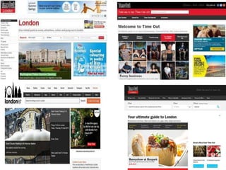
2. • In the previous slides I have linked images of websites that focus
on theatre and London. I focused on this magazines and its
websites as it was my favourite when I was doing my research.
Personally I like the colour scheme and the layout of this
website. This is because the layout is simple and well spaced
out. The websites also has a main image which is focused on the
top , therefor I will use one of my main images that I have edited
to star as my image on my website. Similarly I will also have a
simple task bar at the top so that it is easy for the target
audience to locate what specific information they are looking
for.
3.
4. Above is a bunch of billboards which I have looked at to
get inspiration from for when I make mine. For example
in the images above you can see that some are similar
than others. Personally I like the really simple and blank
ones as I feel it gets straight to the point and brings the
attention to the writing (which is the key bit).Personally
I like the colour white as it makes all the other colours
on it stand out and the images that I use will be very
simple. If I look in my raw images it will be a picture of
a building with a simple white background.