
Recommended
More Related Content
What's hot
What's hot (17)
Similar to Rap album cover analysis
Similar to Rap album cover analysis (20)
More from FREDDIEC4
More from FREDDIEC4 (20)
Recently uploaded
Recently uploaded (20)
Rap album cover analysis
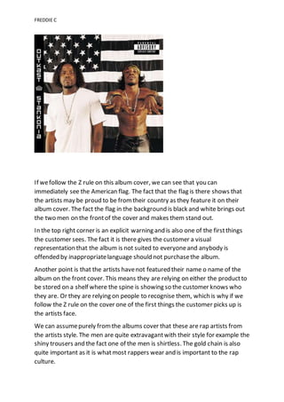
- 1. FREDDIE C If wefollow the Z rule on this album cover, we can see that you can immediately see the American flag. The fact that the flag is there shows that the artists may be proud to be from their country as they feature it on their album cover. The fact the flag in the background is black and white brings out the two men on the frontof the cover and makes them stand out. In the top right corner is an explicit warning and is also one of the firstthings the customer sees. The fact it is there gives the customer a visual representation that the album is not suited to everyoneand anybody is offended by inappropriatelanguage should not purchasethe album. Another point is that the artists havenot featured their name o name of the album on the front cover. This means they are relying on either the productto be stored on a shelf where the spine is showing so the customer knows who they are. Or they are relying on people to recognise them, which is why if we follow the Z rule on the cover one of the first things the customer picks up is the artists face. We can assumepurely fromthe albums cover that these are rap artists from the artists style. The men are quite extravagantwith their style for example the shiny trousers and the fact one of the men is shirtless. The gold chain is also quite important as it is whatmost rappers wear and is important to the rap culture.
- 2. FREDDIE C Also, the rap movement is predominantly made up of Americans, so it is no coincidence that the two men have the American flag in the background of their album cover. The colours of the album aremade up of dark shades and generally boring colours which is quite like most rap covers. The font on the spine of the album is very futuristic which could suggestthat the songs featured in their album is different to all their other songs. The fact the title on the spine is in bold and capitals is to attract the customer when it is on the shelf.
- 3. FREDDIE C If wefollow the Z rule on this cover, we immediately see the album’s title which suggests summer like and up beat songs on the album. The next thing the customer sees is the artists face. Much like Outkastthe artists name is not featured on the album, so the customer either has to recognise the artist or rely on the productbeing on a shelf. The albums name “Surf” is in differentcolours to the background this is to make it stand out and make the customer easily awareof the albums name. The title also links with the background which is an image of a wave. Unlike Outkast, this album cover has the explicit warning as one of the last things the customer sees. This is a good advertising technique as the warning could easily be missed by the customer and by the album unawareof the language. This album is slightly unorthodoxas the colours are quite vibrantwhich is opposite to the usualdark shades in normal rap covers. Also, the artist is not showing their style and means it is not easy for the customer to work out what genre of music this artist produces. All in all Chance the Rapper is making it quite difficult for the customer to get information about the album as there is no indication on the front. This adds mystery for the customer and will makethem want to buy the album.