
Recommended
More Related Content
What's hot
What's hot (19)
Viewers also liked
Viewers also liked (20)
Similar to POSTER ANALYSIS
Similar to POSTER ANALYSIS (20)
More from Jess Greenfield
Recently uploaded
Recently uploaded (20)
POSTER ANALYSIS
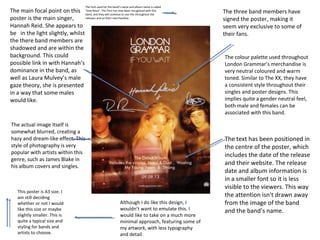
- 1. The font used for the band’s name and album name is called recognised with this The main focal point on this ‘Vow Neue’. This font has now beenthis throughout the band, and they will continue to use releases and on their merchandise. poster is the main singer, Hannah Reid. She appears to be in the light slightly, whilst the there band members are shadowed and are within the background. This could possible link in with Hannah’s dominance in the band, as well as Laura Mulvey’s male gaze theory, she is presented in a way that some males would like. The actual image itself is somewhat blurred, creating a hazy and dream-like effect. This style of photography is very popular with artists within this genre, such as James Blake in his album covers and singles. This poster is A3 size. I am still deciding whether or not I would like this size or maybe slightly smaller. This is quite a typical size and styling for bands and artists to choose. Although I do like this design, I wouldn’t want to emulate this. I would like to take on a much more minimal approach, featuring some of my artwork, with less typography and detail. The three band members have signed the poster, making it seem very exclusive to some of their fans. The colour palette used throughout London Grammar’s merchandise is very neutral coloured and warm toned. Similar to The XX, they have a consistent style throughout their singles and poster designs. This implies quite a gender neutral feel, both male and females can be associated with this band. The text has been positioned in the centre of the poster, which includes the date of the release and their website. The release date and album information is in a smaller font so it is less visible to the viewers. This way the attention isn't drawn away from the image of the band and the band’s name.
- 2. This poster has a symmetrical and geometric design. Triangles are shown in this particular design, as well as previous album art. Such as the album ‘The Bones Of What You Believe’. The focal attention is drawn to the triangles,as well as the small flower which is positioned almost directly central of the poster. However the whole poster is rather busy, there is a lot happening with the prints that are used. The triangles are filled with more geometric prints, created a sense of illusion and not knowing where to look. The more I look, the more I see different details. This band is ‘CHVRCHES’,in this article the band are promoting a gig happening in Chicago. I was just fascinated by the presentation and artwork of the poster, I wanted to analyse deeper into it. ‘CHVRCHES’ consistently use capital letters, and is typed in a way where the ‘U is replaced with the ‘V’ and the ‘E’ is replaced with a three lines that are horizontal. They present this throughout the release of EP’s and album, as well as featuring on their merchandise. The band have not yet appeared on album/EP covers or posters. I like this style of advertising, as it creates a sense of mystery, and gets people thinking ‘who is this band?’, intriguing them, resulting in research and finding background information on the band. This is similar to The XX. I want to create my poster in this way, as well as the DigiPak as I believe the selling point will increase if advertising it is done in this way. The colour palette is of a monochrome, pale pastel green and a bold orange. All of which look very aesthetically pleasing.
- 3. This poster is for the artist ‘Lorde’, promoting her Australian tour for the album release ‘Pure Heroine.The style of the poster is very similar to the layout of a fashion magazine. With the typography at the header ‘LANEWAY FESTIVAL PROUDLY PRESENTS IN ASSOCIATION WITH THE HABOUR AGENCY’. In addition to this, the images behind the letters is quite a typical style for a genre like this, and for fashion magazines. Lorde also makes an appearance in the images, twice, which looks like a repeated effect. The poster has a transparent white, highlighted strip going across the entirety of it. This makes it look shiny, and glossy, relating back to the idea of the magazine feel to it. It also creates a sense of high end and couture, and expensive looking. The poster includes the record label, which is hardly ever shown on some artists and bands posters. The text used for the dates and location of the tour is in a stylised and quite a simple italic font. The use of capital letters follows the conventions of many artists. Not only is it clearer to read, it has become a huge style and trend to use, mainly for the aesthetics. The colour palette is very simple, and follows the monochrome theme. I did have the idea of creating a neutral style for my poster and DigiPak, however the idea I have gone with, with the artwork is much more suited for the genre of Indie/Synth Pop.