2. Headings, Subheadings and Information
The main heading is obviously, ‘Contents’ with examples of
subheadings being ‘Features’ and ‘On the cover’. All of which have
been written in a san serif font which catches the audiences attention.
The text has also been continuously written in a white font, with white
connoting purity and innocence.
Information about the articles - This is a common convention for a
contents page. It gives the audience extra information about the topics
featured to see if there is any article in particular they want to read.
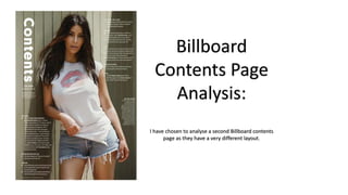
3. Images
Unlike many Billboard contents pages, this edition has only one image. This is
because it is of the dominant person featured in the magazine. It also associated
with the subheading ‘On the cover’ as the model – Kim Kardashian West – is
heavily featured on the cover too. The image uses the gaze to draw in the
audiences attention and allow the audience to build a connection with the model.
4. Page Numbers
This is also a common convention for a magazine. In fact it is key feature that makes the
magazine successful. Without this information people will have to read the magazine fully to
find the article they want to read. Some people buy magazines to read specific pieces and
without page numbers would make this a challenge.
Only the key page numbers tend to be displayed on a contents page otherwise the list would be
endless.
5. Masthead and Date
Similarly to the page numbers, including the masthead and date are key conventions on a
contents page. The masthead tends to be featured on every page of the magazine to allow the
audience to see and become familiar with magazine. The date is also included on the contents
but not necessarily on every page. Both pieces of information are prominent on the contents
page as they aren’t seen to be the most important feature, despite this they are still present to
give the audience the key everyday information they need and like to see on a magazine.