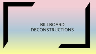
3. The masthead has been placed
centrally between other text. This
allows the masthead to be the
main focus for the audience.
The masthead has also been
layered to imply a deeper meaning
to the text.
The masthead ‘Beauty and the
Beast’ is originally a Disney
animated movie, the layering of
the text could suggest that this
may differ from the original plot.
4. Several different fonts have been
used on this billboard which help
convey different themes. A san
serif font has been used on the less
important words such as ‘series
premiere’ which contrasts to the
bold font on the date and time
which is key information for the
audience. In the tag line “HOW
BRAVE IS YOUR LOVE?” ‘brave’ is
in bold suggesting that bravery is a
key skill to have in the show.
A serif font has been used on the
masthead which contrasts to the
sans serif font which has been used
on the other information which
could also imply mystery and
create intrigue for the audience.
5. A gold text has also be used. Gold
has many connotations suggest
triumph and wealth which could
represent the plot behind the
show. Gold has also been used in
the eyes of the male character. This
helps create a house style and
doesn’t confuse the audience.
Only three colours have been used
on this billboard greyish black,
white and gold. The black gives a
dark tone to the billboard and gives
a reflection of the show. The white
allows for clarity of the text and
gold as mentioned above
symbolise wealth and success.
6. Only two images have been used
on this billboard which has helped
create a simple effect as the
audience aren’t bombarded with
loads of images that clutter the
billboard.
The male character (who could be
said to be “the Beast”) has been
positioned in front of the female
character (“Beauty”?) connoting
the idea of male superiority and
importance.
However, the female is positioned
side on with an intriguing look in
her eyes to suggest that she may
have the power.
The use of mode address through
the images has allowed for a
connection with the audience to
happen.
7.
8. Two images have been used on the
text, one product and the other a
model. This conveys the effect of
the product as well as the product
itself (foundation) . The model
image gives an insight into what
this product will do once applied to
the skin. The three bottles of the
foundation have been shown to
appeal to a wider audience due to
the shade ranges.
9. The background colour can be
shade to be an ombre effect of skin
tones which reflects the shades
of/and the foundation itself. The
peachy tone to the background is
soft and feminine touch to the
billboard.
10. The masthead has been place
underneath the subheadings
in bold. The boldness of the
text creates importance and
showcases to the audience
the name of the brand. The
font is easily recognisable too
due to brand recognition.
11.
12. Unlike most billboard
advertisements a masthead is used
to denote the brand name.
However, Pepsi’s logo is extremely
familiar to the audience that
stating the brand name isn’t
necessary.
The brand logo is clearly
positioned in the centre so that
despite the lack of masthead the
audience are aware of what the
advertisement is.
Another of the images is of the full
can of Pepsi again showcasing the
product.
13. Multiple images have been used on
this billboard to showcase the
different events and or places in
which Pepsi can be drunk. It
showcasing people have a great
time all over from beaches to
parties suggesting that Pepsi can
be a universal drink wherever ,
whenever.
14. The slogan has been scattered on
several of images. The Pepsi logo
has been included in the slogan to
create ‘Live For Now.’ Placing the
text in different images means that
the audience will see every image
and therefore work out the slogan
or see the slogan and then look
behind for the images.