1. Once again, the masthead appears in the top left corner, and the whole page
follows the same white, red and black colour scheme, in addition to a quadrilateral
cluster design, creating a consistent element of brand identity and the formation of
a symbiotic link, despite the fact that the reader would already know that he/she is
reading Q. Celebration of Britain is immediately on hand with the bold article title
’50 ULTIMATE BRITISH SONGS’ along with a Union Jack, and intense mode of
address, with words like ‘quintessential’ and ‘discerning’, words that even in
appearance seem appropriately ‘British’. Also, the Union Jack appears to be quite
weathered and worn, possibly indicating age, and that the 50 ultimate British songs
will consist of many artists from previous decades, contrasting with the minimal,
sleek look of the contents page as a whole, which in turn suggests a more modern
collection of artists. Worth noting too is the fact that all the artists featuring on
this contents page, bar Conor Oberst, are British, again celebrating Britain and its
music, while emphasising the upcoming artists within the magazine. Direct address
also features, with the word ‘yours’ finishing off the article description, absolutely
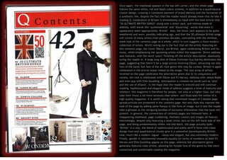
luring the reader in. A large long shot of Elbow frontman Guy Garvey dominates the
page, suggesting that there’ll be a large article involving Elbow, attracting not only
fans of the band, but fans of the alt-rock genre who may be curious. Britain is again
celebrated in the article teaser linked to the image. The vast array of artists
involved on the page celebrates the alternative genre due to its uniqueness and
variety. Alt-rock is celebrated with Elbow and PJ Harvey, dubstep with James Blake
and even pop with Ellie Goulding. Anticipation is created via words such as ‘plus’
and the use of ellipsis’, in the hope that the reader is enticed and will continue
reading. Sophisticated and elegant mode of address suggests a level of maturity and
intellect; this magazine is therefore for people, not only of a higher class, but who
take their music a lot more seriously than others, and illustrates the notion of a
high quality magazine. It is worth noting that minimised images of 3 double page
spread articles are presented in the contents page. Not only does this improve the
look of the page by adding some flavour in the form of image, but it lets the reader
take a glimpse at the intriguing bundles of exclusive information that the issue will
present. In general, the conventions of contents pages are followed here. A
reappearing masthead, page numbering, thematic colours and images all feature.
Interestingly, despite only featuring a small Union Jack on the left hand side of the
page, and being predominantly white, red and black, the page actually looks
‘British’ in a way; the blend of sophisticated and subtly serif’d fonts with clean
design lines and quadrilateral chunks give it a somewhat stereotypically British
look; much like a modern Jaguar – classy and elegant, but also extremely modern.
Finally, gender is represented unusually equally (in terms of numbers) as both PJ
Harvey and Ellie Goulding appear on the page, whereas the alternative genre
generally features male artists, allowing for female fans of the genre to feel more
connected and comfortable reading the magazine.