A Critique of the Proposed National Education Policy Reform
Indie Digipak Analysis
1. Indie Digipak Analysis
Humbug, Arctic Monkeys
This digipak by Arctic Monkeys is extremely typical of its genre for a
number of reasons. What's expected of the indie genre is that it
dismisses mainstream ideas and instead adopts its own style.
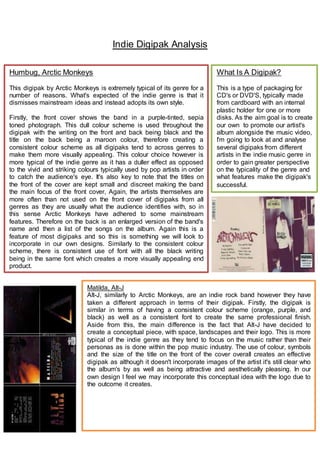
Firstly, the front cover shows the band in a purple-tinted, sepia
toned photograph. This dull colour scheme is used throughout the
digipak with the writing on the front and back being black and the
title on the back being a maroon colour, therefore creating a
consistent colour scheme as all digipaks tend to across genres to
make them more visually appealing. This colour choice however is
more typical of the indie genre as it has a duller effect as opposed
to the vivid and striking colours typically used by pop artists in order
to catch the audience's eye. It's also key to note that the titles on
the front of the cover are kept small and discreet making the band
the main focus of the front cover, Again, the artists themselves are
more often than not used on the front cover of digipaks from all
genres as they are usually what the audience identifies with, so in
this sense Arctic Monkeys have adhered to some mainstream
features. Therefore on the back is an enlarged version of the band's
name and then a list of the songs on the album. Again this is a
feature of most digipaks and so this is something we will look to
incorporate in our own designs. Similarly to the consistent colour
scheme, there is consistent use of font with all the black writing
being in the same font which creates a more visually appealing end
product.
What Is A Digipak?
This is a type of packaging for
CD's or DVD'S, typically made
from cardboard with an internal
plastic holder for one or more
disks. As the aim goal is to create
our own to promote our artist's
album alongside the music video,
I'm going to look at and analyse
several digipaks from different
artists in the indie music genre in
order to gain greater perspective
on the typicality of the genre and
what features make the digipak's
successful.
Matilda, Alt-J
Alt-J, similarly to Arctic Monkeys, are an indie rock band however they have
taken a different approach in terms of their digipak. Firstly, the digipak is
similar in terms of having a consistent colour scheme (orange, purple, and
black) as well as a consistent font to create the same professional finish.
Aside from this, the main difference is the fact that Alt-J have decided to
create a conceptual piece, with space, landscapes and their logo. This is more
typical of the indie genre as they tend to focus on the music rather than their
personas as is done within the pop music industry. The use of colour, symbols
and the size of the title on the front of the cover overall creates an effective
digipak as although it doesn't incorporate images of the artist it's still clear who
the album's by as well as being attractive and aesthetically pleasing. In our
own design I feel we may incorporate this conceptual idea with the logo due to
the outcome it creates.