
Recommended
More Related Content
What's hot
What's hot (19)
Similar to 1975 digipak analysis final
Similar to 1975 digipak analysis final (20)
More from 07adanmu
Recently uploaded
Recently uploaded (20)
1975 digipak analysis final
- 1. + The1975 – The1975 Deluxe Digipak Analysis By Mustaf A
- 2. + I have specifically decided to analyze the 1975 Digipak as I am planning on creating indie singer songwriter hybrid music video, digipak and ad and aim to get a clear understanding on the ways in which indie artist constructed there star image and keep and maintain their consist image to their brand within there promotional products. In addition I have also chosen to analyze this specific digipak as I aim to extract inspiration and idea for my own media product such as how the 1975 have established brand identity and created synergy between all three promotional media products i.e. Music video, Digipak and Magazine Ad Relevance to my own work
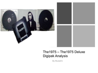
- 3. + Cover Panel Analysis The 1975 digipak cover carry's a basic design as the band is extremely consist with the image they portray and create as a band when launching first studio album. The use of the simple black, white and gray grayscale colour scheme on the cover and throughout the entire digipak conforms to the conventions of alternative/ indie rock music genre and connoting a sense of individuality, being on the outer edge, being different to which represents to the true nature of the genre to the audience. The contrast between the black and white somewhat creates an easier observation therefore putting more emphasis on the text drawing the audiences attention to the key elements of the digipak such being the bands logo. Furthermore the use of the simple grayscale colour scheme also connotes the greater importance of the music over the visual aesthetics of the digipak which is typically associated with alternative and indie genres. The grayscale theme also displays the album as dramatic and artistic, as it has more impact than something more colorful. The design of the digipak is plain and simple, not only because of the basic colour scheme, but also because of the lack of graphics, the only graphics being the logo, which is essential to establish the brand identity. The digipak cover panel and inner panels successfully exploits the bands image/brand identity well as the digipak cover convey an underground aspect to it, all the images look quite vintage and amateurish, in a natural looking setting, as if it had been constructed by the band them selves which shows the independent rise of the band and the large scale of fame that they have reached but still remaining to their roots which is key to all indie artist/bands. Rather than an overly styles and airbrushed photoshoot which promote mainstream culture as a result The 1975 conformed to conventions of the alternative indie genre by using non-artificial images for their digipak to represent an indie image. The mes en scene of the cover panel has been internationally constructed to fit the codes and conventions of the indie rock genre as this genre is often associated with urban settings and lower middle class background. Furthermore another convention incorporated within the 1975 digipak cover is that the artist or band are not usually featured on the cover, which connotes the greater importance of the music over the materialistic aesthetics or persona of the artists rejecting the conventions of the pop genre emphasizing the bands ‘alternative’ and ‘indie’ image. This also anchors ideologies about those who create music Indie–Rock and how they want to present themselves in a raw way and for their love for the music itself to overpower everything else about the band. This appeals to alternative audiences and makes the band seem easier to relate to as it suggest the bands have not Fallen subject to the celebrity subculture. The 1975 digipak artwork illustrated on the front panel relate to the tracks of the album for e.g. ‘The City’ and ‘M.O.N.E.Y’ following the giving conventions of digipak aiming to elevate and uphold brand identity. I believe both the digipak cover and track list represent the nature of the alternative indie rock genre of music and the image the band portray.
- 4. + The typography used on the 1975 logo on the digipak cover is of a retro style yet mixed in with a solid white neon effect, connoting that their image is a re-invented style, the font style is simple, yet more modern to reflect their music which has a modern influence. The font also represents their music genre as it is edgy and distinctive, yet quite simple and vintage. The illuminated rectangle is the most eye catching elements of the cover, along with the illuminated logo of the band name which is successfully brought to the forefront due to the contrast of the illuminated lights and dark and bleak background, creating emphasis and a immediate focus on the most important part of the digipak the band name(Logo). The logo establishes an identity to the band, which is edgy, cool and quirky. The text on the digipak is bold, putting more focus on the lyrics and music rather than the artist, conveying that the music is of the up most important and not their look/appearance. The logo of the 1975 band is partly written backwards and distorted. However, this has been constructed as a mean to create a unique and distinctive brand that the audience can clearly identify who the artist is, and associate the font with the band 1975.The typography, grayscale colour scheme and luminous design of the logo is simplistic and distinctive, which enables the audience to recognizable and familiar with band promotional media text’s and other media platforms as the bands logo has been featured throughout all of the 1975 promotional platforms such as poster ads, website and music videos. This has been done as a means to create a trademark image for the band and between the album(Digipak), music video and other promotional platforms so that the audience recognize they are related to establish brands identity. This has deliberately been done so that the consumer will immediately recognize the distinctive logo as well as drawing the attention of those who may not be familiar with the band helping the sales. Cover Panel Analysis
- 6. + Outer Panel And Spine Analysis The outer panels of the 1975 digipak keeps to the existing simple design demonstrated throughout the digipak and the rest of the digipak following the consistent style and grayscale colour scheme. Again like the cover, the font style is simple, yet more modern to reflect their music which has a modern influence. The 1975 digipak abides by the existing digipak codes and conventions by listing the album track list on back panel. The track list is successfully brought to the forefront due to the illuminated typography and black background, putting immediate focus on the track list and emphasizing its importance .Most of the text is written in capitals and is bold .This again puts more focus on what is important which is the fact that the album is the 'deluxe edition’ including all the songs on the album and songs from the band previous three EP’s. This shows the audience what is so special about this album and why the price is probably relatively higher than a jewel case album. It shows all the songs and displays that the album is deluxe, giving it a high quality image which allows the artist to add more value to the album. From the track list, we can identify that the titles show disc one, disc two etc. There is a use of the hash key before these titles '//’ creating synergy with the 1975 social media communications such as twitter, as they tend to use // before they communicate information to their fans. This appeals to a media conscious audience, which is typically young people, this shows that they are targeting their audience effectively. As young people would likely recognize and understand the digital synergy with the use of the // as they are more likely to spend more time on social networks and digital media platforms. As with most other digipaks, the 1975 self titled album keep and incorporate mandatory digipak features on the back panel and spine of the album such as UPC Barcode (Universal Product Code), A barcode is the standard method for distribution company's of tracking digital and physical music sales. In addition the spin and back cover of the digipak feature the record label which distributed the album ‘Polydor’. The record company tag is often featured and found on the back of the digipak as a indication of production rights. Additional features on the back panel of the 1975 digipak consist of copy right notice and publishing information.
- 7. +
- 8. + Inner Panels and CD Analysis The inner panels of the 1975 digipak maintains the same design displayed on the cover and the rest of the digipak following the consistent style and grayscale colour scheme upholding the consist alternative image the band portrays. The digipak opens up like a book, with two CDs either side. This is great for the fans, as it feels as though they are being allowed to find out more, bonus information about the band. The image used in the Digipak inner panels, which folds out displays the band in the black and white filter maintaining the consistency to the theme of the digipak but also includes some codes and conventions of the indie rock genre through the bands attire for e.g. the sartorial codes in the indie rock genre often promote the bohemian values, through clothing such as hoodies, and scruffy jeans suggesting a rejection of conventions and culture as ‘hoodies’ is typically associated with youthful deviance. The layout of the images are quite unique as it shows a three different shots put together to look like one. Which allows the artist to be perceived as different and edgy. Furthermore the image of the four piece band has been styled to look like a snapshot of everyday life rather than an overly styles and airbrushed photo-shoot which promote mainstream culture. Moreover the grayscale theme, composition and mes en scene displayed within in the photograph of the band within the digipak suggest it is a complete pastiche of Joy Division’s Hulme photography from the 1970’s. Joy Division’s are a renowned indie rock band suggesting that the band 1975 may have extracted inspiration from the band but also mold their artistry and brand after suggesting the 1975 are aiming to portray a alternative image. Direct address is not used in the photograph of the alternative indie rock band which gives a naturalistic mood plus the fact that the band members are dispersed through the composition suggest a contrast against typical boy band imagery which is typically associated with the pop genre.
- 9. + Inner Panels and CD’S