1. Creating our record label
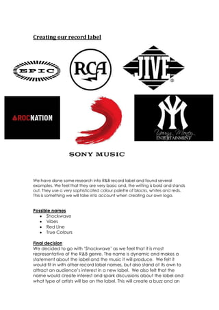
We have done some research into R&B record label and found several
examples. We feel that they are very basic and, the writing is bold and stands
out. They use a very sophisticated colour palette of blacks, whites and reds.
This is something we will take into account when creating our own logo.
Possible names
Shockwave
Vibes
Red Line
True Colours
Final decision
We decided to go with ‘Shockwave’ as we feel that it is most
representative of the R&B genre. The name is dynamic and makes a
statement about the label and the music it will produce. We felt it
would fit in with other record label names, but also stand of its own to
attract an audience’s interest in a new label. We also felt that the
name would create interest and spark discussions about the label and
what type of artists will be on the label. This will create a buzz and an
2. interest in the label, possibly creating more potential buyers of any
music we produce.
This is our final design for out logo, we have taken conventions from
other logos we found and combined them to create a unique logo for
ourselves. We have used the same colourpaletteof black and red, this
is very sophisticated and very simple. Again this is a theme throughout
a lot of the logos we found. We have tried to stick to the conventions
of the genre but also create something that is unique and that will
stand out to ensure this draws attention to the label. I feel that we have
included enough conventions of the genre to make the audience
aware of what the label represents and what music it will produce, but
also it is original enough to stand on its own.
I found this task challenging as I am not very familiar with Photoshop
compared to some other students. I know this task will help with other
tasks needed in this project, such as the digipak or magazine cover.
This has given me a background to the software.