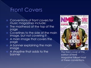
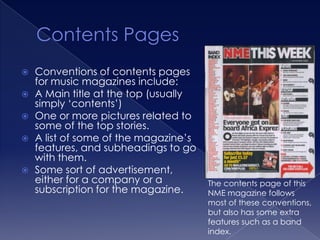
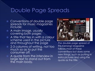
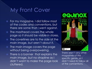
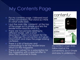
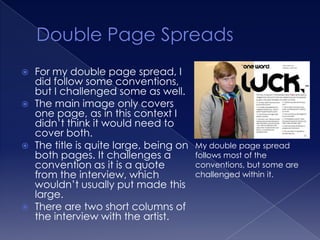
The document outlines conventions for different elements of music magazines, including front covers, contents pages, and double page spreads. It then discusses how the author's own magazine publication follows most conventions but also challenges some. For the front cover, contents page, and double page spread of the author's magazine, most conventions are followed, but some elements are adapted to better suit the specific genre or context.
2. Conventions of front covers for
music magazines include:
The masthead at the top of the
page
Coverlines to the side of the main
image, but not covering it
A main image that covers the
page
A banner explaining the main
image
A strapline that adds to the The front cover of this
banner edition of NME
Magazine follows most
of these conventions.
3. Conventions of contents pages
for music magazines include:
A Main title at the top (usually
simply ‘contents’)
One or more pictures related to
some of the top stories.
A list of some of the magazine’s
features, and subheadings to go
with them.
Some sort of advertisement,
either for a company or a The contents page of this
subscription for the magazine. NME magazine follows
most of these conventions,
but also has some extra
features such as a band
index.
4. Conventions of double page
spreads for music magazines
include:
A main image, usually
covering both pages
A title that ties in with a colour
scheme used in the picture
and throughout the page The double page spread of
2-3 columns of writing, not too this Kerrang! Magazine
much so as to put the follows most of these
consumer off. conventions but does some
new things, such as putting in
A quote from the interview in extra pictures and using the
large text to stand out from quote as the title.
the main body.
5. For my magazine, I did follow most
of the codes and conventions, but
there are some that I went against.
The masthead covers the whole
page so it should be visible in stores.
The coverlines are to the side of the
main image, but aren’t about it.
The main image covers the page
without being overpowering.
There aren’t any other
There is a banner that explains the magazines of this
main image, but no strapline as I specific genre, so I
didn’t want to make the page look didn’t need to follow all
cluttered. of the conventions.
6. For my contents page, I followed most
of the conventions that stand as I think
it’s what works best.
I put the main title ‘contents’ at the top
of the page as it is simple and lets the
reader know exactly what it is.
There are two pictures relating to
different stories, with a short
description. There is no reason for me
to challenge this convention as it gives
information and stops the page looking
cluttered.
There is a list of features and
subheadings to let the reader know My contents page does
what is in the magazine. follow most of the
There is an advert for a subscription for conventions, so it is simple
the magazine with a special offer to and easy to understand.
draw the customer in more.
7. For my double page spread, I
did follow some conventions,
but I challenged some as well.
The main image only covers
one page, as in this context I
didn’t think it would need to
cover both.
The title is quite large, being on My double page spread
both pages. It challenges a follows most of the
convention as it is a quote conventions, but some are
from the interview, which challenged within it.
wouldn’t usually put made this
large.
There are two short columns of
the interview with the artist.