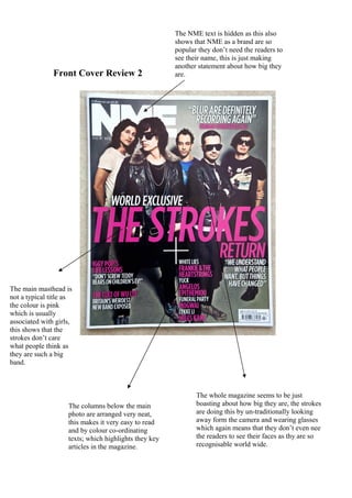
1. The NME text is hidden as this also
shows that NME as a brand are so
popular they don’t need the readers to
see their name, this is just making
another statement about how big they
Front Cover Review 2 are.
The main masthead is
not a typical title as
the colour is pink
which is usually
associated with girls,
this shows that the
strokes don’t care
what people think as
they are such a big
band.
The whole magazine seems to be just
The columns below the main boasting about how big they are, the strokes
photo are arranged very neat, are doing this by un-traditionally looking
this makes it very easy to read away form the camera and wearing glasses
and by colour co-ordinating which again means that they don’t even nee
texts; which highlights they key the readers to see their faces as thy are so
articles in the magazine. recognisable world wide.