
Recommended
More Related Content
What's hot
What's hot (20)
Viewers also liked
Viewers also liked (15)
Similar to Magazinecontents courteeners
Similar to Magazinecontents courteeners (20)
More from Charlotte Ayres
More from Charlotte Ayres (20)
Recently uploaded
Recently uploaded (20)
Magazinecontents courteeners
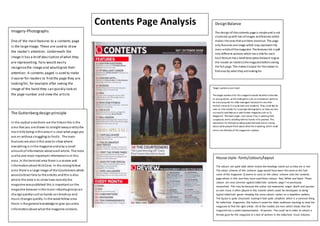
- 1. House style- fonts/colours/layout The colours are quite bold which makes the headings stand out as they are in red. The colour scheme of this contents page would have been the same as the font cover of the magazine. Q seems to carry on the colour scheme onto the contents page where in this case they have used three colours: Red, White and black. These colours are very common against indie/rock contents page I’ve previously researched. This may be because the colour red represents anger, death and passion as rock music is often played in this manner which could be sterotyped as being typical indie/rock genre. Keeping the same colours carries on a repetitive pattern. The layout is quite structured making it look quite simplistic which is a common thing for indie/rock magazines, this makes it easier for older audiences wanting to read the magazine to find the right article. All of the models are men which shows that the magazine has a under-representation of women. This could be in order to attract a female gaze for the magazine or a lack of women in the indie/rock music industry. Target audience and need The target audience for this magazine would be either indie fans or young adults, as the indie genre such as courteeners seems to be more popular for older teenagers because for one their fashion sense as it is quite dark and simplistic. They could also be seen as role models for a younger demographic, as they are very successful and feature in well-known magazine such as ‘Q Magazine’. The lead singer, Liam James Fray, is wearing dark sunglasses andis standing withhis hands inhis pockets. This represents his lifestyle as being quite laid back andun-caring about what people think about what the is wearing, which could mirror the lifestyle of the magazine’s readers. Imagery-Photographs One of the main features to a contents page is the largeimage. These are used to draw the reader’s attention. Underneath the image it has a brief description of what they are representing. Fans would easily recognisethe image and would grab their attention. A contents paged is used to make it easier for readers to find the page they are lookingfor, for example after seeing the image of the band they can quickly look at the page number and view the article. The Guttenbergdesignprinciple In the optical areathere are the titleas this is the area that you are drawn to straight awayandbythe maintitle beinginthis area it is clear what page you are on without struggling to findit. The main features are alsointhis area to show where everything is inthe magazine andalso a small amount of information about eacharticle. The most useful and most important informationis in this area. In the terminal area there is a review and informationabout NickCave. In the strongfellow area there is a large image of the Courteeners which wouldattract fans to the articles andthis is also where the date is to show how recentlythe magazine waspublished this is important on the magazine because inthe music industry gossipcan change quicklysuchas bands canbreakup and music changes quickly. In the weakfellow area there is the general knowledge to give youextra informationabout what the magazine contains. DesignBalance The design ofthis contents pageis simpleand is not cluttered upwith lots ofimages andfeatures which makes theones thatarethere standout. The page only features oneimage which may represent the main articleofthemagazine. Thefeatures list is spilt into different sections which has a titlefor each. Each feature has a briefdescriptionbelowit togive the reader an insidetothemagazinebeforeseeing the full page. This makes iteasier for thereader to find exactly whatthey arelooking for. Contents Page Analysis