
Recommended
More Related Content
What's hot
What's hot (19)
Similar to Unit 2 task 3 & 4 create feedback improve refine
Similar to Unit 2 task 3 & 4 create feedback improve refine (20)
More from CeliaHuang5
More from CeliaHuang5 (8)
Recently uploaded
Recently uploaded (20)
Unit 2 task 3 & 4 create feedback improve refine
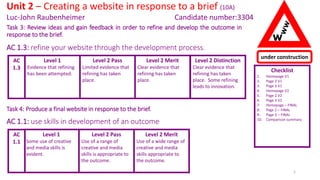
- 1. Task 3: Review ideas and gain feedback in order to refine and develop the outcome in response to the brief. AC 1.3: refine your website through the development process. Level 1 Evidence that refining has been attempted. Level 2 Pass Limited evidence that refining has taken place. Checklist 1. Homepage V1 2. Page 2 V1 3. Page 3 V1 4. Homepage V2 5. Page 2 V2 6. Page 3 V2 7. Homepage – FINAL 8. Page 2 – FINAL 9. Page 3 – FINAL 10. Comparison summary Unit 2 – Creating a website in response to a brief (10A) Luc-John Raubenheimer Candidate number:3304 AC 1.3 1 Level 2 Merit Clear evidence that refining has taken place. under construction W Level 2 Distinction Clear evidence that refining has taken place. Some refining leads to innovation. Task 4: Produce a final website in response to the brief. Level 1 Some use of creative and media skills is evident. Level 2 Pass Use of a range of creative and media skills is appropriate to the outcome. AC 1.1 Level 2 Merit Use of a wide range of creative and media skills appropriate to the outcome. AC 1.1: use skills in development of an outcome
- 2. Checklist 1. Homepage V1 2. Page 2 V1 3. Page 3 V1 4. Homepage V2 5. Page 2 V2 6. Page 3 V2 7. Homepage – FINAL 8. Page 2 – FINAL 9. Page 3 – FINAL 10. Comparison summary Unit 2 – Creating a website in response to a brief (10A) Luc-John Raubenheimer Candidate number:3304 2 under construction W Level 1 Some description of feedback is evident. Level 2 Pass Some explanation of how feedback was used to identify changes. AC 2.3 Level 2 Merit Clear explanation of how feedback was used to identify appropriate changes. AC 2.3: use feedback to identify changes needed Task 4: Produce a final website in response to the brief.
- 3. Homepage - V1 Luc-John Raubenheimer 3 This is my homepage for my website. There is an animated banner that I made in Fireworks, an animated advert that I made in Fireworks and an animated footer that I made in Fireworks. I made the buttons in Photoshop. I found the Terminator GIF online in google images along with the lightbulb. I made the social media buttons in Photoshop.
- 4. Homepage - V1 Luc-John Raubenheimer 4 I made this animated banner in Fireworks, I made this because I think it would appeal to most of my target audience because it looks like it is from an intense scene from an action movie. I made the plane in Photoshop and I also made the background in Photoshop by putting a picture of clear skies and adding a filter on to it and colouring it in with dark blue. I made this animated footer in Fireworks because it would appeal to my target audience who like violence in their movies and their video games. I made the background with Photoshop by colouring it in with dark blue and light red. I added the gunshots by finding an image of an explosion and making it smaller, I also added the smoke effect to the gunshot and if you look closely you can see the smoke. I made this button in Fireworks, it is the Instagram logo with a flash on the light, this is the on version of this social media button rollover. I made an Instagram one because I think this is what a lot of my target audience use in their spare time. I made five social media rollovers. Google plus Twitter Facebook Email
- 5. Homepage - V1 Feedback – Chris symes - I liked the layout of your homepage I think that it is very eye catching and it appeals to the target audience of teenagers. The choice of font and text colour go very well together because it is clear enough to read yet not a boring text. The animated food advert on the side is very appealing. You haven’t added in any hotspots to your pdf documents or any hyperlinks to the social media websites. I like the look of your animated banner however I feel that it need to have some more options for people to chose because it looks very plain. There isn’t any grammatical or spelling errors however I think you could do with making it sound a bit more professional, e.g. prices ranging from £2 to £8 Luc-John Raubenheimer 5 Feedback – Katie Lovekin – the homepage is very eye-catching, the animated banner isn’t too fast so you can read the text clearly. The page buttons are linked together but the social media buttons aren’t linked to the sites. You haven’t added the pdf for the footer. The animated banner doesn’t have the time when the event ends or starts. No grammar problems. The animated food advert is detailed but the writing is too small to read.
- 6. Food & Drinks- V1 Luc-John Raubenheimer 6 This is the Food and drinks page for my website. I used a static image of people in the cinema because it is a known fact that people eat popcorn when in the movies. I got this image from http://www.bing.com/images/search?view=detailV2&ccid=GYnA9f2N&id=2CB28E8C3E617A23B2DEB57CEDC08F9525EBE861&q=people+eating+popc orn+in+the+movies&simid=608039389079932362&selectedIndex=2&ajaxhist=0 . I also got an animated GIF of a movie rolling from http://www.bing.com/images/search?view=detailV2&ccid=bk4MYgWU&id=76487AC695398778B2DDD1ADD8363DA519BAE7F5&q=movie+rolling+gif &simid=608020998032197117&selectedIndex=12&ajaxhist=0
- 7. Food & Drinks - V1 Feedback – Chris symes The overall layout of the 2nd page is good and I like the way there's still a lot going on but not enough to distract someone from what they want to find out. Although the animated food advert is very appealing and informative I think that it doesn’t need to be repeated on the second slide because the space its taking up could be used to tell people some more information or you could make an advert for the films your showing. All the links till work for your buttons I think the buttons could be a bit more interesting than what they are right now, I think that you could add some more colour or make them stand out more. Luc-John Raubenheimer 7 Feedback – Katie Lovekin The social media buttons aren’t linked together on the 2nd page either. The layout is simple but very eye catching again. There's not a lot of information about foods and drinks next to the images. The footer is going too fast again so you can’t see what's going on in the background.
- 8. Activities- V1 Luc-John Raubenheimer 8 This is my activities page for my website, it has an animated banner, an animated advert, an animated map, four rollover images and an animated footer. I made the animated banner in Fireworks, I made the animated advert in Fireworks as well but I made it in a hurry and it turned out quite well. The rollover images were made by me on both Photoshop and Fireworks. I made the animated footer in both Photoshop and Fireworks as well. I made the animated map in fireworks, I made it so that it would look like a magnifying glass going across the map and zooming in to St. Ann’s Wells Gardens. I got the pictures from Google Images. I have linked the pages together, the terms of service PDF has been linked to the button and the contact us PDF has been linked to the button as well. Rollovers
- 9. Activities- V1 Feedback – Spencer Cooper In the footer the Conditions & Accessibility Help don’t link to any page, neither does the tickets page. Lots of gifs give the page lots of vibe, social media icons change when hovering over, well made. Luc-John Raubenheimer 9 Feedback – Finnan Purdie McVeigh–Make sure you fix the tickets hotspots and maybe a clearer background for text maybe add the background to the text, everything almost 100% working apart from the alt tags and add the links for the social media websites.
- 10. Version 1 feedback – improvements I want to make Luc-John Raubenheimer 10 Add more choices for people to click on. Done – I’ve made a terms and conditions PDF for my footer. I used word and I searched on the internet to find terms and conditions. I then used X tool to change the name to the name of my event which is The Thrill of the flight. I added a logo in the header and then I saved it as a PDF and linked it to the footer. I did this so my target audience of young teens know the terms and conditions. This is also something I’ve seen on professional websites. Add a contact us page. Done- I’ve added a contact us page for my target audience who are teens and young adults to have a place to contact my website if they have a problem with the terms of service or any technical issues. Make prices look more professional. Done- I have made the prices of the food and drinks look more professional, I did this by adding the £ symbol to the prices and making the prices cheaper so that my target audience can actually afford it. Link social media buttons. Done- I have added links to my social media buttons so that my audience can access it in order to get the latest news about my website and my event. Add more colour to buttons to make them stand out. Done- I have added more colour to my website so that my target audience would find it less boring and more enjoyable. Add the tickets page. Done- I have added a tickets page so that my audience have a place to buy online tickets if they are interested incoming to my event. The alt tags for the social media websites and the links don’t really work. Done- I have made the links work , but the Alt tags don’t show up even if I add one to them. On my next version I am going to try and make the Alt tags on my website work, I am also going to add a contact us PDF, I was going to make an individual contact us page but I changed my plan and I am going to be making a PDF instead. I am also going to make some more hotpots and links so that my audience can click on them.
- 11. Luc-John Raubenheimer 11 under construction W Version 2 evidence now follows…..
- 12. Homepage – V2 Luc-John Raubenheimer 12 This is my improved homepage, I made a tickets page and linked it to this page, I also linked the social media pages to this page. The footer on this website is supposed to be that fast, I made all the buttons on this website in Photoshop. I adjusted the lengths of the columns so they wouldn’t stick out like they did before. I changed the GIF in to a photo so it would load and appear faster when I open the site.
- 13. Homepage – V2 Feedback – Muj I Think that the layout can be improved because there is too many pictures and buttons everywhere. And also I think that you can remove the white background from the pictures so that it looks neater. Luc-John Raubenheimer 13 Feedback – Scott Scott Rittman – There are no technical errors on this page of the website. The rollovers work fine and the links to the other pages all work correctly. One suggestion to improve this page would be to make the white background behind the social media buttons transparent, so that it shows the website background. It would also be good to fix the alignment of the table making it so that there is no spacing between the images and the footer and banner. The footer links ‘Conditions’ and ‘Accessibility Help’ also don’t link to anything
- 14. Food & Drinks– V2 Luc-John Raubenheimer 14 I added a Gif to this page so that it wouldn’t look as boring as it was in the last one. I added a tickets page so the button could be linked to it. I linked all the social media buttons to their websites. Gmail, Google Plus, Instagram and Twitter so that my target audience can know what’s going on with my website and my event.
- 15. Food & Drinks– V2 Feedback – Muj I think that you should add alt tags so when someone hovers over the image there can be text so it tells the what it is. Also make the image sizes the same so you don’t see the backgrounds lines because it makes it look messy. Luc-John Raubenheimer 15 Feedback – Scott Scott Rittman – The first thing I spot whilst looking at this page of the website is the alignment between the image of people in the cinema. This is something that needs to be fixed throughout the whole website. Another suggestion would be to also add more body text next to the two images as the two subjects could use more detail. The drinks menu image is also too stretched to read. However you did a good job on keeping the movie theme of the festival throughout the website. The footer links ‘Conditions’ and ‘Accessibility Help’ also don’t link to anything
- 16. Activities– V2 Luc-John Raubenheimer 16 There wasn’t really any feedback telling me to improve this page except to link the social media buttons, I did that and I also slowed down the speed of the animated gifs in fireworks by saving the file correctly , I made a tickets page so that the tickets button could be linked to that page and I shortened some of the rows and columns to make the page look more even that it was before.
- 17. Activities– V2 Feedback – Muj I Like the animated map it is okay. But the planes white background can be removed so that it looks neat and so that it looks professional. Also the images can be improved because they are kind of boring to look at. You can use fireworks and use the magic wand to get of the white background of some images. Luc-John Raubenheimer 17 Feedback – Scott Scott Rittman – There is a spelling error in the body text of this page as you spelt ‘Favourite’ ‘Favourite’. Other than that there are no SPaG errors in this page. There are also no technical errors as all of the buttons in the footer and the social media ones as usual. One recommendation would be to remove the white background on the images. The footer links ‘Conditions’ and ‘Accessibility Help’ also don’t link to anything
- 18. Tickets– V2 Luc-John Raubenheimer 18 This is the tickets page, I did not have this page when we first did the feedback. I made an animated advert about Brightspark sponsoring this event. And I linked all the social media buttons and the homepage button, the food button and the activities button. I made pictures of tickets in Photoshop, the I made PDFs with those pictures on them so the user could print them out, including a normal ticket and a VIP ticket. I made these PDFs in PowerPoint. NEXT PAGE
- 19. Tickets– V2 Luc-John Raubenheimer 19 This is the normal ticket PDF that people will print out. This is the registration code, it is supposed to be different every time someone clicks into this PDF. I found this picture of tickets online. This is to show the audience what to do.
- 20. Tickets– V2 Luc-John Raubenheimer 20 This is the PDF for the V.I.P ticket. I used the same ticket from the normal ticket and photoshoped it on Photoshop. The registration code is different to the last one to show how the code will be different every time someone wants to print a ticket out The barcode is supposed to be different every time for the worker at the till to scan them and permit the entry of the buyer into the festival.
- 21. Tickets – V2 Feedback – Spencer Cooper All buttons to link pages are working, only 2/4 links work in the footer. Maybe add something different instead of 2 pictures of tickets that both link to the same page. Luc-John Raubenheimer 21 Feedback – Scott Scott Rittman – The footer links also still don’t work on this page. Other than that there are no technical errors on this page. When it comes to SPaG errors, on the PDF file ‘Terms of Service’ the website name is spelt wrong.
- 22. Version 2 feedback – improvements I want to make Luc-John Raubenheimer 22 Improve the map gif on page 2, activities. Done – I have re-designed the map GIF so that it doesn’t look so boring, it used to just be a normal map with a magnifying glass hovering over it but know it is a magnifying glass that actually zooms in to the image. Make the two the links in the footer work so they don’t confuse anyone. Done – I have added links to this choices so my target audiences can click on them if they have any accessibility problems or any conditions they have problems about. Check for spelling and grammar mistakes. Done – I have checked for spelling and grammar mistakes throughout the whole of my website, I am pretty sure that there are know more of them. Add alt tags. Done -- I have added alt tags to my website. Unfortunately they do not show up in the live view for some reason. Make the layout of my website a bit less messier. Done – I have improved the layout of my website so that it isn’t that messy anymore. On my final version I want to make the layout on all my pages less messy so that it is easier for my target audiences to see where things are and how to use the website. I am also going to check for SPaG mistakes throughout the whole of my website.
- 23. Luc-John Raubenheimer 23 under construction W Final version evidence now follows…..
- 24. Homepage - Final Luc-John Raubenheimer 24 This is what my final homepage looks like, I improved the layout a lot on Dreamweaver. I adjusted the size of the buttons so they are now the same size, I adjusted the size of the pictures and GIFs so that my website does not look so messy. I also add links to all the other buttons that did no have links before.
- 25. Homepage - Final Feedback – Finnan- there Is little evidence of html code but I like the genre and the theme maybe some more text in the main page everything else on this page is good including the banner. Luc-John Raubenheimer 25 Feedback – Muj- Some more text on this page would make it better. The footer goes a bit too fast. The buttons look a bit too bland. But overall it looks good.
- 26. Food & Drinks - Final Luc-John Raubenheimer 26 This I the final version of my Food and Drinks page, I improved the layout of this page because at first it was very messy. I added the Bright Spark logo to the food and drinks animated advert so that my target audience can know who is sponsoring my website and my event. This I the logo I made for Bright Spark on my food and drinks animated advert.
- 27. Food & Drinks - Final Feedback – Finnan- I like your movie gif very well done on that some drinks advert again try accessorize your adverts position, definitely more text needed not enough information about food and drinks. Luc-John Raubenheimer 27 Feedback – Muj- this page looks good the banner look very nice, but the GIF in the middle is moving a bit too fast.
- 28. Activities - Final Luc-John Raubenheimer 28 This is my final version of my activities page on my website, I have improved the layout of this page like I have done with all the other pages. I have also added colour to my hotspots on this page. I have also improved the animated advert on the side of this page so that it does not go too quickly, I did that by reducing the time and saving it correctly.
- 29. Activities - Final Feedback – Finnan – you have unfinished work to do on tickets make sure you include that as well, everything else on the page I like but please do more text on your information about this page, spelling is good but not great. Luc-John Raubenheimer 29 Feedback – Muj- the map in the middle is too big, it does not fit with the website nicely, it pushes the text and image up.
- 30. Final feedback – improvements / tweaks I want to make Luc-John Raubenheimer 30 I need to make the animated map a little bit smaller so that it doesn’t push the buttons up too much. Done- I moved the animated map lower a bit and made it smaller, the buttons don’t look so small and squished up so much now. The footer needs to be slower. Done- I designed the footer to be that fast, but since all the feedback people have given me are to slow it down, I slowed down the time between the states so that the footer slows down a bit. The GIF in the middle of page 2 activities page is moving too quickly. Done- I split it up into images in a GIF splitter online and used Fireworks to slow the GIF down by increasing the time between the states and saving it correctly. The feedback has gotten more and more repetitive by telling me that the things like the footer is going too fast. I meant for the footer to be fast. So I decided to go with the feedback and slow the footer down.
- 31. Clearly explain how feedback was used to identify changes you made Luc-John Raubenheimer 31 On the home page, I was told to add more welcome text and body text, I did it and the homepage looked much better than it did without the same amount of text, I was also told to slow down the GIFs on pretty much all the pages, and they looked better after I slowed them down, except for the footer, that was meant to be that fast. On the food and drinks page I was told to add more links and PDFs, I think that was a very useful piece of feedback because now my target audience can have more choices for things to do on my fix the hotspots and add more colour to the website, I did that and my website looks much better than it was before. website. On my activities page I was told to I was told to make a tickets page and after I made it I realised that my target audience has a place to print tickets and rent booths easily.
Editor's Notes
- Where is the detail explaining (using keywords) how you made your banner? ….your footer? ….your buttons? And the other assets?