Trauma-Informed Leadership - Five Practical Principles
inspiration
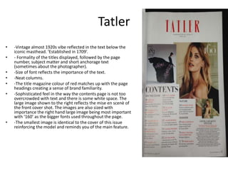
1. Tatler
• -Vintage almost 1920s vibe reflected in the text below the
iconic masthead. ‘Established in 1709’.
• - Formality of the titles displayed, followed by the page
number, subject matter and short anchorage text
(sometimes about the photographer).
• -Size of font reflects the importance of the text.
• -Neat columns.
• -The title magazine colour of red matches up with the page
headings creating a sense of brand familiarity.
• -Sophisticated feel in the way the contents page is not too
overcrowded with text and there is some white space. The
large image shown to the right reflects the mise en scenè of
the front cover shot. The images are also sized with
importance the right hand large image being most important
with ‘160’ as the bigger fonts used throughout the page.
• -The smallest image is identical to the cover of this issue
reinforcing the model and reminds you of the main feature.
3. Favourite 3
• 1) Front cover – use of CU, simplicity of masthead and consistent colour
palette, but cover lines do not use many illustrative techniques, simple
yet impactful
• 2) Contents Page- single contents, red/white/black colour palette,
headlines red stand out, 1 image of model, page numbers different font
• 3) DPS – 1 page of single image extreme CU/layering of another, over
page – copy and 3 single images, again consistent colour palette