SlideShare a Scribd company logo
1 of 3
Colour scheme- This Arctic Monkeys digipack lacks colour.
It is made up from black and white images as well as a
black background with white texts or shapes. Due to this
the album cover as well as inside and back cover look
classier. This can be said to signify the ‘classic rock’ genre
that the bands music falls under. This is their 5th album and
typically from the studio albums released before (shown on
the right), their album artwork and colour scheme isn’t
bright or colourful but toned down and simplistic with only
one (picture or text) dominating the design.
Main Images- All four members of Arctic
Monkeys are in this image. They’re wearing
suits that make them look smart and classy.
This corresponds well with the organised
layout of the album as well as the classy use of
the black and white colour scheme. In
addition, none of the men are looking directly
into the camera lens creating a mysterious
atmosphere. Their facial expressions lack
emotion and therefore highlight the
stereotype of a dominant, self-relying man.
This idea can be further supported with the
use of shadows which adds to the serious and
almost ‘ominous’ atmosphere. For the front
cover as well as CD design, they have used
frequency lines which has been described as a
‘characteristic of an amplitude modulated
(AM) signal’ which is a technique used for
electronic communication. This is a clever idea
since the title of this 5th studio album is ‘AM’
allowing the audience to decide if that stands
for ‘Arctic Monkeys’ or ‘Amplitude
Modulation’. Once again, the uncertainty and
lack of a definite answer empathies the
mystery.
CD- The CD follows the same pattern as
illustrated on the front cover of the
album/digipack. This promotes
continuity and allows the audience to
feel familiar with the music when
listening to it. Keeping the CD artwork
simple allows the audience to focus on
the music instead of being distracted by
the CD itself. Focusing on the music can
be seen as a repeating feature here.
Layout- The layout of the digipack is very
organised. The spacing is equal making the
digipack not look crowded and
overwhelming. The ratio of images to text is
not equal since the only text featured in the
digipack is located on the back cover. This
isn't an uncommon feature for Arctic
Monkeys. The white lines used for the wave
make up for the lack of text used.
Text/Fonts- The only text available on the
whole digipack is the back cover where the
name of the band ‘Arctic Monkeys’ is
displayed along with the track list of the
album. The band name text increases in size
giving off the impression similar to the sound
logo (shown below) as the sound waves
increase. In addition, the letters curve up
suggesting that this was done intentionally to
fit in with the waves (shown below) that are
featured on the CD and front cover. All of this
relates back to music.
The font of the band name is wavy and
irregular which contrasts with the simplistic
and organised lay out of all the other images
and shapes on the digipack. This shows that
the nature of the band isn’t strict. The font
used for the track list is a simple, sans-serif
font that can be recognised by anyone as it is
commonly used digitally. Once again, this
follows the simplicity and familiarity of the
whole digipack.
Colour scheme- The colours used for the ‘Blur’ digipack are very
bright and bold. They are a continuing feature used in the digipack
as you can find them on the front and back cover of the album as
well as on the inner part of the CD. The four bright, main colours
used are- yellow, blue, green and pink, accompanied by a white
‘filing’ colour for text. The bright colours most probably have the
intention to attract the audience when looking at the album. In
addition, since colours are featured on the front cover and help
determine the difference between each of the members of the
band. It is clearly meant for the colours to clash. They even out
their boldness by using white as the font of the writing. The back
cover is similar. The band went against using the four colours
usually associated as the ‘main’ colours- blue, green, yellow and
red. Instead they replaces red with pink.
Layout- Although the digipack
gives off a very busy atmosphere
due to the big images and many
bright colours used, the layout of
it is very organised. The shapes
used are mostly coloured
rectangles which fill up a lot of
space giving the illusion of a
full/busy layout. The rectangular
theme gives the digipack a neat
finish. It is even continued in the
inner part of the CD. A mixture of
the bright colours accompanied
with the rectangular shapes
creates a sharp and ‘in-your-face’
look that you can’t miss. Most
probably this was done as a way
of attracting the audience when
the album is on the shelf or
when it’s an option for
livestreaming/downloading.
CD- The CD is extremely simple,
it is left completely blank
allowing the aluminium surface
to dominate the whole design of
the CD. The only detail,
distinguishing it as a Blur CD, is
the four colours that are used
throughout the digipack located
on the inner part of the CD.
Although there is no way of
knowing why Blur chose to have
these four specific colours on
the digipack, they match
perfectly with the usual
aluminium shine and reflection
on a CD. In addition, lack of
design on a CD allows for the
audience/listeners to focus
solely on the music without any
distractions.
Text/ Fonts- The ‘blur’ text on
the front cover establishes who
the band are. To help this, the
font used is the typical blur logo
(shown below). The font used on
the back cover for the track list is
a simple sans-serif font used on
most albums for the track list,
Blur have decided to not
personalise that part of the
album.
Main Images- The main images on the front cover are the only ones on the
whole digipack and therefore are significant. They are headshots of all four band
members, this is important since this digipack comes from the ‘Blur: The Best Of’
album so it is important to show off the band. However, the images are not
photographs but instead artwork that looks as though it was made digitally.
Although the headshots only have dots for eyes and nose, it is evident that their
facial expressions are serious. All members of Blur are also looking directly into
the camera lens making the album more personal to the audience since you feel
as though the members are looking at you. Through this, they are almost
breaking the ‘fourth wall’ between themselves and the audience/listeners. This
must play a part in attracting the audience to buy the album. Intertextuality
plays a part in this front cover since it bears some similarity to the 1982 Queen
album ‘Hot Space’ (shown on the right).
Colour scheme- The colour scheme is largely black and white. The front cover, back cover and
all the background of the remaining panels are all white. This creates a very classy and
simplistic look that allows the audience to focus on the details of the images, that are also very
simple and lack complexity. The one differing part of the digipack is the black CD, most
probably the most important aspect of a digipack since it stores the music. As a result, you
cannot miss it. The digipack also includes colours such as red (for the clothes of some of the
band members in the window of the front cover) or blue in the reflection of the windows. This
is done very subtly using pastel shades that do not overwhelm the audience yet add a more
aesthetically pleasing finish to the digipack.
Layout- The layout of the digipack is very
organised and minimalistic. Mostly it
includes pictures that take up the whole
panel/side. The minimalistic nature of
the digipack can be seen by the use of
the all white panel with a small pattern
located in the centre. Proving that the
digipack is organised are the almost
symmetrical photographs and the writing
that is positioned centrally to the given
side/panel.
CD- The colours of the CD are inverted
and stand out from the remaining
sides/panels of the digipack. The font
and size of writing used on the CD is
identical to the font and size used on the
front cover of the album. It has no
specific pattern yet it is very clear that
the CD is from the Mumford and Sons
‘Sigh No More’ album because of the
writing on the disk. There are signs of
continuity and familiarity since the CD
includes a pattern that is included on the
opposite white panel of the digipack.
Main Images- The main image is a long
shot of one house in what looks like a row
full of houses. Judging from the awning on
the side houses, this is a row of shops and
cafes/restaurants. Presumably the four
characters in the window of the shop are
the four band members of ‘Mumford and
Sons’. In the image they are acting as
models as they are positioned in a usual
place of a mannequin. Their clothing
resembles the folk rock music that they
preform. In addition, in the picture they are
all holding or are stood with instruments
(guitars- both acoustic and electric, a cello
and an accordion). Once again, this
perfectly mirrors their music styles and
automatically tells the audience who may
not be familiar with the band, what style of
music they play. Furthermore, showing
continuity, in the picture included on the
inner panel of the digipack (shown below)
one of the members is playing the trumpet.
Continuity is also presented on the album
through the use of windows, they make a
reoccurring appearance. The picture on the
back cover presents just a window, the
same one used in the picture from the
inner part of the digipack (once again,
shown below).
Text/Fonts- Most of the space in the digipack is
taken up by images and therefore there is minimal
space for text. On the front cover as well as the
CD, the band name is displayed in a font that has
been used on a number of their albums . The font
used for the track list on the back cover is a serif
font. This is typically more aesthetically pleasing
than a sans-serif font. This corresponds with the
‘&’ sign they use for their band name which is
seen fancier and prettier than a usual ampersand.

More Related Content

What's hot

Catfish and the bottlemen
Catfish and the bottlemenCatfish and the bottlemen
Catfish and the bottlemenTaggar97
 
Digipak and Advert Analysis
Digipak and Advert AnalysisDigipak and Advert Analysis
Digipak and Advert Analysisediemurray
 
Analyse magazine adverts or digipak
Analyse magazine adverts or digipakAnalyse magazine adverts or digipak
Analyse magazine adverts or digipakshayward99
 
Digipak Analysis
Digipak AnalysisDigipak Analysis
Digipak AnalysisSteph2000
 
DIGIPAK ANALYSIS
DIGIPAK ANALYSIS DIGIPAK ANALYSIS
DIGIPAK ANALYSIS rmackrory10
 
4 cd panel slide
4 cd panel slide4 cd panel slide
4 cd panel slidesao95
 
Digipak and magazine advert
Digipak and magazine advert Digipak and magazine advert
Digipak and magazine advert EDavoile13
 
Step by step costruction of media products
Step by step costruction of media products Step by step costruction of media products
Step by step costruction of media products godsell1999
 
Digipak and Magazine Advert improvments
Digipak and Magazine Advert improvments Digipak and Magazine Advert improvments
Digipak and Magazine Advert improvments godsell1999
 
CD Digipak Analysis
CD Digipak AnalysisCD Digipak Analysis
CD Digipak Analysispaige_rowell
 
Media digipack analysis
Media digipack analysisMedia digipack analysis
Media digipack analysisEdPearce1998
 
Electronic Rock Album Covers
Electronic Rock Album CoversElectronic Rock Album Covers
Electronic Rock Album CoversKateBracher
 

What's hot (18)

Digipak
Digipak Digipak
Digipak
 
Catfish and the bottlemen
Catfish and the bottlemenCatfish and the bottlemen
Catfish and the bottlemen
 
Digipak and Advert Analysis
Digipak and Advert AnalysisDigipak and Advert Analysis
Digipak and Advert Analysis
 
Digipak analysis
Digipak analysis Digipak analysis
Digipak analysis
 
Analyse magazine adverts or digipak
Analyse magazine adverts or digipakAnalyse magazine adverts or digipak
Analyse magazine adverts or digipak
 
DigiPak Analysis
DigiPak AnalysisDigiPak Analysis
DigiPak Analysis
 
Digipak Analysis
Digipak AnalysisDigipak Analysis
Digipak Analysis
 
DIGIPAK ANALYSIS
DIGIPAK ANALYSISDIGIPAK ANALYSIS
DIGIPAK ANALYSIS
 
Digipaks
DigipaksDigipaks
Digipaks
 
DIGIPAK ANALYSIS
DIGIPAK ANALYSIS DIGIPAK ANALYSIS
DIGIPAK ANALYSIS
 
4 cd panel slide
4 cd panel slide4 cd panel slide
4 cd panel slide
 
Digipak and magazine advert
Digipak and magazine advert Digipak and magazine advert
Digipak and magazine advert
 
Digipak analysis
Digipak analysisDigipak analysis
Digipak analysis
 
Step by step costruction of media products
Step by step costruction of media products Step by step costruction of media products
Step by step costruction of media products
 
Digipak and Magazine Advert improvments
Digipak and Magazine Advert improvments Digipak and Magazine Advert improvments
Digipak and Magazine Advert improvments
 
CD Digipak Analysis
CD Digipak AnalysisCD Digipak Analysis
CD Digipak Analysis
 
Media digipack analysis
Media digipack analysisMedia digipack analysis
Media digipack analysis
 
Electronic Rock Album Covers
Electronic Rock Album CoversElectronic Rock Album Covers
Electronic Rock Album Covers
 

Similar to Digipacks

Similar to Digipacks (20)

Digipak analysis
Digipak analysisDigipak analysis
Digipak analysis
 
DIGIPAK ANALYSIS
DIGIPAK ANALYSISDIGIPAK ANALYSIS
DIGIPAK ANALYSIS
 
Album cover analysis
Album cover analysisAlbum cover analysis
Album cover analysis
 
Digipak Research
Digipak Research Digipak Research
Digipak Research
 
digipack desconstuction
digipack desconstuctiondigipack desconstuction
digipack desconstuction
 
Digipak Analysis
Digipak AnalysisDigipak Analysis
Digipak Analysis
 
Digipak mate
Digipak mateDigipak mate
Digipak mate
 
Analysis of Digipaks
Analysis of DigipaksAnalysis of Digipaks
Analysis of Digipaks
 
Analysis of digipaks
Analysis of digipaksAnalysis of digipaks
Analysis of digipaks
 
Album cover analysis
Album cover analysisAlbum cover analysis
Album cover analysis
 
The 1975 digipak analysis
The 1975 digipak analysisThe 1975 digipak analysis
The 1975 digipak analysis
 
Analysis Of 3 CD Digipak
Analysis Of 3 CD DigipakAnalysis Of 3 CD Digipak
Analysis Of 3 CD Digipak
 
Digipak Analysis
Digipak AnalysisDigipak Analysis
Digipak Analysis
 
Digipack analysis
Digipack analysisDigipack analysis
Digipack analysis
 
Digipack analysis
Digipack analysisDigipack analysis
Digipack analysis
 
Digipak Analysis
Digipak Analysis Digipak Analysis
Digipak Analysis
 
Digipaks.
Digipaks.Digipaks.
Digipaks.
 
Digipak Research
Digipak ResearchDigipak Research
Digipak Research
 
Digipak Analysis
Digipak AnalysisDigipak Analysis
Digipak Analysis
 
Digipak presentation.
Digipak presentation. Digipak presentation.
Digipak presentation.
 

More from Amelia Ofiarska (20)

Old Story Boards
Old Story BoardsOld Story Boards
Old Story Boards
 
Q4
Q4Q4
Q4
 
Rsk Assessment
Rsk AssessmentRsk Assessment
Rsk Assessment
 
Shooting Schedule
Shooting ScheduleShooting Schedule
Shooting Schedule
 
Video idea
Video ideaVideo idea
Video idea
 
Storyboards
StoryboardsStoryboards
Storyboards
 
Media risk assessment form
Media risk assessment formMedia risk assessment form
Media risk assessment form
 
Planning
PlanningPlanning
Planning
 
Planning
PlanningPlanning
Planning
 
Planning
PlanningPlanning
Planning
 
Risk Assessment Form
Risk Assessment FormRisk Assessment Form
Risk Assessment Form
 
Question 6
Question 6Question 6
Question 6
 
Textual Analysis
Textual AnalysisTextual Analysis
Textual Analysis
 
Drafting
DraftingDrafting
Drafting
 
Organising
OrganisingOrganising
Organising
 
Organising
OrganisingOrganising
Organising
 
Textual Analysis
Textual AnalysisTextual Analysis
Textual Analysis
 
Reader profiles
Reader profilesReader profiles
Reader profiles
 
Survey analysis
Survey analysisSurvey analysis
Survey analysis
 
Analysis of Survey and the results
Analysis of Survey and the resultsAnalysis of Survey and the results
Analysis of Survey and the results
 

Recently uploaded

1:1定制(UQ毕业证)昆士兰大学毕业证成绩单修改留信学历认证原版一模一样
1:1定制(UQ毕业证)昆士兰大学毕业证成绩单修改留信学历认证原版一模一样1:1定制(UQ毕业证)昆士兰大学毕业证成绩单修改留信学历认证原版一模一样
1:1定制(UQ毕业证)昆士兰大学毕业证成绩单修改留信学历认证原版一模一样vhwb25kk
 
PKS-TGC-1084-630 - Stage 1 Proposal.pptx
PKS-TGC-1084-630 - Stage 1 Proposal.pptxPKS-TGC-1084-630 - Stage 1 Proposal.pptx
PKS-TGC-1084-630 - Stage 1 Proposal.pptxPramod Kumar Srivastava
 
Schema on read is obsolete. Welcome metaprogramming..pdf
Schema on read is obsolete. Welcome metaprogramming..pdfSchema on read is obsolete. Welcome metaprogramming..pdf
Schema on read is obsolete. Welcome metaprogramming..pdfLars Albertsson
 
Call Girls In Dwarka 9654467111 Escorts Service
Call Girls In Dwarka 9654467111 Escorts ServiceCall Girls In Dwarka 9654467111 Escorts Service
Call Girls In Dwarka 9654467111 Escorts ServiceSapana Sha
 
办理(Vancouver毕业证书)加拿大温哥华岛大学毕业证成绩单原版一比一
办理(Vancouver毕业证书)加拿大温哥华岛大学毕业证成绩单原版一比一办理(Vancouver毕业证书)加拿大温哥华岛大学毕业证成绩单原版一比一
办理(Vancouver毕业证书)加拿大温哥华岛大学毕业证成绩单原版一比一F La
 
(PARI) Call Girls Wanowrie ( 7001035870 ) HI-Fi Pune Escorts Service
(PARI) Call Girls Wanowrie ( 7001035870 ) HI-Fi Pune Escorts Service(PARI) Call Girls Wanowrie ( 7001035870 ) HI-Fi Pune Escorts Service
(PARI) Call Girls Wanowrie ( 7001035870 ) HI-Fi Pune Escorts Serviceranjana rawat
 
Brighton SEO | April 2024 | Data Storytelling
Brighton SEO | April 2024 | Data StorytellingBrighton SEO | April 2024 | Data Storytelling
Brighton SEO | April 2024 | Data StorytellingNeil Barnes
 
Call Girls in Defence Colony Delhi 💯Call Us 🔝8264348440🔝
Call Girls in Defence Colony Delhi 💯Call Us 🔝8264348440🔝Call Girls in Defence Colony Delhi 💯Call Us 🔝8264348440🔝
Call Girls in Defence Colony Delhi 💯Call Us 🔝8264348440🔝soniya singh
 
High Class Call Girls Noida Sector 39 Aarushi 🔝8264348440🔝 Independent Escort...
High Class Call Girls Noida Sector 39 Aarushi 🔝8264348440🔝 Independent Escort...High Class Call Girls Noida Sector 39 Aarushi 🔝8264348440🔝 Independent Escort...
High Class Call Girls Noida Sector 39 Aarushi 🔝8264348440🔝 Independent Escort...soniya singh
 
9711147426✨Call In girls Gurgaon Sector 31. SCO 25 escort service
9711147426✨Call In girls Gurgaon Sector 31. SCO 25 escort service9711147426✨Call In girls Gurgaon Sector 31. SCO 25 escort service
9711147426✨Call In girls Gurgaon Sector 31. SCO 25 escort servicejennyeacort
 
dokumen.tips_chapter-4-transient-heat-conduction-mehmet-kanoglu.ppt
dokumen.tips_chapter-4-transient-heat-conduction-mehmet-kanoglu.pptdokumen.tips_chapter-4-transient-heat-conduction-mehmet-kanoglu.ppt
dokumen.tips_chapter-4-transient-heat-conduction-mehmet-kanoglu.pptSonatrach
 
Call Us ➥97111√47426🤳Call Girls in Aerocity (Delhi NCR)
Call Us ➥97111√47426🤳Call Girls in Aerocity (Delhi NCR)Call Us ➥97111√47426🤳Call Girls in Aerocity (Delhi NCR)
Call Us ➥97111√47426🤳Call Girls in Aerocity (Delhi NCR)jennyeacort
 
VIP Call Girls Service Miyapur Hyderabad Call +91-8250192130
VIP Call Girls Service Miyapur Hyderabad Call +91-8250192130VIP Call Girls Service Miyapur Hyderabad Call +91-8250192130
VIP Call Girls Service Miyapur Hyderabad Call +91-8250192130Suhani Kapoor
 
VIP High Profile Call Girls Amravati Aarushi 8250192130 Independent Escort Se...
VIP High Profile Call Girls Amravati Aarushi 8250192130 Independent Escort Se...VIP High Profile Call Girls Amravati Aarushi 8250192130 Independent Escort Se...
VIP High Profile Call Girls Amravati Aarushi 8250192130 Independent Escort Se...Suhani Kapoor
 
꧁❤ Greater Noida Call Girls Delhi ❤꧂ 9711199171 ☎️ Hard And Sexy Vip Call
꧁❤ Greater Noida Call Girls Delhi ❤꧂ 9711199171 ☎️ Hard And Sexy Vip Call꧁❤ Greater Noida Call Girls Delhi ❤꧂ 9711199171 ☎️ Hard And Sexy Vip Call
꧁❤ Greater Noida Call Girls Delhi ❤꧂ 9711199171 ☎️ Hard And Sexy Vip Callshivangimorya083
 
Building on a FAIRly Strong Foundation to Connect Academic Research to Transl...
Building on a FAIRly Strong Foundation to Connect Academic Research to Transl...Building on a FAIRly Strong Foundation to Connect Academic Research to Transl...
Building on a FAIRly Strong Foundation to Connect Academic Research to Transl...Jack DiGiovanna
 
Industrialised data - the key to AI success.pdf
Industrialised data - the key to AI success.pdfIndustrialised data - the key to AI success.pdf
Industrialised data - the key to AI success.pdfLars Albertsson
 

Recently uploaded (20)

1:1定制(UQ毕业证)昆士兰大学毕业证成绩单修改留信学历认证原版一模一样
1:1定制(UQ毕业证)昆士兰大学毕业证成绩单修改留信学历认证原版一模一样1:1定制(UQ毕业证)昆士兰大学毕业证成绩单修改留信学历认证原版一模一样
1:1定制(UQ毕业证)昆士兰大学毕业证成绩单修改留信学历认证原版一模一样
 
PKS-TGC-1084-630 - Stage 1 Proposal.pptx
PKS-TGC-1084-630 - Stage 1 Proposal.pptxPKS-TGC-1084-630 - Stage 1 Proposal.pptx
PKS-TGC-1084-630 - Stage 1 Proposal.pptx
 
Schema on read is obsolete. Welcome metaprogramming..pdf
Schema on read is obsolete. Welcome metaprogramming..pdfSchema on read is obsolete. Welcome metaprogramming..pdf
Schema on read is obsolete. Welcome metaprogramming..pdf
 
Call Girls In Dwarka 9654467111 Escorts Service
Call Girls In Dwarka 9654467111 Escorts ServiceCall Girls In Dwarka 9654467111 Escorts Service
Call Girls In Dwarka 9654467111 Escorts Service
 
办理(Vancouver毕业证书)加拿大温哥华岛大学毕业证成绩单原版一比一
办理(Vancouver毕业证书)加拿大温哥华岛大学毕业证成绩单原版一比一办理(Vancouver毕业证书)加拿大温哥华岛大学毕业证成绩单原版一比一
办理(Vancouver毕业证书)加拿大温哥华岛大学毕业证成绩单原版一比一
 
Decoding Loan Approval: Predictive Modeling in Action
Decoding Loan Approval: Predictive Modeling in ActionDecoding Loan Approval: Predictive Modeling in Action
Decoding Loan Approval: Predictive Modeling in Action
 
(PARI) Call Girls Wanowrie ( 7001035870 ) HI-Fi Pune Escorts Service
(PARI) Call Girls Wanowrie ( 7001035870 ) HI-Fi Pune Escorts Service(PARI) Call Girls Wanowrie ( 7001035870 ) HI-Fi Pune Escorts Service
(PARI) Call Girls Wanowrie ( 7001035870 ) HI-Fi Pune Escorts Service
 
Brighton SEO | April 2024 | Data Storytelling
Brighton SEO | April 2024 | Data StorytellingBrighton SEO | April 2024 | Data Storytelling
Brighton SEO | April 2024 | Data Storytelling
 
Call Girls in Defence Colony Delhi 💯Call Us 🔝8264348440🔝
Call Girls in Defence Colony Delhi 💯Call Us 🔝8264348440🔝Call Girls in Defence Colony Delhi 💯Call Us 🔝8264348440🔝
Call Girls in Defence Colony Delhi 💯Call Us 🔝8264348440🔝
 
High Class Call Girls Noida Sector 39 Aarushi 🔝8264348440🔝 Independent Escort...
High Class Call Girls Noida Sector 39 Aarushi 🔝8264348440🔝 Independent Escort...High Class Call Girls Noida Sector 39 Aarushi 🔝8264348440🔝 Independent Escort...
High Class Call Girls Noida Sector 39 Aarushi 🔝8264348440🔝 Independent Escort...
 
9711147426✨Call In girls Gurgaon Sector 31. SCO 25 escort service
9711147426✨Call In girls Gurgaon Sector 31. SCO 25 escort service9711147426✨Call In girls Gurgaon Sector 31. SCO 25 escort service
9711147426✨Call In girls Gurgaon Sector 31. SCO 25 escort service
 
dokumen.tips_chapter-4-transient-heat-conduction-mehmet-kanoglu.ppt
dokumen.tips_chapter-4-transient-heat-conduction-mehmet-kanoglu.pptdokumen.tips_chapter-4-transient-heat-conduction-mehmet-kanoglu.ppt
dokumen.tips_chapter-4-transient-heat-conduction-mehmet-kanoglu.ppt
 
Deep Generative Learning for All - The Gen AI Hype (Spring 2024)
Deep Generative Learning for All - The Gen AI Hype (Spring 2024)Deep Generative Learning for All - The Gen AI Hype (Spring 2024)
Deep Generative Learning for All - The Gen AI Hype (Spring 2024)
 
Call Us ➥97111√47426🤳Call Girls in Aerocity (Delhi NCR)
Call Us ➥97111√47426🤳Call Girls in Aerocity (Delhi NCR)Call Us ➥97111√47426🤳Call Girls in Aerocity (Delhi NCR)
Call Us ➥97111√47426🤳Call Girls in Aerocity (Delhi NCR)
 
Call Girls in Saket 99530🔝 56974 Escort Service
Call Girls in Saket 99530🔝 56974 Escort ServiceCall Girls in Saket 99530🔝 56974 Escort Service
Call Girls in Saket 99530🔝 56974 Escort Service
 
VIP Call Girls Service Miyapur Hyderabad Call +91-8250192130
VIP Call Girls Service Miyapur Hyderabad Call +91-8250192130VIP Call Girls Service Miyapur Hyderabad Call +91-8250192130
VIP Call Girls Service Miyapur Hyderabad Call +91-8250192130
 
VIP High Profile Call Girls Amravati Aarushi 8250192130 Independent Escort Se...
VIP High Profile Call Girls Amravati Aarushi 8250192130 Independent Escort Se...VIP High Profile Call Girls Amravati Aarushi 8250192130 Independent Escort Se...
VIP High Profile Call Girls Amravati Aarushi 8250192130 Independent Escort Se...
 
꧁❤ Greater Noida Call Girls Delhi ❤꧂ 9711199171 ☎️ Hard And Sexy Vip Call
꧁❤ Greater Noida Call Girls Delhi ❤꧂ 9711199171 ☎️ Hard And Sexy Vip Call꧁❤ Greater Noida Call Girls Delhi ❤꧂ 9711199171 ☎️ Hard And Sexy Vip Call
꧁❤ Greater Noida Call Girls Delhi ❤꧂ 9711199171 ☎️ Hard And Sexy Vip Call
 
Building on a FAIRly Strong Foundation to Connect Academic Research to Transl...
Building on a FAIRly Strong Foundation to Connect Academic Research to Transl...Building on a FAIRly Strong Foundation to Connect Academic Research to Transl...
Building on a FAIRly Strong Foundation to Connect Academic Research to Transl...
 
Industrialised data - the key to AI success.pdf
Industrialised data - the key to AI success.pdfIndustrialised data - the key to AI success.pdf
Industrialised data - the key to AI success.pdf
 

Digipacks

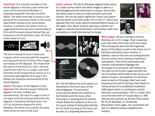
  • 1. Colour scheme- This Arctic Monkeys digipack lacks colour. It is made up from black and white images as well as a black background with white texts or shapes. Due to this the album cover as well as inside and back cover look classier. This can be said to signify the ‘classic rock’ genre that the bands music falls under. This is their 5th album and typically from the studio albums released before (shown on the right), their album artwork and colour scheme isn’t bright or colourful but toned down and simplistic with only one (picture or text) dominating the design. Main Images- All four members of Arctic Monkeys are in this image. They’re wearing suits that make them look smart and classy. This corresponds well with the organised layout of the album as well as the classy use of the black and white colour scheme. In addition, none of the men are looking directly into the camera lens creating a mysterious atmosphere. Their facial expressions lack emotion and therefore highlight the stereotype of a dominant, self-relying man. This idea can be further supported with the use of shadows which adds to the serious and almost ‘ominous’ atmosphere. For the front cover as well as CD design, they have used frequency lines which has been described as a ‘characteristic of an amplitude modulated (AM) signal’ which is a technique used for electronic communication. This is a clever idea since the title of this 5th studio album is ‘AM’ allowing the audience to decide if that stands for ‘Arctic Monkeys’ or ‘Amplitude Modulation’. Once again, the uncertainty and lack of a definite answer empathies the mystery. CD- The CD follows the same pattern as illustrated on the front cover of the album/digipack. This promotes continuity and allows the audience to feel familiar with the music when listening to it. Keeping the CD artwork simple allows the audience to focus on the music instead of being distracted by the CD itself. Focusing on the music can be seen as a repeating feature here. Layout- The layout of the digipack is very organised. The spacing is equal making the digipack not look crowded and overwhelming. The ratio of images to text is not equal since the only text featured in the digipack is located on the back cover. This isn't an uncommon feature for Arctic Monkeys. The white lines used for the wave make up for the lack of text used. Text/Fonts- The only text available on the whole digipack is the back cover where the name of the band ‘Arctic Monkeys’ is displayed along with the track list of the album. The band name text increases in size giving off the impression similar to the sound logo (shown below) as the sound waves increase. In addition, the letters curve up suggesting that this was done intentionally to fit in with the waves (shown below) that are featured on the CD and front cover. All of this relates back to music. The font of the band name is wavy and irregular which contrasts with the simplistic and organised lay out of all the other images and shapes on the digipack. This shows that the nature of the band isn’t strict. The font used for the track list is a simple, sans-serif font that can be recognised by anyone as it is commonly used digitally. Once again, this follows the simplicity and familiarity of the whole digipack.
  • 2. Colour scheme- The colours used for the ‘Blur’ digipack are very bright and bold. They are a continuing feature used in the digipack as you can find them on the front and back cover of the album as well as on the inner part of the CD. The four bright, main colours used are- yellow, blue, green and pink, accompanied by a white ‘filing’ colour for text. The bright colours most probably have the intention to attract the audience when looking at the album. In addition, since colours are featured on the front cover and help determine the difference between each of the members of the band. It is clearly meant for the colours to clash. They even out their boldness by using white as the font of the writing. The back cover is similar. The band went against using the four colours usually associated as the ‘main’ colours- blue, green, yellow and red. Instead they replaces red with pink. Layout- Although the digipack gives off a very busy atmosphere due to the big images and many bright colours used, the layout of it is very organised. The shapes used are mostly coloured rectangles which fill up a lot of space giving the illusion of a full/busy layout. The rectangular theme gives the digipack a neat finish. It is even continued in the inner part of the CD. A mixture of the bright colours accompanied with the rectangular shapes creates a sharp and ‘in-your-face’ look that you can’t miss. Most probably this was done as a way of attracting the audience when the album is on the shelf or when it’s an option for livestreaming/downloading. CD- The CD is extremely simple, it is left completely blank allowing the aluminium surface to dominate the whole design of the CD. The only detail, distinguishing it as a Blur CD, is the four colours that are used throughout the digipack located on the inner part of the CD. Although there is no way of knowing why Blur chose to have these four specific colours on the digipack, they match perfectly with the usual aluminium shine and reflection on a CD. In addition, lack of design on a CD allows for the audience/listeners to focus solely on the music without any distractions. Text/ Fonts- The ‘blur’ text on the front cover establishes who the band are. To help this, the font used is the typical blur logo (shown below). The font used on the back cover for the track list is a simple sans-serif font used on most albums for the track list, Blur have decided to not personalise that part of the album. Main Images- The main images on the front cover are the only ones on the whole digipack and therefore are significant. They are headshots of all four band members, this is important since this digipack comes from the ‘Blur: The Best Of’ album so it is important to show off the band. However, the images are not photographs but instead artwork that looks as though it was made digitally. Although the headshots only have dots for eyes and nose, it is evident that their facial expressions are serious. All members of Blur are also looking directly into the camera lens making the album more personal to the audience since you feel as though the members are looking at you. Through this, they are almost breaking the ‘fourth wall’ between themselves and the audience/listeners. This must play a part in attracting the audience to buy the album. Intertextuality plays a part in this front cover since it bears some similarity to the 1982 Queen album ‘Hot Space’ (shown on the right).
  • 3. Colour scheme- The colour scheme is largely black and white. The front cover, back cover and all the background of the remaining panels are all white. This creates a very classy and simplistic look that allows the audience to focus on the details of the images, that are also very simple and lack complexity. The one differing part of the digipack is the black CD, most probably the most important aspect of a digipack since it stores the music. As a result, you cannot miss it. The digipack also includes colours such as red (for the clothes of some of the band members in the window of the front cover) or blue in the reflection of the windows. This is done very subtly using pastel shades that do not overwhelm the audience yet add a more aesthetically pleasing finish to the digipack. Layout- The layout of the digipack is very organised and minimalistic. Mostly it includes pictures that take up the whole panel/side. The minimalistic nature of the digipack can be seen by the use of the all white panel with a small pattern located in the centre. Proving that the digipack is organised are the almost symmetrical photographs and the writing that is positioned centrally to the given side/panel. CD- The colours of the CD are inverted and stand out from the remaining sides/panels of the digipack. The font and size of writing used on the CD is identical to the font and size used on the front cover of the album. It has no specific pattern yet it is very clear that the CD is from the Mumford and Sons ‘Sigh No More’ album because of the writing on the disk. There are signs of continuity and familiarity since the CD includes a pattern that is included on the opposite white panel of the digipack. Main Images- The main image is a long shot of one house in what looks like a row full of houses. Judging from the awning on the side houses, this is a row of shops and cafes/restaurants. Presumably the four characters in the window of the shop are the four band members of ‘Mumford and Sons’. In the image they are acting as models as they are positioned in a usual place of a mannequin. Their clothing resembles the folk rock music that they preform. In addition, in the picture they are all holding or are stood with instruments (guitars- both acoustic and electric, a cello and an accordion). Once again, this perfectly mirrors their music styles and automatically tells the audience who may not be familiar with the band, what style of music they play. Furthermore, showing continuity, in the picture included on the inner panel of the digipack (shown below) one of the members is playing the trumpet. Continuity is also presented on the album through the use of windows, they make a reoccurring appearance. The picture on the back cover presents just a window, the same one used in the picture from the inner part of the digipack (once again, shown below). Text/Fonts- Most of the space in the digipack is taken up by images and therefore there is minimal space for text. On the front cover as well as the CD, the band name is displayed in a font that has been used on a number of their albums . The font used for the track list on the back cover is a serif font. This is typically more aesthetically pleasing than a sans-serif font. This corresponds with the ‘&’ sign they use for their band name which is seen fancier and prettier than a usual ampersand.