
Recommended
More Related Content
What's hot
What's hot (20)
Similar to In what ways does your media product use
Similar to In what ways does your media product use (20)
More from Alexandrav223
More from Alexandrav223 (20)
Recently uploaded
Recently uploaded (20)
In what ways does your media product use
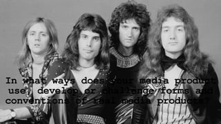
- 1. In what ways does your media product use, develop or challenge forms and conventions of real media products?
- 2. Music Video Andrew Goodwin theorises that there are five conventions of a music video, these are… 1. Relationship between music and visuals 2. Relationship between lyrics and visuals 3. Close up and focus on star personality 4. Intertextuality 5. Voyeurism and notions of looking These conventions can be found in most music videos however we have conformed to some of these conventions but also challenged these conventions.
- 3. Relationship between music and visuals Our music video conformed to this conventions as their several examples of the music matching the visuals o screen. The first example is taken from the beginning of the video and is on the top in the left hand corner. This shot shows a foot walking on the pavement. The foot hits the ground on the beat creating a direct link between the music and visuals. The second to examples show beneath on the left hand side show two people playing their instruments at the same time they are being played in the song, once again creating a direct link. By conforming to this convention it makes the video look smoother and creates a sense of rhythm throughout.
- 4. Relationship between lyrics and visuals The relationship between the lyrics and the visuals is one of the conventions that we did not follow and instead challenged it. Instead of focusing on the lyrics and making sure what was shown in the video at the same time matched instead we focussed more on the narrative of the video and making sure the shots matched the music. The relationship between the lyrics and the visuals isn’t the most crucial convention to follow as if the lyrics and visuals don’t match the music video can still make sense and look good where as if the music and visuals didn’t match the video would look disjointed and strange.
- 5. Close up and focus on star personality Our media product used a lot of close ups throughout the video. We used the close ups to show what our characters were doing or to show how they were feeling. The first examples of this is are the first two images on the right hand side. The second image shows a close up on another charcters face. By using close up the audience can see clearly how the character is feeling and it is a change from the long shots and mid shots used in the video. The third image doesn’t show a character but instead one of the band playing the drums. We broke up the video between a narrative structure and footage of the band playing. By showing the instruments it gives the audience a clearer image of what is happening. The last image on the right hand side shows another one of our characters in a mid shot. By focusing on him it allows the audience to get a good luck at the character as most of what they have seen of him before this was a close up of his foot or his eyes.
- 6. Intertextuality Our video features a couple of examples of intertextuality. The first is when we show Alex stood behind the bars and the second is when we see Charleigh dragging her along, once again behind the bars. We decided to do this as a homage to Francois Truffaut's “The 400 blows”. Truffaut often filmed his main character, Antione, behind bars to signify how he was essentially trapped and how he longed for freedom. We filmed Alex behind the bars as like Antione she was trapped and wanted to be free. The second example of intertextuality is the shot where Sam appears to be talking and moving about at 1:38. This was meant to be another homage to Travis from Martin Scorsese's “Taxi driver” when he is psyching himself up.
- 7. Voyeurism and notions of looking We have conformed to this convention however there are not many examples of voyeurism and notions of looking in our video because its narrative doesn’t involve a lot of watching or looking. However there are a couple of examples of it in our video. The first two examples on the left hand side show two close ups of Sam’s eyes. By looking directly into the camera it gives the appearance of looking straight at the audience and makes them feel as though they are right there. The other example is of Charleigh holding a banana and looking directly into the camera. Once again this makes the audience feel as though they are in the video.
- 8. Magazine Advert Our magazine advert conforms to all of the conventions that you would expect from an advert. Unlike a music video however if we didn’t conform to the conventions our advert wouldn’t be very effective at all. Some of the conventions of a magazine advert are… 1. Name of band 2. Name of album 3. Release date 4. Recording studio logo 5. What it is available on
- 9. The name of the band and of the album are displayed on the top of the magazine so that it is the first thing that the reader sees. This catches their eye and makes them want to read more if they are a fan of the band. By displaying the logos of apps that the album is available on it shows that it is easily accessible for everyone. The recording studio label gives a potential customer an idea of where it is from. The release date and the website of the Band is displayed towards the bottom of the advert. The release date is a crucial convention to conform to as without it no one would know when they would be able to purchase it. The website means that if a customer wants more information they can go online and look on the website. The main image used is effective for catching the audiences eye as the eyes are all looking directly into the camera. It makes the audience feel a though they are being watched. It is effective as it will attract the readers attention.
- 10. Digipak
- 11. Front cover For our digipak we have used a logo for Queen so that our audience will be able to recognise the band. We have also used the same background as was used for the magazine advert as well as the same fonts for the name of the band and of the album. By using the same fonts we are establishing a sense of continuity between two of our media products. Conforming to the conventions of the front cover was essential to creating an effective digipak.
- 12. Back cover The back cover for our Digipak once again conforms to the conventions that you would expect to find on the back of a digipak. It contains a track listing for the CD and what is on the CD, as well as the barcode and recording studio logo. All of these conventions are important as they let the customer know exactly what they are buying as well as what to expect from the digipak. By conforming to these conventions we have made a more effective digipak that we would of done had we not conformed.
- 13. CD and DVD For our CD and DVD we have used images instead of leaving it blank or with one block colour as some digipaks do. For the CD we have used a close up of Alex's hands whilst for our DVD we have used a silhouette of one of our models doing an iconic Freddy Mercury pose. We have challenged the convention of having the track listing on the CD and using an image linked to the music video instead. We decided to do this so that our digipak would link to both the music video and to the original band itself.