
Recommended
More Related Content
What's hot
What's hot (19)
Viewers also liked
Viewers also liked (20)
Similar to Task 4 final images review work sheet potrait
Similar to Task 4 final images review work sheet potrait (20)
More from AlexNesbit
More from AlexNesbit (20)
Recently uploaded
Recently uploaded (20)
Task 4 final images review work sheet potrait
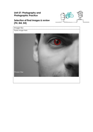
- 1. Unit 57: Photography and Photographic Practice Selection of final images & review (P4, M4, D4) Image No: Paste image here Picture One
- 6. Picture Ten
- 7. Theme or focus of image & reasons for choice I’d say that the themes of the photographs that I analysed in the proposal are quite similar to my images because Image One, Three, Seven and Ten are all in black and white and in one of the images I analysed it was in black and white and it shows of the Djs and I’d say I’ve shown this in those images plus the reason for this was because they look really good in black and white because they look abit dull in colour. Then there was another image which showed the decks of the Dj, I did a similar thing but still shown the Dj because it is a portrait shoot. You can see that I applied this to picture Five, Six and Seven they all show the Dj but also shows there decks which is what I wanted in the proposal but I did this because it had to at least show the Dj because it wouldn’t have been a portrait if it was just the decks. Finally there was one image and this was my Idea that I could think of it was an image of the artist looking at the audience and the shoot is behind him and I applied this to picture Two, it shows a performance in this eye, I did this because the idea was that he was seeing his future and the key to that was to look in his eye, he was a Dj so you’d expect to see a Dj perform with a big crowd which explains what is shown in the image. So all my images are almost similar to the ones I analysed in the proposal which I think would consider as a success. Techniques used In order for my photos to look originally as good the aperture, iso and shutter speed were the most important of them all because the depth of field was added in some of the images and added to some on the edited part of the project, Firstly when I took my images they needed to all alter because of the light changed during the shooting because some images looked good in the dark and some good in the light which was a pain because I had to change the aperture to make sure it was right, Then I have the shutter was fast just because I wasn’t catching any movement, Finally there was the ISO it changed depending on light because I changed it when we turned the lights on and off. Strengths & suggested improvements Most of my images look professional because of the black and white effect or the colour change or the blur effect, on the other hand some of the original images that I had to choose from were to blurry for me to use even picture Nine was originally blurry but I edited to make it look not as bad but also some of my images showed luminous lights which were a hassle because there were smaller pixels of colours that weren’t the same colour but a darker/lighter of the colour of the light which was very had to select so I couldn’t use the colour cancellation on those colours, so next time I probably will use less lighting so the image will be able to use the colour cancellation of a certain colour. So overall when I do another photo shoot I make sure the lights are right for the setting and make sure I get clear photos that are not too blurry when choosing images. Editing details Picture One – this was my most created of images, Firstly I added a duplicate layer of the originally photo, then I added a black and white effect to the top image causing the image to go black and white, then I selected the eye and nothing else, I deleted the black and white effect over the eye which then revealed the colour version of the eye. Then I selected the iris of the eye and copied it and put it on a separate layer, I decided on the colour red, so I used the setting colour balance to change to red, it was the right red that I wanted so then I went on the image then adjustments and went on the variations tool which made me be able to change the colour of the red and making me able to get the right red, then finally I added a brush of cracked
- 8. glass and added it too the pupil. Picture Two – the process for this image was my idea it was an easy process, firstly I opened an image of the person but his hands In the air and selected only him in the shot, then make him smaller so he fits in the eye and then I turned down the opacity so it looked abit transparent, then I got a crowd suitable for the picture and turned the opacity down as well to the crowd and finally turned the saturation up a little bit. Picture Three – I just changed it to black and white because I just wanted to keep it simply but it still looks good because it is still simply and it shows off a picture I analysed on the proposal Picture Four - I changed the hue and saturation to the image but also gave it a gradient map which was green to red and changed the blend mode so it went over the colour which then this is what I got for the final edit. Picture Five – all I did for this image was blur out the background and boosted up the contrast. I used a Gaussian blur this is very useful blur because it is the most effect for editing. Picture Six – For this image I added six setting to the picture; Brightness, Contrast, Exposure, Hue, Saturation and channel mixer. Firstly I added Channel Mixer, I added more of the red channel but also lower the constant and it games me an aqua feel to the image. Next I added the Hue and Saturation, I turned the saturation down and made it a little bit lighter this made the image felt more dull bit it wasn’t exactly finished because next was the exposure, I turned exposure and the gamma collection up just a little and it made my image less dull and made it lighter and exposed the dullness. Finally there was the Brightness and Contrast, I boosted the brightness and left the contrast and then this final Image. Picture Seven – this was a simple process I duplicated my original image, then turned the bottom layer black and white then erased everything except the green light on the collar so it has a colour cancellation. Picture Eight – I did the same as picture Seven for this edit but instead of the green glow on the collar this time I didn’t erase the red lens flare but also captures the reflection on the person. Picture Nine – I added a blur around the person but also added a photo filter, the filter I used was a warming filter and turned the density to almost 100%. Picture Ten – For this Image I duplicated the image for the first layer I turned it into black and white but also gave it a Gaussian blur so it would focus on the person, then for the second layer, I erased the back so you could see the black and white effect but also can see the blur effect, then added a photo filter to the second image but before that, I selected what I wanted to be in effect. So I selected the person this then made a mask causing it to only go the person going into effect then I changed that effect to warming filter and turned the density to its fullest. Capture Log Setting Shutter Speed ISO Aperture All pictures were in All pictures were in All pictures were in All pictures were in
- 9. manual Picture One Picture Two Picture Three Picture Four Picture Five Picture Six Picture Seven Picture Eight Picture Nine Picture Ten manual 1/15 Secs 1/15 Secs 1/13 Secs ¼ Secs 1/3 Secs 1/15 Secs ¼ Secs 1/3 Secs 0.62 Secs 1/6 Secs manual 400 500 800 3200 800 3200 800 800 800 800 manual 4.8 4.8 4.2 4.5 3.6 3.6 3.6 4.4 4.7 3.8
- 10. manual Picture One Picture Two Picture Three Picture Four Picture Five Picture Six Picture Seven Picture Eight Picture Nine Picture Ten manual 1/15 Secs 1/15 Secs 1/13 Secs ¼ Secs 1/3 Secs 1/15 Secs ¼ Secs 1/3 Secs 0.62 Secs 1/6 Secs manual 400 500 800 3200 800 3200 800 800 800 800 manual 4.8 4.8 4.2 4.5 3.6 3.6 3.6 4.4 4.7 3.8