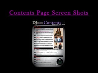
2. Step One For the background of my contents page I felt it fitting to keep one that resembled the front cover to present the link between the two. However, I did decide to enlarge the spotlight affect allowing text to be easily read and a large area of focus as this would be filled with image and text. I created a banner to sit at the top for a scaled down Masthead to be seen. Applying the masthead is a convention of music magazine, I preferred it on the left hand side as it resembled that on the front cover. To this banner I included ‘Contents’ in larger text, this would make it stand out and be identifiable for readers. The use of purple font meant it stuck within ‘DJ Talk’s colours. Below this is white text, another colour found in ‘DJ Talk’ I placed the issue date and number. In the main section of the page I placed small banners with titles for each section of my content features, (The Artists, The Look and Plus). These were in red font to stick with the house theme continue from the front cover. It also meant it stood out from the colour other texts on the page.
3. Step Two To the contents page I added page numbers for my magazine stories, these were placed to left hand side as I felt it was easily read this way and better to identify what can be found where. Below each section I added a brief description of each article highlighting and enlarging the names of artists/personalities who were the main focus of each article. This allowed readers who would perhaps scan the contents page to have their attention drawn to the name and then easily identify which article to read. I made sure to leave space towards the top for my images. My text was placed within the spotlight section so it is easily seen by the audience.
4. Step F Step Three To the right of my text towards the top of my text I placed three images in relation to other article found in my magazine. This allows my audience to identify what can be found and create a link between some of the articles listed and the image itself. To the left of these images I placed an enlarged page number so that if my audience’s attention be drawn to the image first they can identify its page number before even looking at contents features and its description. I also included a flasher found on the front cover, ‘20 Stars to follow on Twitter’ this would help remind the audience of this additional article and with a page number next to it they would know where to find it.
5. Final Contents Page My final Contents page greatly remains within the same theme and edgy look on the front cover. This helps the audience establish the magazine’s look and what they can expect inside. Images used resembled those I found in other Hip-Hop/R&B magazine. The use of three images allowed what would usually be a heavily text based page to have something different and to look at. I felt this broke up the page well and stopped the amount of texting appearing over-whelming. I believe my Contents page looked most professional and all its features easy to read which was most important.