Captivating Charm: Exploring Marseille's Hillside Villas with Our 3D Architec...
Progress
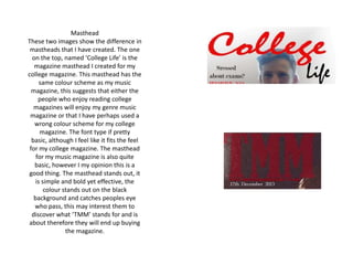
1. Masthead
These two images show the difference in
mastheads that I have created. The one
on the top, named ‘College Life’ is the
magazine masthead I created for my
college magazine. This masthead has the
same colour scheme as my music
magazine, this suggests that either the
people who enjoy reading college
magazines will enjoy my genre music
magazine or that I have perhaps used a
wrong colour scheme for my college
magazine. The font type if pretty
basic, although I feel like it fits the feel
for my college magazine. The masthead
for my music magazine is also quite
basic, however I my opinion this is a
good thing. The masthead stands out, it
is simple and bold yet effective, the
colour stands out on the black
background and catches peoples eye
who pass, this may interest them to
discover what ‘TMM’ stands for and is
about therefore they will end up buying
the magazine.
2. Sell lines.
• The sell lines within my college magazine
were very basic, I had used the same plain
font and stuck to a basic colour scheme of
red and black. This doesn’t look very
professional at all, the font makes the piece
look it has been made very quickly and
rushed. However the positioning of the sell
lines are in the correct place. The sell lines
for my final magazine are much more
appropriate for my music genre and the
target audience. I used a variety of fonts
and colours which again matches my target
audience. The sell lines are more intriguing
than the ones used on the college
magazine, these will interest people but
not give too much away so they will want
to buy and read the magazine.
3. Strap line
• The strap line used for my magazine that I designed for the college magazine is very plain, although the
colour scheme is one that I stuck to throughout most of my final product I believe within this certain task it
doesn’t fit well. The font is very bold and has a ‘in your face’ type feel to it. Whereas the strap line for my
final magazine is a lot more subtle , the colour matches well with the rest of the design and using a large
but thin font in my opinion makes the magazine look more professional, it is also a way to get more
information onto my magazine cover, giving the reader a better idea of what is inside the magazine front
just looking at the cover quickly.