
Recommended
More Related Content
What's hot
What's hot (20)
Viewers also liked
Similar to Similar conventions of a contents page media
Similar to Similar conventions of a contents page media (20)
Recently uploaded
Recently uploaded (20)
Similar conventions of a contents page media
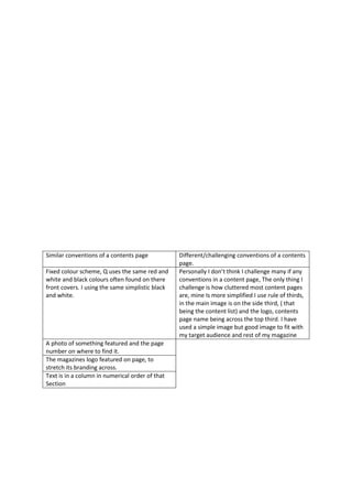
- 1. Similar conventions of a contents page Different/challenging conventions of a contents page. Fixed colour scheme, Q uses the same red and white and black colours often found on there front covers. I using the same simplistic black and white. Personally I don’t think I challenge many if any conventions in a content page, The only thing I challenge is how cluttered most content pages are, mine Is more simplified I use rule of thirds, in the main image is on the side third, ( that being the content list) and the logo, contents page name being across the top third. I have used a simple image but good image to fit with my target audience and rest of my magazine A photo of something featured and the page number on where to find it. The magazines logo featured on page, to stretch its branding across. Text is in a column in numerical order of that Section