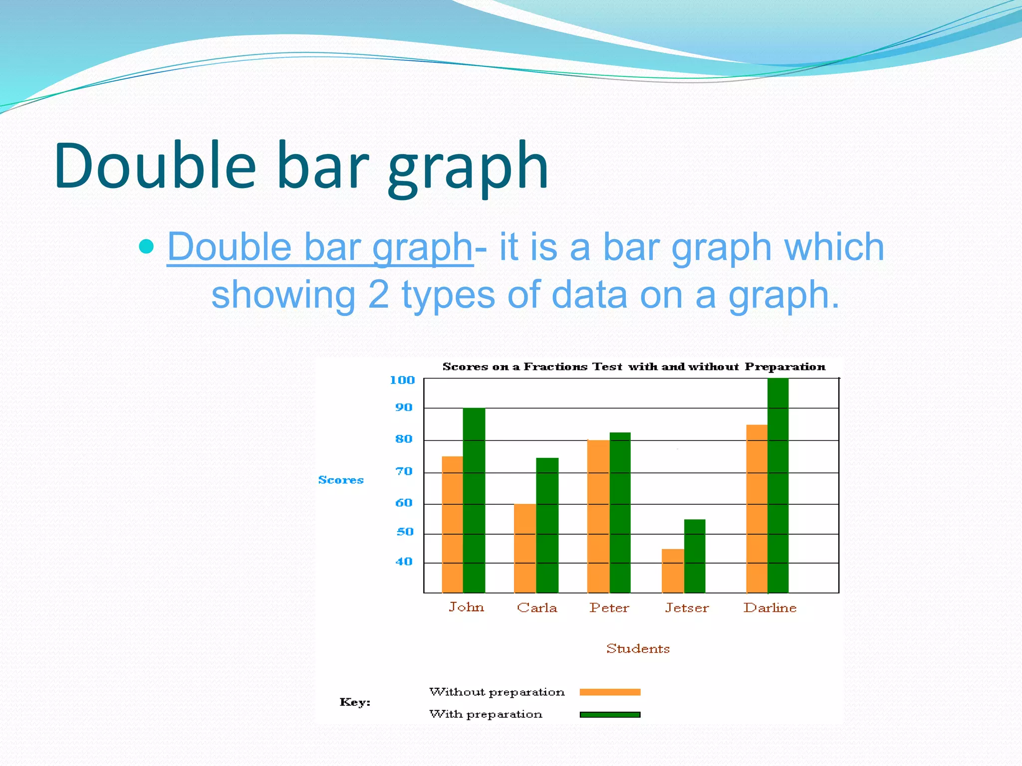
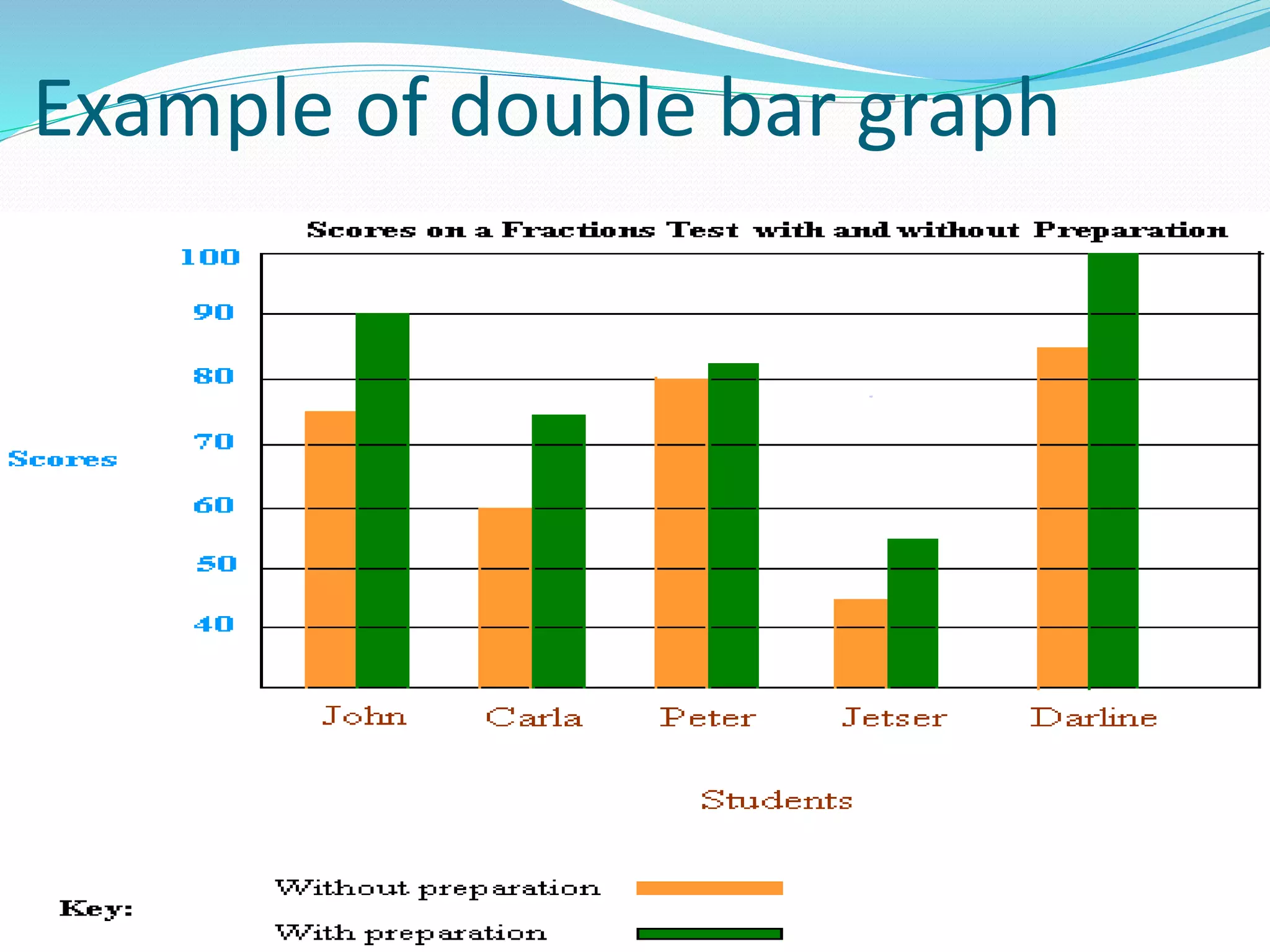
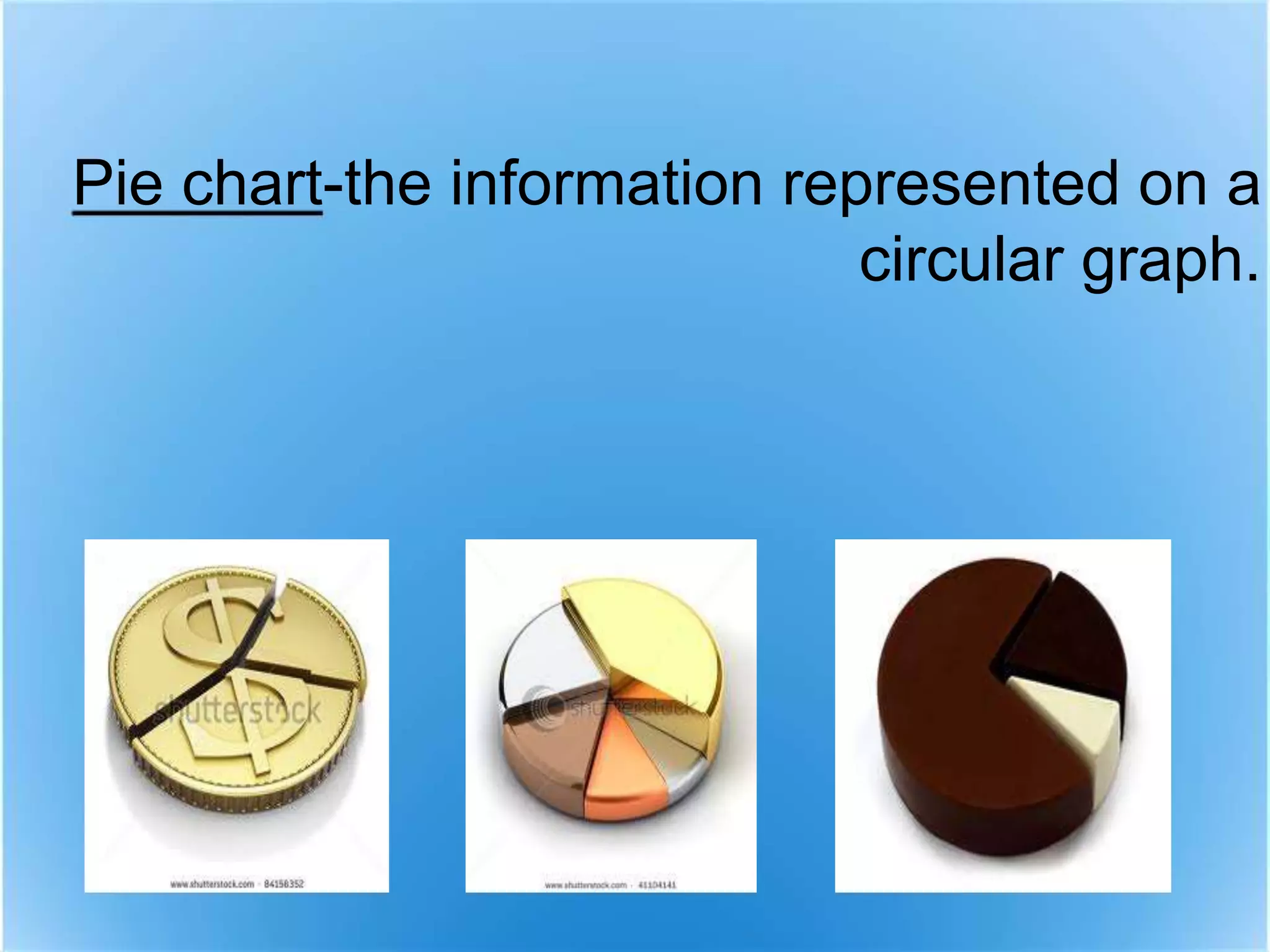
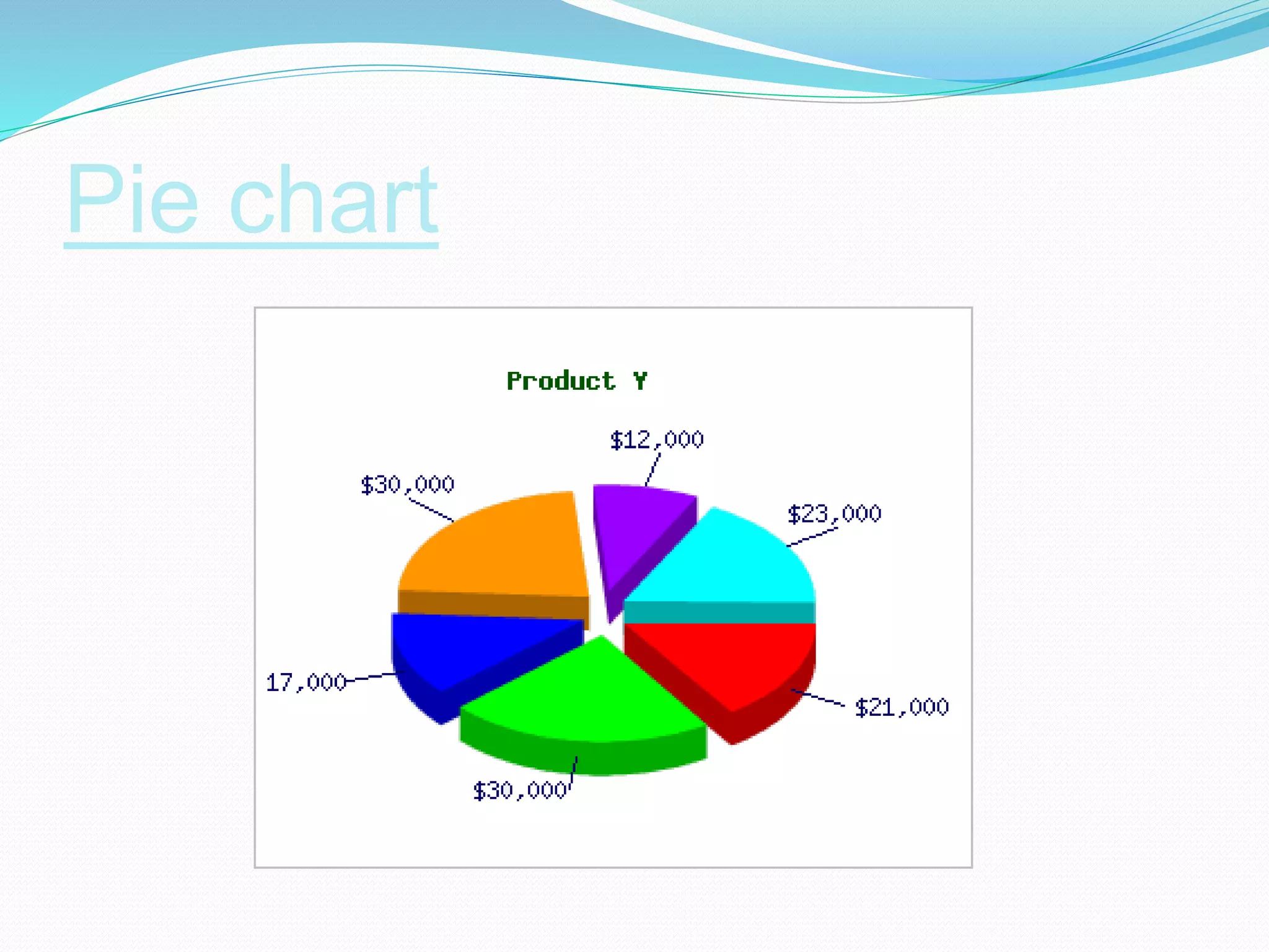
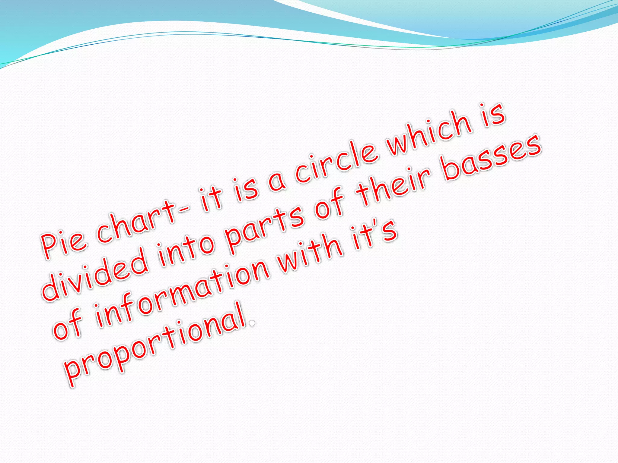
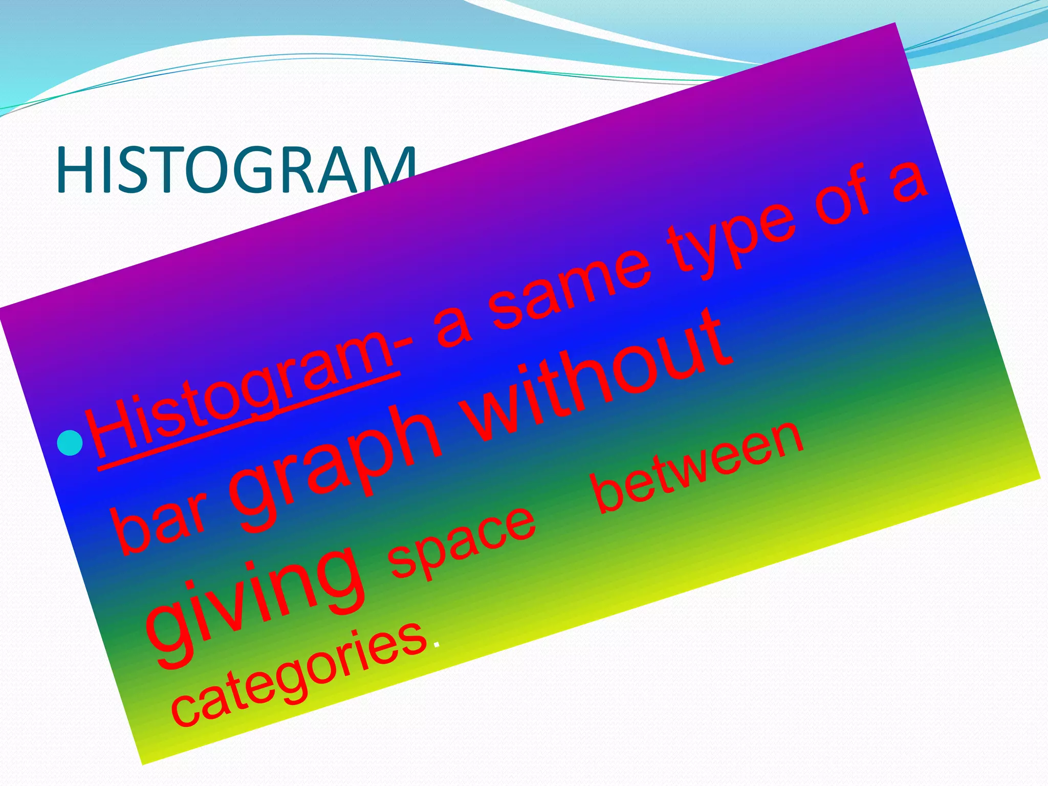
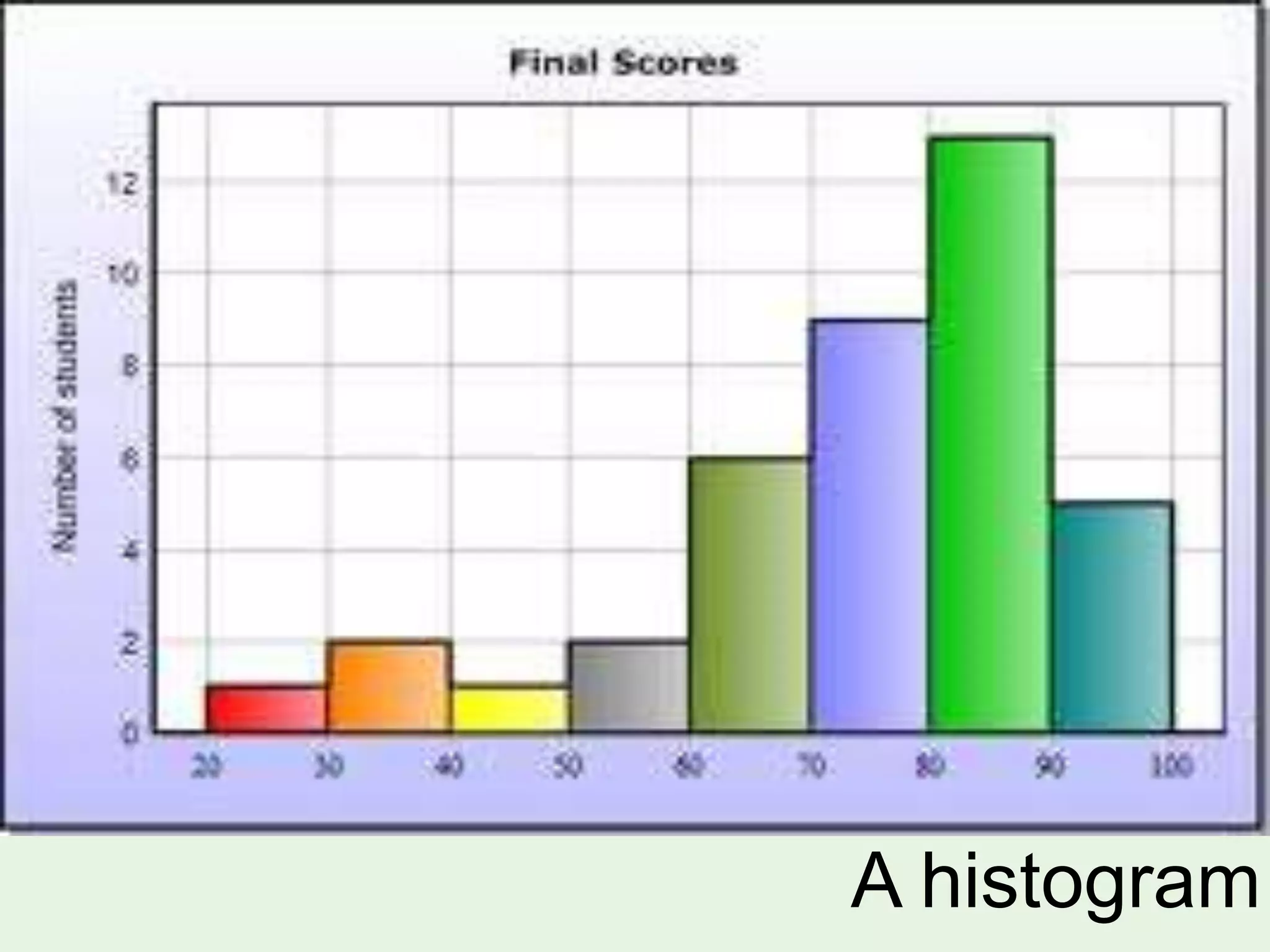
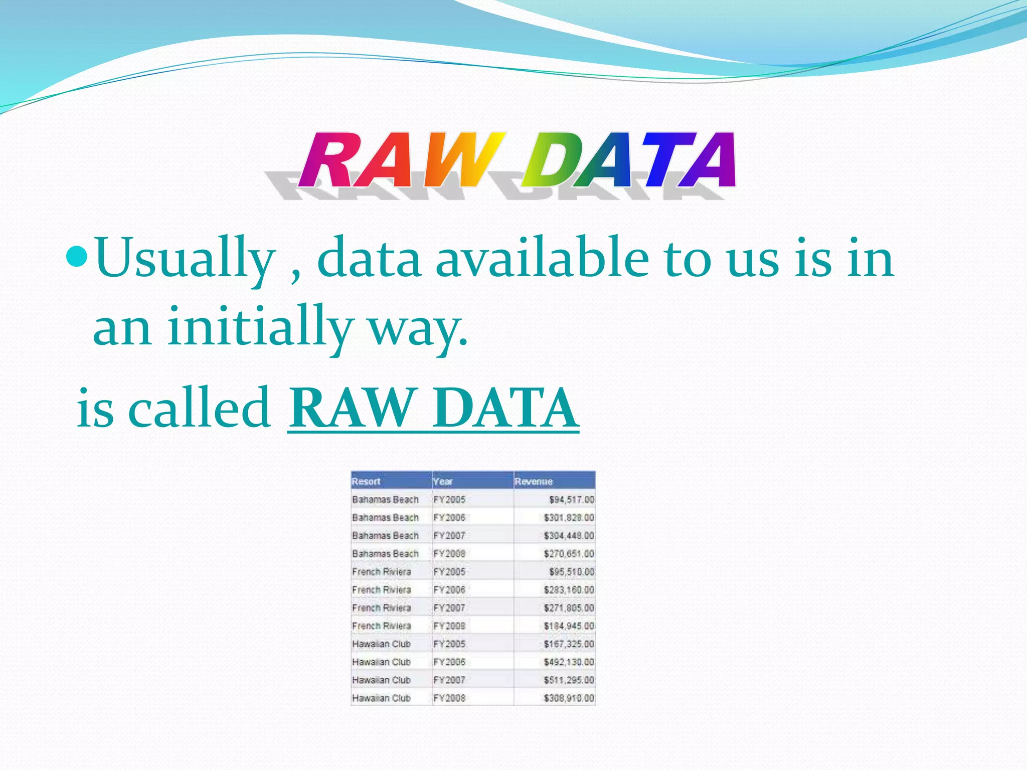
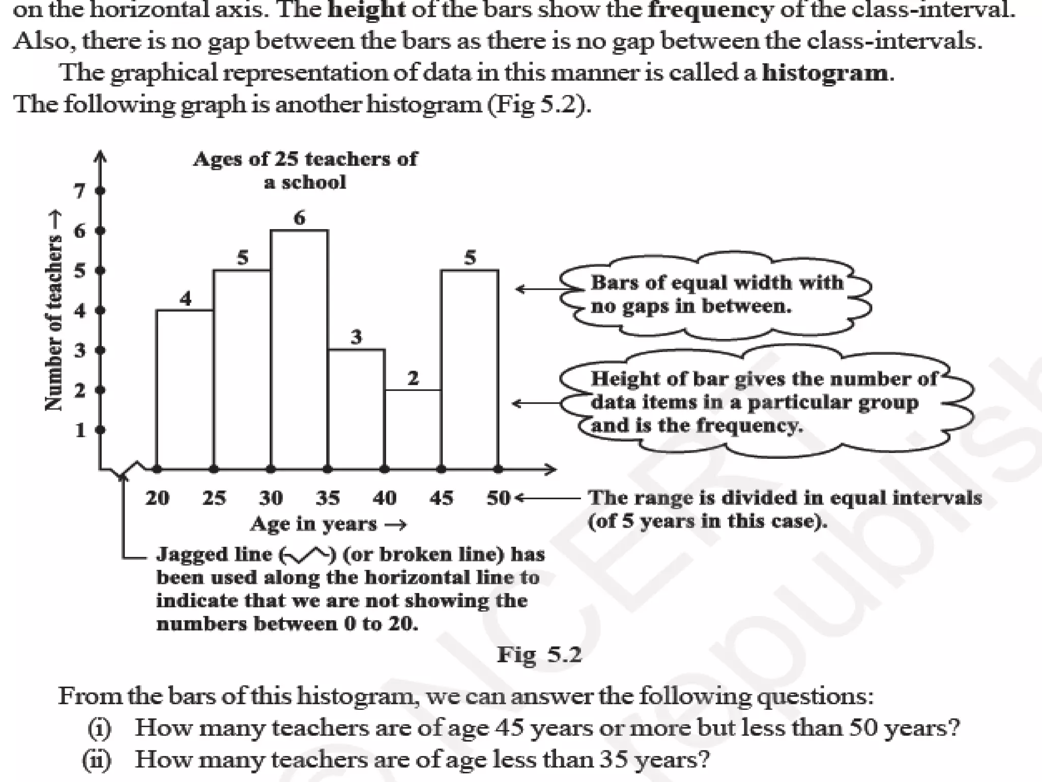
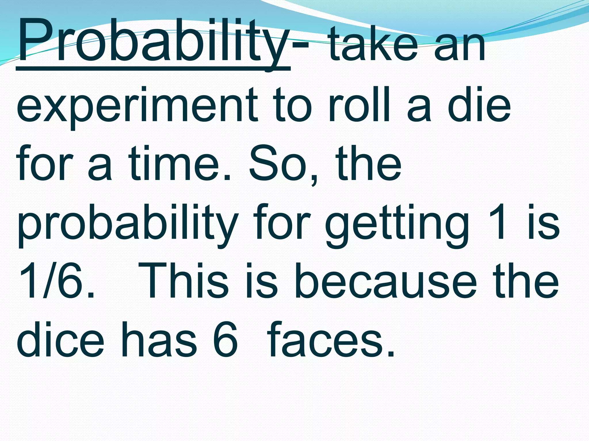
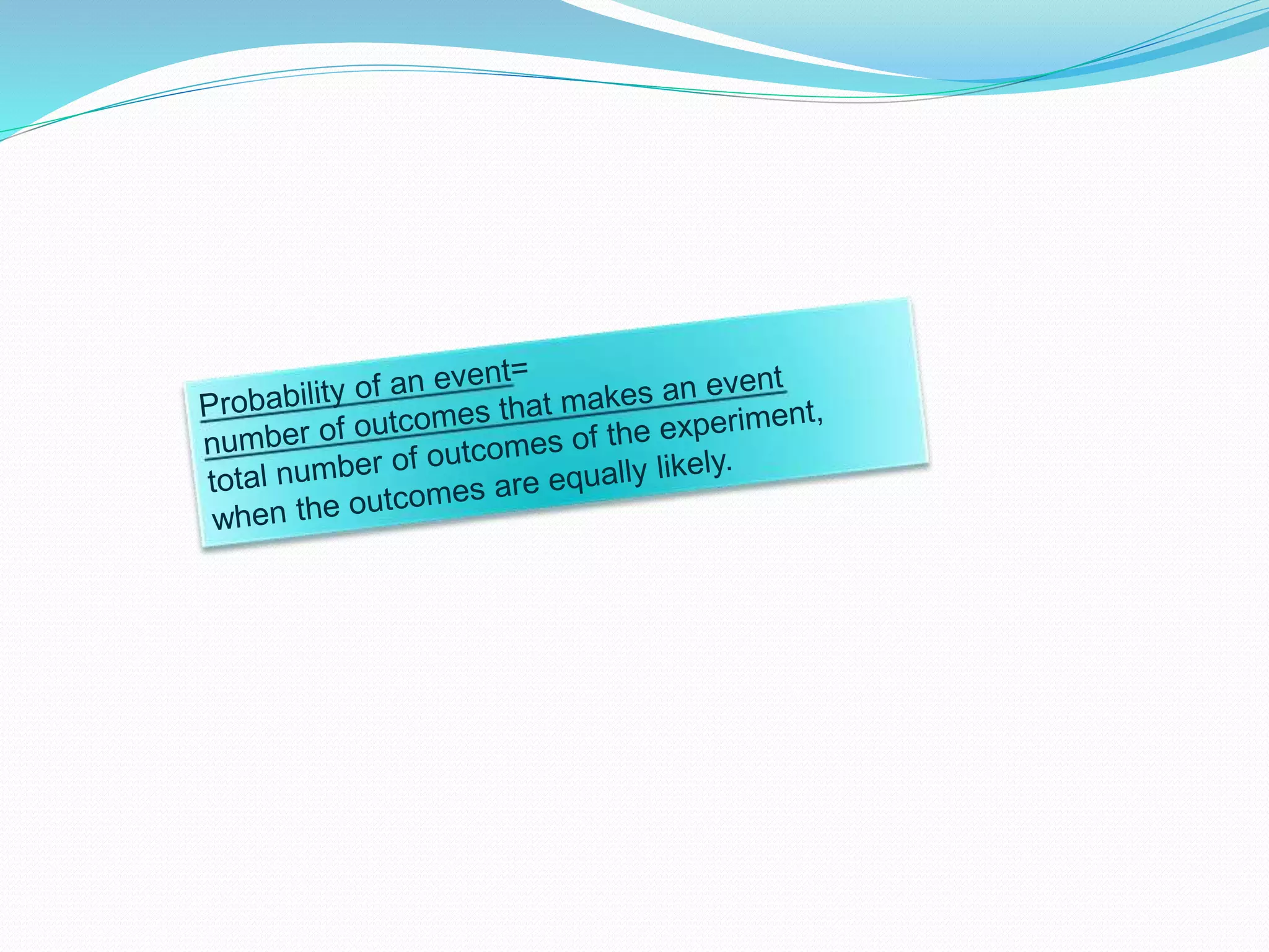
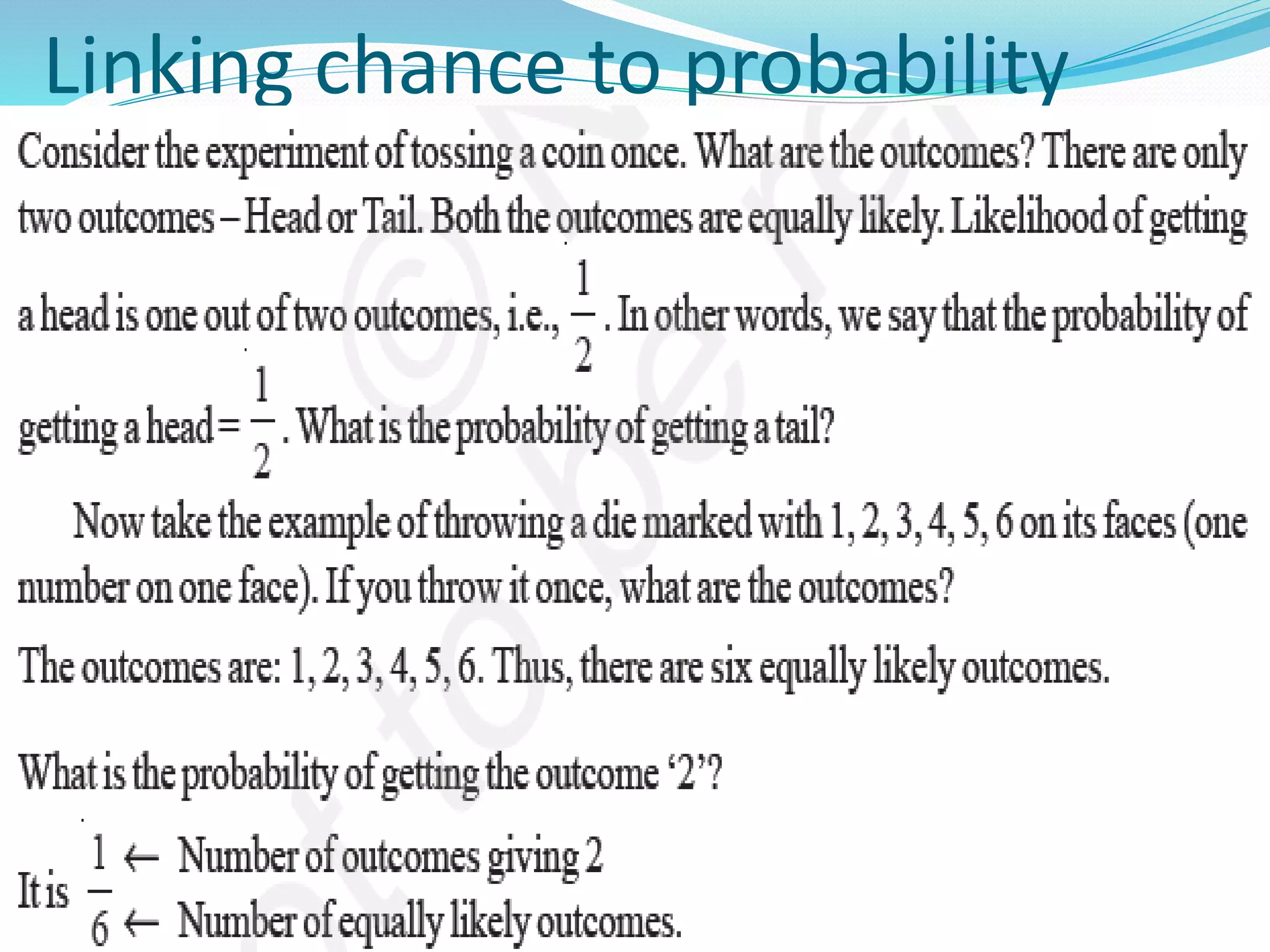
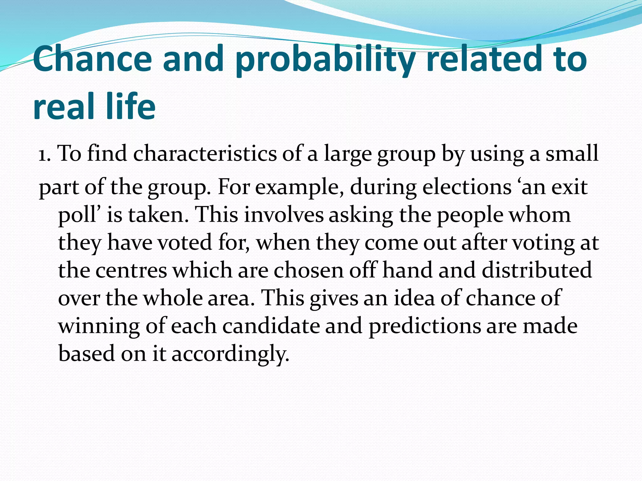
Organizing and presenting data in a systematic manner allows for meaningful analysis and interpretation. Raw data can be grouped and displayed through methods like frequency distribution tables, histograms, pie charts, and other graphs. These graphical representations make it easier to understand relationships in data and identify trends. Probability is used to quantify chance and predict outcomes of random experiments where each result is equally likely. It is calculated by dividing the number of favorable outcomes by the total number of possible outcomes.