
Recommended
More Related Content
Viewers also liked
Viewers also liked (15)
Similar to COLLEGE MAGAZINE EVALUATION
Similar to COLLEGE MAGAZINE EVALUATION (20)
Recently uploaded
Recently uploaded (20)
COLLEGE MAGAZINE EVALUATION
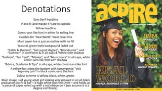
- 1. Denotations Sans Serif headline P and R (and maybe S?) are in capitals Yellow headline Comic-sans like font in white for selling line Capitals for “Real World” main cover line Main cover line is just an outline with no fill Natural, green leafy background faded out “Caleb & Student”, “Get a grad degree”, “Blockbuster”, and “Summer” in serif fonts & in all-caps & Yellow with shadow “Fashion”, “For free!”, “Movies”, and “Music tours” in all-caps, white comic-sans like font with shadow “Advice, Guidance & Tips” in all-caps, white comic-sans like font A yellow bar along the bottom with convergence “visit Aspireny.com” in black comic-sans like font Colour scheme is yellow, black, white, green. Main image is of young adult girl looking very pleased in an all-black graduation outfit & hat – a huge white-toothed smile – and holds up a piece of paper rolled up with a red ribbon on it (we assume it is a degree certificate).
- 2. Typography • Sans Serif bold headline makes it look less fancy, but no less professional, as it can look neater in sans serif. ‘P’, ‘R’, and possibly ‘S’ are capitalised, leaving the vowels capitalised, which some people may see as aesthetically attractive, or interesting. It makes their headline and brand unique. • The comic-sans like font for the selling adds a fun, less serious edge to the magazine, showing that they are interested in more than the degrees, and more about student life.
- 3. Typography • “Celeb & Student”, “Get a grad degree”, “Blockbuster”, and “Summer” are in all-capitals, making them bolder and more interesting to the eye. Their serif fonts add a slightly professional edge to it, and differ to the title. • “Fashion”, “For free!”, “Movies”, and “Music tours” the same white comic-sans-like font as the selling line and, with the different font to the first part of the sentence or phrase, the audience often always mentally pauses between, for example, saying “Blockbuster” and “Movies”, adding more emphasis therefore more intrigue. • The cover lines also have a drop-shadow affect to them, making them bold, and appear to jump off the page, attracting attention to them and making them seem more interesting.
- 4. Typography • Capitals for “Real World” main cover line, showing the importance of it. It is in stencil form with no fill. This different form of typography may show the importance of it again, and attract attention to it. Some people may find this aesthetically attractive or interesting. The words “REAL WORLD” will also attract the attention of students who are scared about, excited for, unsure about, etc. going into what everyone outside of education describes as the ‘real world’. • A yellow bar along the bottom with convergence “visit Aspireny.com”. The convergence works well for students, as they are known for using technology heavily in their education and life. The black against the yellow also keeps in touch with the yellow/white/black/green colour scheme (yellow and black together can also symbolise loyalty).
- 5. Image • Yellow, bright like this, connotes happiness and energy, and may hint at offering a student a happy future. • The use of white fonts may be down to white, like black, going well with practically any other colour. It also makes it brighter, reflecting the ‘bright’ future they want to offer their student readers. • Main image is of young adult girl. This will attract the attention of students, who are often young adults. It will also attract a female audience, as they are represented on the cover. It may also draw the male gaze (though this is not a convention that is strongly hinted at, as she is not at all sexualised). • She superimposes the title, making her more important than the magazine but, as it is behind her, it’s helping her along and ‘has her back’ in the graduation process.
- 6. Image • She is looking very pleased with a huge white- toothed smile. A smile is more likely to attract an audience than a (non-sexualised) frown. A white- toothed smile is often always associated with success (particularly economical). • She is in an all-black graduation outfit & hat which, again, attracts the attention of students who wear (or strive to wear) this attire that symbolises their success in their graduation, and has strong connotations with joy (the hat is seen as something that is thrown in celebration). • She holds up a piece of paper rolled up with a red ribbon on it, which the audience assumes is a diploma due to her attire and positive-looking attitude. The red could also symbolise power.