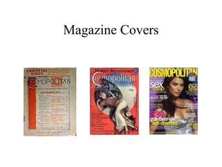
Magazine Covers
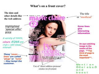
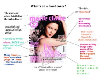
What’s on a front cover? The title or ‘ masthead ’ Cover lines give interesting information Mention ‘Celebs’ and boost sales! Use of ‘direct address pronoun’  creates involvement The date and other details like the web address A variety of  fonts ,  colours ,  sizes  and  styles  add visual interest. These ‘ cover   lines ’ are called ‘ plugs ’ or  ‘ lures ’ – they tempt the customer. Highlighted ‘special offer’ price An eye-catching image in the centre of the page.  ** Top third of page is the most important**.
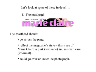
Let’s look at some of these in detail… The Masthead should: 1.  The masthead: go across the page; reflect the magazine’s style – this issue of Marie Claire is pink (feminine) and in small case (informal). could go over or under the photograph.
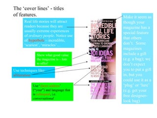
The ‘cover lines’ - titles of features. Make it seem as though your magazine has a special feature that others don’t.  Some magazines include a gift (e.g. a bag); we don’t expect you to put a gift in, but you could use it as a ‘plug’ or ‘lure’ (e.g. get your free designer-look bag) Show what good value the magazine is – lots to offer! Real life stories will attract readers because they are usually extreme experiences of  ordinary people . Notice use of  hyperbole  – incredible, ‘scariest’, ‘miracles’… Use techniques like:  alliteration Use ‘ direct   address ’ (“your”) and language that is  colloquial , i.e.  conversational
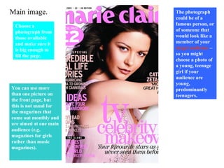
Main image. Choose a photograph from those available and make sure it is big enough to fill the page.   The photograph could be of a famous person, or of someone that would look like a member of your  target audience  – so you might choose a photo of a young, teenage girl if your audience are young, predominantly  teenagers. You can use more than one picture on the front page, but this is not usual for the magazines that come out monthly and are aimed at one main audience (e.g. magazines for girls rather than music magazines).
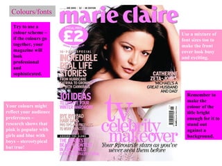
Colours/fonts Try to use a colour scheme – if the colours go together, your magazine will look professional and sophisticated. Your colours might reflect your audience preferences – research shows that pink is popular with girls and blue with boys – stereotypical but true! Use a mixture of font sizes too to make the front cover look busy and exciting. Remember to make the colour of the title bright enough for it to stand out against a background.
What do you need to consider when planning your magazine cover? Target audience? Name of the magazine? Type of features? What language will be used in the titles? Type of person in the main photograph? Start planning!
What’s on a front cover? The title or ‘ masthead ’ Cover lines give interesting information Mention ‘Celebs’ and boost sales! Use of ‘direct address pronoun’  creates involvement Don’t forget:  Alliteration… Hyperbole… Chatty, friendly style The date and other details like the web address A variety of  fonts ,  colours ,  sizes  and  styles  add visual interest. These ‘ cover   lines ’ are called ‘ plugs ’ or  ‘ lures ’ – they tempt the customer. Highlighted ‘special offer’ price An eye-catching image in the centre of the page.  ** Top third of page is the most important**.

Magazine Covers

  • 1.
  • 2.
    What’s on afront cover? The title or ‘ masthead ’ Cover lines give interesting information Mention ‘Celebs’ and boost sales! Use of ‘direct address pronoun’ creates involvement The date and other details like the web address A variety of fonts , colours , sizes and styles add visual interest. These ‘ cover lines ’ are called ‘ plugs ’ or ‘ lures ’ – they tempt the customer. Highlighted ‘special offer’ price An eye-catching image in the centre of the page. ** Top third of page is the most important**.
  • 3.
    Let’s look atsome of these in detail… The Masthead should: 1. The masthead: go across the page; reflect the magazine’s style – this issue of Marie Claire is pink (feminine) and in small case (informal). could go over or under the photograph.
  • 4.
    The ‘cover lines’- titles of features. Make it seem as though your magazine has a special feature that others don’t. Some magazines include a gift (e.g. a bag); we don’t expect you to put a gift in, but you could use it as a ‘plug’ or ‘lure’ (e.g. get your free designer-look bag) Show what good value the magazine is – lots to offer! Real life stories will attract readers because they are usually extreme experiences of ordinary people . Notice use of hyperbole – incredible, ‘scariest’, ‘miracles’… Use techniques like: alliteration Use ‘ direct address ’ (“your”) and language that is colloquial , i.e. conversational
  • 5.
    Main image. Choosea photograph from those available and make sure it is big enough to fill the page. The photograph could be of a famous person, or of someone that would look like a member of your target audience – so you might choose a photo of a young, teenage girl if your audience are young, predominantly teenagers. You can use more than one picture on the front page, but this is not usual for the magazines that come out monthly and are aimed at one main audience (e.g. magazines for girls rather than music magazines).
  • 6.
    Colours/fonts Try touse a colour scheme – if the colours go together, your magazine will look professional and sophisticated. Your colours might reflect your audience preferences – research shows that pink is popular with girls and blue with boys – stereotypical but true! Use a mixture of font sizes too to make the front cover look busy and exciting. Remember to make the colour of the title bright enough for it to stand out against a background.
  • 7.
    What do youneed to consider when planning your magazine cover? Target audience? Name of the magazine? Type of features? What language will be used in the titles? Type of person in the main photograph? Start planning!
  • 8.
    What’s on afront cover? The title or ‘ masthead ’ Cover lines give interesting information Mention ‘Celebs’ and boost sales! Use of ‘direct address pronoun’ creates involvement Don’t forget: Alliteration… Hyperbole… Chatty, friendly style The date and other details like the web address A variety of fonts , colours , sizes and styles add visual interest. These ‘ cover lines ’ are called ‘ plugs ’ or ‘ lures ’ – they tempt the customer. Highlighted ‘special offer’ price An eye-catching image in the centre of the page. ** Top third of page is the most important**.