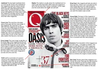
1. masthead:The big bright masthead which
is on the top left corner is the masthead of
this magazine.It used the colours red and
white fits in with the colour scheme of the
front cover(red ,white and black),I think
these colour can contract with each other
but go well together,and these colour make
this magazine a stronger sense of visual
impact,so it will more attractive the audi-ence
than other magazines.
Cover Image:The cover image usually fills up
the whole page of the magazine,and this per-son
always decide the main story of the mag-azine.
From this magazine ,we can see the
cover image is a black and white photo,I think
this is very special.In my opinion,they use that
because OASIS is a rock band,so they use
the “rock colour” of the cover. image,and it
can also echo the cover line.
Drop Cap:In this magazine,all texts are write in
drop cap.First, I think it can it can stand out the
main stories.Second,it can make the layout
more orderly.They only use red and black as
the colour of font,there both bright colour,so it
can catch the reader’s eyes as well.
Cover Line:The cover line is the large
piece of text goes with the cover image ,in
this magazine the cover line is ‘OA-SIS’.
From this magazine,we can see,the
cover line’s font is the largest,so for the
reader,it will easy to find.The colour of the
cover line is black,in my opinion,because
OASIS play rock music,and black is the
symbol colour of rock, so this colour im-plies
readers that they are a rock band.
Puff:A puff is a promotion of a product
service,on this magazine the puff is pro-moting
the covers that can be collect in
the magazine,this may attract the readers
who like collect something,it will help the
magazine sell itself as well.
Skyline:The skyline is usually above the masthead and it is
used to add extra information either about the magazine it-self
or the top story.Here it gives a evaluation of this maga-zine
that would attract the reader and sell itself.
House Style:The layout of this magazine is
very simple.They put the main story on the right
of the magazine,and the cover story on the left.I
think the special thing is they want to stand out
the cover story,so they use the big black font
only in the cover line,and stay a sentence by
Liam Gallagher of OASIS,this may attract more
readers’ interest,and the ellipsis create more
suspense.The whole cover use the red and
black the most ,they also use a little blue and
white to decorate.The good thing is they use
blue for the puff,so it will be stand out and at-tract
readers,also,they use black and white
photo as the cover image is very special,and
this is consistent with their band property.
Exclusive:From the bottom of the magazine we
can see a sign—“+37 pages of reviews”.This
signs is quite different from other magazines,
this means there will have more colourful de-tails,
so it will attract the readers to buy it.I think
this review is about recently new live or some
new albums,it can also help to promote the al-bums
or enhance the singers or bands visibility .
Bar Code:The bar code of this magazine is on
the low left corner.There also the date line,price
and the website.It can tell the readers clearly
the price of the magazine, and it also provide
more information for the readers on the web-site.