1) The document discusses the layout and design principles of a magazine article spread about the band Muse.
2) It highlights various design elements like the kicker, pull quote, caption, images, and their purpose based on where the reader's eyes are drawn.
3) The overall design principle is to draw the reader into the article using these visual elements and entice them to read more to understand why the band's lead singer wants to land a blimp in a stadium.
Major project report on Tata Motors and its marketing strategies
Muse double page spread analysis
1. Alex Thorpe
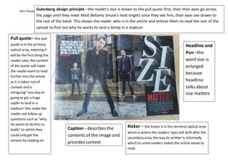
Kicker – the kicker is in the terminal optical area
which is where the readers’ eyes will drift after the
secondary area, the way its written is informally
which to somereaders makes the article easier to
read.
Pull quote– this pull
quote is in the primary
optical area, meaning it
will be the first thing the
reader sees, the content
of the quote will make
the reader want to read
further into the article
as it is taken out of
context and is
intriguing” one day im
going to get a huge
zeplin to land in a
stadium” this make the
reader ask follow up
questions such as “why
he wants to do this so
badly” to which they
could only get the
answer by reading on
Caption - describes the
contents of the image and
provides context
Headline and
Pun –the
word size is
enlarged
because
headline
talks about
size matters
Gutenberg design principle –the reader’s eye is drawn to the pull quote first, then their eyes go across
the page until they meet Matt Bellamy (muse’s lead singer) once they see him, their eyes are drawn to
the rest of the band. This shows the reader who is in the article and entices them to read the rest of the
spread to find out why he wants to land a blimp in a stadium
2. Alex Thorpe
Pull quote
– a quote
lifted from
the article
Drop cap – used to guide
the reader trough the
important parts of the
article
Pagination- the
page numbers
Images –
showcases some of
muses work
Captions
(containing
pull quotes)
– a quote
lifted from
the article
to help
describe the
images and
provide
context.
White
space – the
white
borders
surrounding
the article.
Gutters – the white margins
between the columns
Headline – the
word glory is
juxtaposed with
the word madness