Vashikaran Specialist in London Black Magic Removal No 1 Astrologer in UK
Mockups
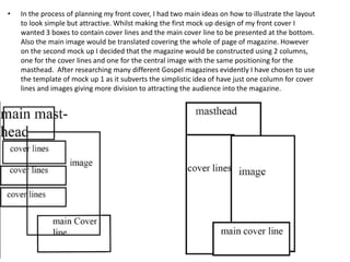
1. • In the process of planning my front cover, I had two main ideas on how to illustrate the layout
to look simple but attractive. Whilst making the first mock up design of my front cover I
wanted 3 boxes to contain cover lines and the main cover line to be presented at the bottom.
Also the main image would be translated covering the whole of page of magazine. However
on the second mock up I decided that the magazine would be constructed using 2 columns,
one for the cover lines and one for the central image with the same positioning for the
masthead. After researching many different Gospel magazines evidently I have chosen to use
the template of mock up 1 as it subverts the simplistic idea of have just one column for cover
lines and images giving more division to attracting the audience into the magazine.
2. Through my chosen mock-up and research I have made my final draft
of my front cover. The layout I have chosen to do is the rule of thirds
because it centralises the image and embraces how the main image
but it also indicates who my target audience is based upon the
illustration of the young girl. Furthermore the construction of my
layout also predicts the construction of my cover lines which aligned to
the left and the main cover line has been illustrated at the bottom to
attract the reader as it will be presented in bold with colour scheme of
different shades of purple. Moreover the display of my masthead has
been presented like that to indicate the genre of the magazine but to
attract the audience to the unconventional masthead of the Big 'G'
with the display rest of the masthead. The name of the masthead is
called 'Gospel Generation because it formats the not only the gene but
it sets the foundation for the audience that the magazine is aimed
young generation however is also subverts to how it other people
from other generation can read the magazine as well. The date and the
issue has been display aligned to the top right with the strapline taking
the centre; however I changed my strapline just to make it more sharp
and attractive saying 'Gospel Generation that magazine that speaks
through music.As well as the skyline attracts the audience to look and
buy the magazine just to get a cd and other special offers but it also
traps the audience into looking into the magazine.